Wolfgang Weingart


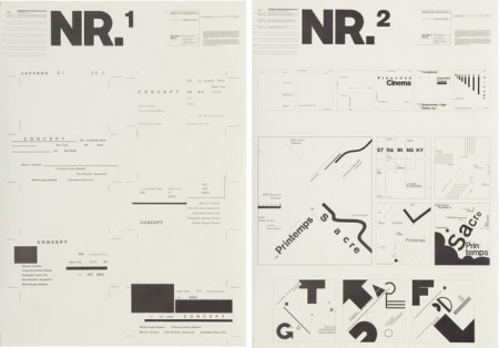
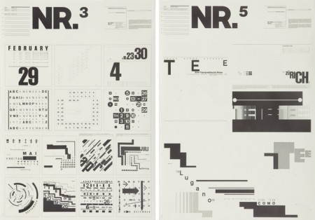
I’ve seen these posters floating around the internet for a while. I searched long and far to try and find anything at all about them, always to no avail. It was tough when all I had was the letters NR and my feeble attempts to describe their excellence to Google. Recently I saw them again on Shelby White’s blog and was very excited to at least have a small lead as to their origin.
Turns out they were designed by Wolfgang Weingart for Kunstgewerbeschule Basle in 1974. These, and a number of other Swiss poster designs, are at The Swiss Poster Collection at Carnegie Melon University. I would love to see one in person; I’m very curious how large they are. I like to imagine them as these massive wall sized super posters, best viewed at a distance. Ready to intimidate any graphic designers that unwittingly wander underneath.
*Favorite is definitely NR1

7 Comments Leave A Comment
NEOkeitaro says:
March 19, 2010 at 3:04 amIn the MoMA permanent collection they have this lithograph in 34 1/2 x 24 1/4″. That’s fairly large, compared to what one can find on Internet… Like you, I would really like to see this in real!
NEOkeitaro says:
March 19, 2010 at 3:05 amSorry for the double post… Here’s the link: http://www.moma.org/collection/browse_results.php?criteria=O:AD:E:6289&page_number=6&template_id=1&sort_order=1
Blake says:
March 19, 2010 at 5:25 am5-6 years ago I interviewed at a small design studio in Miami. In the Principals office was a HUGE poster. Roughly 5′ x 4′. It was a Weingart, for sure. So my guess is these posters are a larger format, but I could be wrong.
John D says:
March 19, 2010 at 5:43 pmHey Alex,
I’m actually right down the street from CMU (UPitt), so if you wanted I’d be willing to take a look at the posters, find out their dimensions, and snap some pictures for you if I can.
Interested? (I wouldn’t mind going, interesting to me too)
Scott says:
March 19, 2010 at 7:50 pmHe is definitely one my favs, I saw a poster of his for sale at The Design Museum but I was skimped at the time and could not get it.
Susan says:
March 22, 2010 at 5:50 pmI was in the design program at San Jose State (lived in Alameda) and saw these in my typography classes w/ ….trying to remember his name. Awesome instructor. Well, at least the exposure to this was memorable. I had no idea they are so big though. Thanks all for sharing this.
I like that phrase… “I was skimped”
c says:
March 23, 2010 at 6:10 pmi was lucky enough to studied under wolfgang in basle. He is quite a character. Nice to see his work making it to blogs. He is a master. Designers today still try and achieve what he did almost 40 years ago.