Hans Gremmen
Posted by Alex


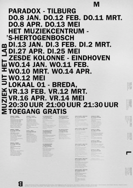
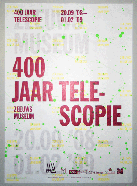
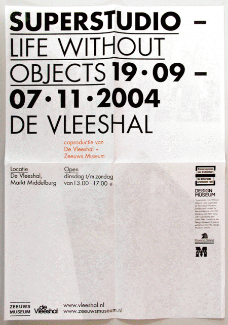
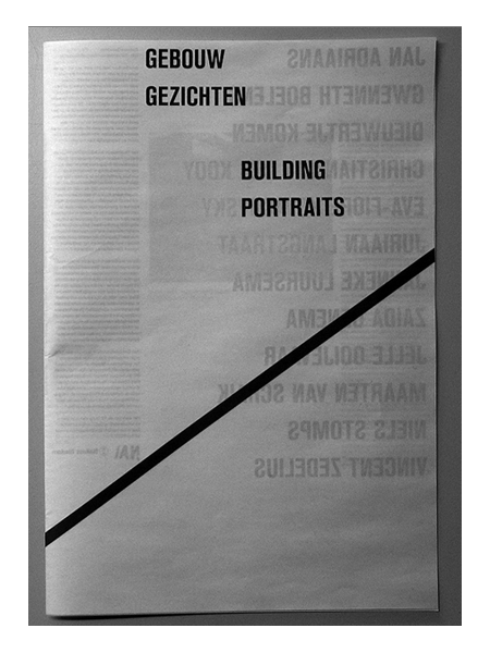
Assorted posters by Dutch designer Hans Gremmen. I love posters — like the first one — that are just PACKED with all sorts of information and data. Really gives the designer a chance to show off their typographic skills and hierarchic sensibilities. I especially enjoy the tendency for the asymmetrically balanced composition; really makes for that much more of an interesting poster.
Also worth noting is Gremmen’s portfolio site which randomly generates a selection of eight of his works. An interesting approach to be sure; I like the concept of an ever-changing front page, though it was a little tough to find the specific work I was looking for.

6 Comments Leave A Comment
Grant says:
October 19, 2009 at 1:14 amyep. love the first one. order is so perfect. i could stare at it all day.
Renoir says:
October 19, 2009 at 7:22 amfirst time i see some dutch artwork/designs on this blog geheh. btw “Paradox – Tilburg” i live around the corner. Paradox is an awesome cafe. ^^
Shelby W. says:
October 19, 2009 at 8:16 amI love that first one
gerwin says:
October 19, 2009 at 2:42 pmI’ve seen some pretty strong typography in the Netherlands, maybe it was by Gremmen :)
Bas says:
October 20, 2009 at 12:13 pmWeird to see all those Dutch cities of the south listed here.