Grid and Photography
Posted by Scott
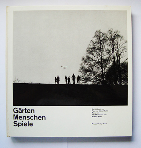
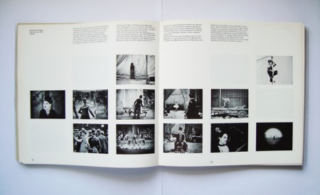
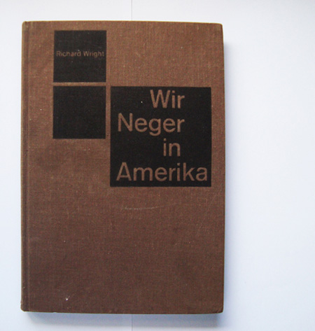
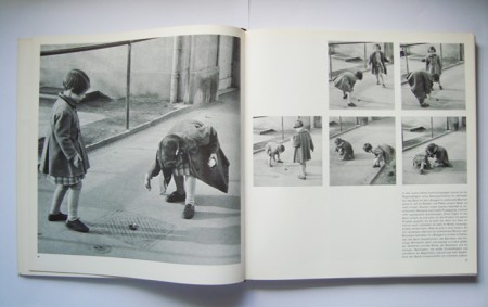
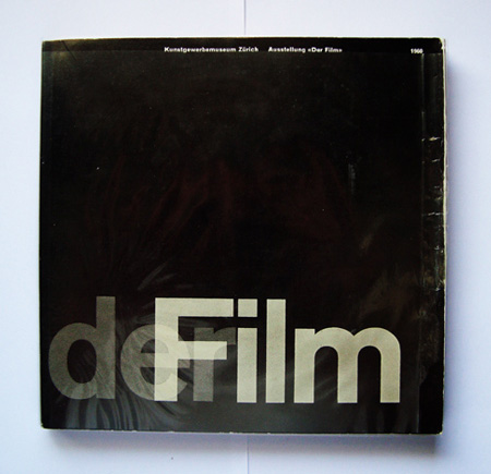
Some nice photography books with grid layouts. That Garten cover is absolutely perfect.
Via 80 Magazine


Some nice photography books with grid layouts. That Garten cover is absolutely perfect.
Via 80 Magazine

8 Comments Leave A Comment
Matt Davis says:
August 7, 2009 at 11:43 ami think it’s perfect because you have an affinity for children and trees.
Dom says:
August 7, 2009 at 10:48 pmI suspect that if the title of the second book was in English, you’d not have posted it: “We niggers in America”. In fact, for many of the older people in Germany, the Word “Neger” doesn’t have a negative connotation at all. Its use is discouraged today, but I don’t think it’s as offensive as its English translation.
Scott says:
August 7, 2009 at 11:19 pmDom-
I don’t believe your translation is accurate. Given the true meaning of the word, I figured it didn’t have as negative a connotation as it’s a translated version of an american book about “[the] folk history of the negro in the u.s.”. It is true that we don’t use the word negro over here anymore either, but we haven’t censored it from historical texts. you must take everything in the context of the time in which it was created. At that time, that particular word was the accepted term to describe a group of people. At a later time that word was deemed unacceptable due to shifts in how it was perceived and the connotation it carried. Perhaps at a later date the terms we now use will be found to be antiquated and offensive, but that doesn’t mean we must expunge every instance from our written history.
A good example is the UNCF. Frederick D. Patterson used the term when he formed the fund in 1944, a time when it was accepted. Things have changed but the name of the organization has remained the same.
gerwin says:
August 8, 2009 at 2:38 amI think it actually says “Like niggers in America”. Great find, by the way. The Gärten cover looks like it has always been a huge influence on your work.
RA_OUL says:
August 8, 2009 at 9:58 amYou are absolutely right about the Garten cover. The designer did a great job of achieving macro-aesthetics by placing a nice silhouette image of the children on the plain along with successful micro-aesthetics with the type treatment. The heaviness of the tree silhouette is balanced by the heavy weight of the title. They made a good choice on the inside pages to shift images out of certain spots where you would expect them to be. I love to see a grid used in a beautiful way.
Tobias says:
August 8, 2009 at 8:27 pmBy the way “Neger” does have the meaning Negro, so in the context of the years in which this was published it doesn’t have to be rascist at all.
Christoph says:
August 9, 2009 at 7:23 amI also don’t think it’s racist. Richard Wright’s (a black author) original american book titles don’t sound that politically correct either when read today, like “A Folk History of the Negro in the United States”
Btw, a good (english) discussion of the book’s design can be found here:
http://wiedler.ch/felix/books/story/38