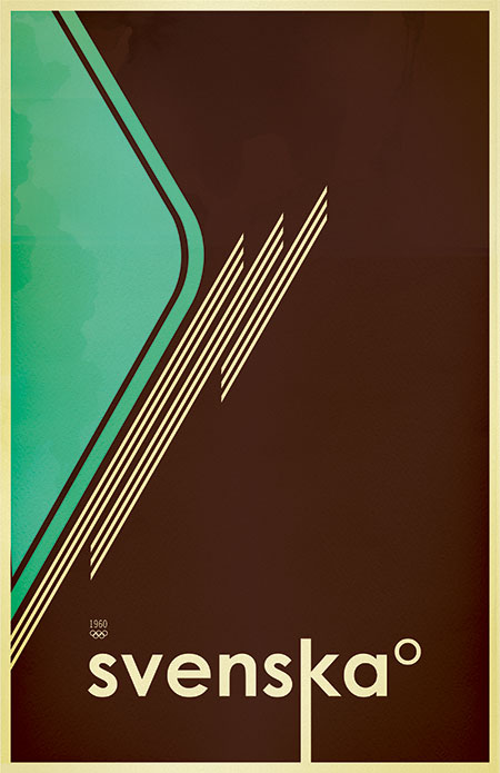
Svenska Version 1B
Posted by Scott

This is a variant of the Svenska print I did that has yet to make it into printed form. I will be posting random variations of some of my released work to hopefully give a better look at the process of working through a design and refining the various elements. The original Svenska print is here and version 2 is here.

17 Comments Leave A Comment
Dustin says:
September 19, 2007 at 8:56 pmOne of my favorites…I love the original, but this variation is wonderful. I think I’d buy this variation over the original.
Phil says:
September 19, 2007 at 9:16 pmI love the composition of the first one, but prefer the colors of the third.
That orange is awesome.
drew kora says:
September 20, 2007 at 5:16 amThis is a nice variation…perhaps my favorite of all the Svenska prints so far.
I have the first version hanging up in my house. People always ask me what it means. (Some think it’s a cool poster for Svedka Vodka…until I point out the spelling difference). So I know Svenska is a language, but is there a backstory to you using it as a poster theme?
Scott says:
September 20, 2007 at 7:12 amThanks Drew-
Svenska = Swedish. The original concept behind this theme was to create a series of travel posters, but I just fell in love with the way this word looked in print, so I just kept going with it in different designs. There’s about 8 of them, I will probably end up releasing 2 more and then be done with it.
M W M says:
September 20, 2007 at 7:58 amAwesome blog man!
I’m a huge fan.
Respect.
MWM
Yannic Walter says:
September 20, 2007 at 9:44 amAwesome work.
Simon J says:
September 20, 2007 at 10:13 amI’ve always been a big fan of your work, it’s truly inspiring. Keep up the good work!
Nicknolte says:
September 20, 2007 at 1:50 pmDear Scott,
I live in Paris, I’m a french webdesigner and I work in the world group in communications consulting in Paris (Euro RSCG). I have a very bad english, so, I’m sure – I like your work, your visual identity, your style & your music. I hope I can work with you in the advert project (perhaps). I hope you can understand my special english language… Have fun & have a nice day…
iheartboris says:
September 20, 2007 at 5:52 pmstill dope scott. keep rockin!!
Niklas says:
September 21, 2007 at 10:42 amOrdet svenska gör sig väldigt bra på den här affishen. Som svensk blev jag väldigt förvånad när jag såg den.
:)
Wembly Fan says:
September 23, 2007 at 7:17 amNot bad, not bad at all.
DOmanate says:
September 30, 2007 at 11:39 amI love the paper wrinkle/water color look on this piece…
Erik says:
October 11, 2007 at 5:52 amSamma här. Trodde först att Scott var svensk eller hade svenska föräldrar eller nåt i den stilen. (mtp hans eftern
Alex N says:
October 25, 2009 at 8:12 pmThis poster reminds me of some old soviet work by Peter Nidzgorski:
http://ffffound.com/image/55e6a81b5a201ac2512595edae3660c6552c5af1
rrmitcxis says:
November 11, 2010 at 3:48 amaY24rN qwzmuncoruzm, [url=http://rxgtimjkqevi.com/]rxgtimjkqevi[/url], [link=http://vjvykbzxlysm.com/]vjvykbzxlysm[/link], http://xxfqvsdbobcf.com/