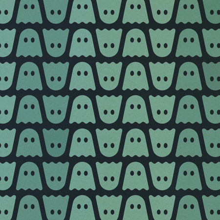
Ghostly Poster Progress

I’ve been working on a new poster over the past week and it’s very near completion. It’s a limited edition for the August Ghostly 10 Year show Chicago installment. If you follow me on Twitter you’ve probably seen a sneak preview of the poster (the image above is a cropped snippet). The one up on the Ghostly site is a very early draft though, we just needed to get something up as a placeholder while I worked out the final version. There will be two versions: one with the artist names and one without. Bot will be available in large format offset and Giclee in the coming weeks. I’m hoping to post up the finals very soon here, could be as early as tomorrow but might hold off until Monday to make sure everything is dialed in.
I’ve been focusing a lot on music lately so this has been a nice chance to get back into design for a little bit. It’s definitely been a challenge wrapping it up though. I feel like the older I get the harder it is to decide when a project is complete; I just want to keep going through every possible permutation and variation until the finished product presents itself to me. For this particular poster I’ve been finding success in bouncing the different versions off of friends to see how they react. I’m still not sure if that’s the best idea, but it seemed to work this time around and it probably cut down a lot of the time I would have spent second guessing myself. Stay tuned for the final versions…

11 Comments Leave A Comment
Lester says:
June 18, 2009 at 2:04 amI LOVE the 10! I need to create more opportunities for me to do designs that I really love, for myself, because I know most of the clients I get in Alaska wouldn’t be fans of subtlety, wit or irony, things that I love.
Rent says:
June 18, 2009 at 2:59 amawesome. think the rough copy on twitter looks great already.
Kevin says:
June 18, 2009 at 7:31 amalmost missed the “10”. had to break out my magic eye glasses. im gonna try and make it to the show too, my friend lives right near the empty bottle. cant wait to see the final version.
Jeremy says:
June 18, 2009 at 7:39 amLooking good Scott!
Peter says:
June 18, 2009 at 11:27 amLooks great, byt the 10 is borderline invisible.. unless that’s what you’re going for.
Daniel Carvalho says:
June 18, 2009 at 12:17 pmCool to see a new poster surfacing from ISO50.
I like the structure, but it’s extremely modest at the same time. It lacks a visual punch or dynamic for me. This poster stylistically leans more towards a contemporary minimalism, with retro technique’ing and distressing as a secondary component. Which is usually the opposite with your older works. I’m not saying that is bad thing, but specifically with this poster, it feels somewhat bland to me. It’s hard to describe, but you get those designs where you feel like the minimalism works for itself, and others where it just feels bland.
I do however, really like the patterned effect created with the Ghostly logos. You were always great at creating repeatable patterns, and varying the colour between them, so that it’s not one dimensional. Keen to see the final output.
Scott says:
June 18, 2009 at 2:41 pmDaniel-
I appreciate the commentary, but like I said, the one on the Ghostly site is a preliminary version rushed out to have a placeholder (hence why I haven’t posted it here). I will be posting the final versions soon and I’d ask that you reserve judgement until you see them.
@tannermoehle says:
June 18, 2009 at 9:11 pmAll of the sudden I have a craving for Boo Berry. This is a delicious design, and part of a complete breakfast.
Daniel Carvalho says:
June 18, 2009 at 11:55 pmYeah, will do.
Pablo says:
June 20, 2009 at 5:14 pmMan, I would love that as a desktop wallpaper. Sweet stuff.