Dan McPharlin


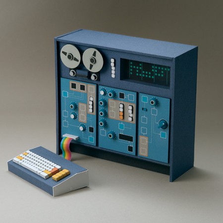
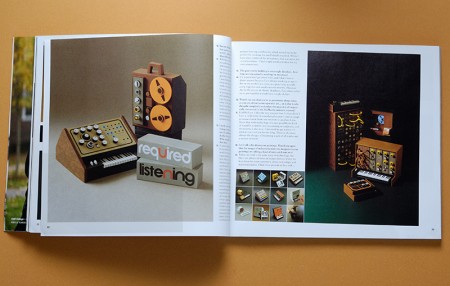
I’ve been following Dan McPharlin’s work for a few years now, ever since his miniature synthesizer models started showing up on Matrixsynth. I fell in love with his perfectly crafted, perfectly photographed (seriously, the photography is almost cooler than the work itself) paper music machines. But after being introduced to his graphic/illustration work he quickly became one of my favorite artists. His illustrations are very reminiscent of another favorite of mine, Roger Dean, and are evocative of that prog-rock driven 70’s sci-fi art scene that, when done right, is just downright incredible.
So it’s been great to see Dan’s work start popping up all over the place, like here, here (Prefuse 73 cover), and here (Jakub, you really should have know better!). Beyond the visual beauty of his work, it’s just great to see someone being creative with such a novel medium. He brings the mind and eye of a designer to a world previously reserved for 60-somethings hiding out in their basements building model railroads. To see him wrap all this up and successfully translate that future-past-that-never-was aesthetic into commercial projects is a good thing indeed.
You can check out more of Dan’s work at his flickr.
On a side note, he’s posted some shots of his home/work-space here. Are you kidding? Amazing. My house looks like it was built of scraps from a 19th-century Troller Boat that ran aground in front of a hippie commune. Seriously, parts of a boat were used in the construction of this house, I am sure of it. Anyways, I am disorganized at best, slovenly at worst and I don’t think I have the skill set to keep such a meticulously minimalist situation like that up for any length of time. If I win the lottery I will get one of those modernist prefabs and put it in front of this house. I’ll then carefully place completely unusable angular furniture and German-designed objects all around it. Finally I will place a single synthesizer with wooden endbells and an analog sequencer on a white table with a molded plywood chair in front of it. When people come over I will tell them that’s where I get all my work done and then I will sit them down at a walnut coffee table with various important looking design books stacked neatly on top of it and expound on typography theory and then chastise them for not understanding the difference between kerning and leading. After they leave I will go back to my real house and eat a sandwich in my basement and watch Adult Swim and then not clean up the plate for a week or so.

13 Comments Leave A Comment
Brian says:
May 12, 2009 at 12:17 amLove his work.
mw says:
May 12, 2009 at 12:45 amabsolutely hilarious
alex says:
May 12, 2009 at 12:46 amWow this is great stuff! I especially love his illustration work; great textures and colors. I would love to know more about his materials and process. What a great imagination…
NAVIS says:
May 12, 2009 at 2:04 amMan… as much as I dream of owning a cool house decked out with cool designer shwag and nifty pieces that tie the room together like Dan’s… I just want one giant ass room where one entire wall opens up to a forest sans the mosquitoes and other strange bugs. I’m a big fan of owning nothing.
Third picture down from le top: amazing. Kinda reminds me of something Mr. Rogers would own if he were more hip.
Sam Spiller - DJ Hegemoney says:
May 12, 2009 at 9:59 amI love the little notes. “An E-Bay find. . . ” Dude! Who finds that stuff on e-bay? All I find are bootleg Shure mics and GI-Joes with the rubber bands broken.
Rent says:
May 12, 2009 at 10:00 amthose little synths are so clean…I want one…and another real synthesizer :P
Andrew J. says:
May 12, 2009 at 1:12 pmi find this to be pretty amazing:
http://www.flickr.com/photos/danmcp/3241006504/
Bas says:
May 12, 2009 at 2:03 pmGreat humor :D
His work is amazing indeed. Especially the chair designs, imho (and his house of course).
Jay G says:
May 13, 2009 at 11:26 amWow… does anyone know if his artwork is up for sale?
adriana says:
May 14, 2009 at 11:55 amthis is great! I’m assuming you’ve checked out Sounds from the Cave by Mr Chop – because the second image is from the back cover of the album :) good stuff!
Patrick says:
October 21, 2010 at 10:39 amI just came across Dan’s work through some flickring and have been seriously blown away. Then I found your article and I guess I mustn’t have been following your blog yet back then…
anyways, Dan obviously has one of the most creative minds around. His work is so clean and precise in every way… perfect shape/color combinations.
time for a blog post write up :)