Your Business Card is Crap!
Posted by Scott

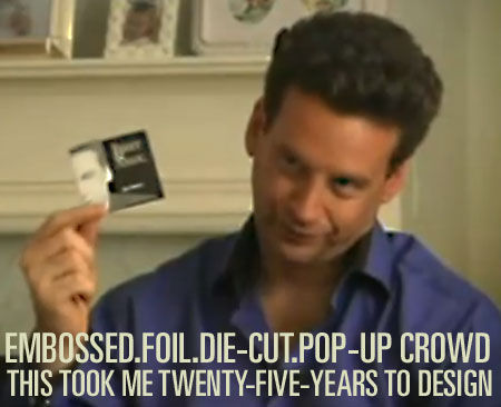
Hilarious, this guy is like the Tony Robbins of business cards or something. “It took me TWENTY—FIVE—YEARS to design this.” Link


Hilarious, this guy is like the Tony Robbins of business cards or something. “It took me TWENTY—FIVE—YEARS to design this.” Link

24 Comments Leave A Comment
Carl says:
April 24, 2009 at 11:51 amwow…who the hell is this dude?! i bet he loves cocaine…
Mason Stewart says:
April 24, 2009 at 11:57 amHILARIOUS. Scrooge McDuck meets Jimmy Buffet meets Business Card Mafia. Thanks, Scott!
Karl Peterson says:
April 24, 2009 at 11:58 amHis name is Joel Bauer and he’s an “Infotainer”! His website: http://infotainer.com/infotainer/blog/about-joel/
Jesse says:
April 24, 2009 at 11:59 amfoil stamped, embossed, die cut and a pop up. words aren’t enough.
what about throwing a drop shadow in there somewhere? or is that to out-of -this-world?
I don’t do anything guaranteed. . .except shit a couple times a day and design 2nd rate business cards it would seem.
thelottery says:
April 24, 2009 at 12:05 pmWhat a perfect way to start the weekend.
Ramune says:
April 24, 2009 at 12:05 pmHilarious indeed! I wish I had twenty-five years to design my business cards. He spent all that money on his wild and crazy business cards and didn’t have any left for his website I guess.
gustaf says:
April 24, 2009 at 12:17 pmTruly awesome in every way. I mean, how can you argue with logic like that?
@botched
Robin Johansen says:
April 24, 2009 at 12:44 pmHilarious! And absolutely inspiring aswell, guess he is an amazing salesperson, so commited to his cause – allthough he didn’t really sell that idea to me though:)
NAVIS says:
April 24, 2009 at 12:47 pmI love this video. If only his haircut would be as awesome as his business cards. I bet he’d cut his own hair too.
Although his website is equally funny that Kari posted! The video is creepy as hell though.
North says:
April 24, 2009 at 12:55 pmHaha, I’m glad you posted this Scott, my branding identity teacher showed our class this gem a month ago.
“…it doesn’t fit in a rolodex, because it doesn’t belong in a rolodex.”
Frost says:
April 24, 2009 at 1:50 pmBusiness card: 25 years
Website: his 12 year old nephew and photoshop 7.
“If it doesn’t belong in a rolodex, it will probably be thrown out”
lol.
Bas says:
April 24, 2009 at 1:57 pm“Hilarious indeed! I wish I had twenty-five years to design my business cards. He spent all that money on his wild and crazy business cards and didn’t have any left for his website I guess.”
Hahaha.
The World Wide Web is only 16 years old, so he needs at least 9 more years to make his website impressive.
Ryan says:
April 24, 2009 at 2:57 pmoh the embossers.. the horror….. the horror
Daniel Carvalho says:
April 24, 2009 at 3:16 pmAh, I see this video made it to the website heh.
I really loved this video when I first saw it circulating around the Twittersphere, so much so, I downloaded it. Absolute classic, so entertaining.
Like others, I also ended up researching on Joel. How could you not after seeing a video like that?
Zach says:
April 24, 2009 at 4:10 pmWow…just wow…
I’m not even sure that…thing…qualifies as a business card any more, much less a well-designed business card. If anything, it’s more of a marketing piece. In any case, I’d still like to have one as a reminder of what I do not want to be as a designer. Thanks for sharing this Scott.
Tardlovski says:
April 24, 2009 at 6:58 pmhe forgot the lens flarez…
Angel says:
April 24, 2009 at 8:04 pmAhahah, when i was born he decided do to it… That’s funy !
Adam says:
April 25, 2009 at 12:19 amOh. My. God… Sold.
Alex N says:
April 25, 2009 at 5:19 pm“Life is not about being liked, its about being effective…”
He’s got “not being liked” down.
Alex says:
April 27, 2009 at 12:51 pmWhat’s a roladex?
Paulo says:
April 28, 2009 at 1:50 amHahaha he started design it when he was on his 20’s and finish only now for this interview, it toke a little time but he is unstoppable now. He reminds me of the American psyco…
Paulius Slivinskas says:
April 28, 2009 at 3:40 amWell it’s quite interesting “card” (looks like whole brochure), but i think that making a standart format business card is some kinda challenge for a designer. This guy has created a brochure with all that plane transformation things and other bling blings, loads of text. How difficult will be to use this card for a person? This squared card can’t fit into standart card holder, so i bet people won’t put this card somewhere in a pocket or else to have it all the time. 20 years of design leading to failure.
Danny Kim says:
May 11, 2009 at 4:11 pmLook at that subtle off-white coloring…the tasteful thickness of it. Oh my god, it even has a watermark. I love when the music comes up when he reveals his card. Sounds like the Go-Go’s or something, haha.
Rick says:
November 10, 2009 at 1:58 pmIt’s a good thing this guy is in a video, I’m not sure I could take him in real life.
@Danny The song is Joan Jett and the Blackhearts – Love Is Pain (link to Lala.com http://bit.ly/1Pej2K )