Festival Project Process / Stickers

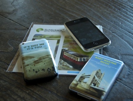
I’m still chipping away at the project I mentioned last week. One of the requirements is the creation of three products to complement the film festival we are creating and branding. The products can be pretty much anything, but one has to tie conceptually to our overall vision for the project. I have no idea what I’m going to do in this regard, and I figured I would knock out the other products first. I decided to try out Schtickers and get a few custom iPhone/iPod skins made. I can’t imagine ever actually wanting to ruin the impeccable design of either device with a sticker, but for a hypothetical film festival mock up, I figured it could at least be interesting. As I am also creating a website for the festival, I thought the iPhone/iPods would look good next to the laptop displaying the page on presentation day. The “electronic” portion of the festival brand fully fleshed out.
Overall, I would recommend Schtickers if you happen to find yourself in the market for some custom skins. I think they are most useful for in-class projects, or perhaps an unusual gift, but are definitely not a serious design option for professionals. Print quality is fairly good, but nothing close to what you’d get on paper. For my image style, it actually ends up looking dead on, but I can’t imagine many people appreciating the softer edges and slight blur you get with the vinyl print. The design/order process was very easy and smooth, and the stickers arrived within two days. Compared to some of the other vendors I am outsourcing to, this was amazing turnaround.
For the above sticker mock ups, two of the images come from agnusleonard and matstace. For the final versions, I will be using my own tilt-shift work like on the record cover. Next up should be the poster, which if all goes according to plan (when does that ever happen?), should be printed tomorrow.
Semi-related, Zweiphone will make your iPhone look like another, out of date phone. (via Subtraction)

11 Comments Leave A Comment
Andrew Witherspoon says:
April 20, 2009 at 8:26 pmGreat work, the project’s coming along nicely. Thanks for the tip on Schtickers, I didn’t know that custom service existed for iPhones. That could definitely come in handy.
ryan says:
April 20, 2009 at 8:28 pmdig it.
i’m really liking following this project, and it seems quite valuable in your education.
i’m quite pleased the blog is now a bit more well-rounded, with a design-focused blogger in addition to jakub and scott.
cheers!
Matt says:
April 20, 2009 at 8:51 pmAwesome. I love those. They delight me. They are the perfect blend of old and new and make a great impression while remaining mysterious.
Rent says:
April 20, 2009 at 9:09 pmbaby making music…nice
agustin says:
April 21, 2009 at 10:08 amThe mockups look sweet, great work.
I’m curious as to your setup for the tilt shift photography – what camera/lenses you’re using.
I love the project itself, but with the Wes Anderson tie in I’m absolutely smitten. Great work
Alex / HeadUp says:
April 21, 2009 at 12:26 pmThey almost look like cassette tapes from travellers guides or language courses you’d listen to in an old tape player.
MatStace says:
April 21, 2009 at 1:04 pmI knew there was a good reason I put my photos on-line under the creative commons – that’s fantastic.
mike h says:
April 21, 2009 at 4:02 pmI really dig the schtickers. The blur reminds me of BoC
gika says:
November 9, 2009 at 4:53 amThanks for the information. It will be useful for many.