Carlo Van de Roer
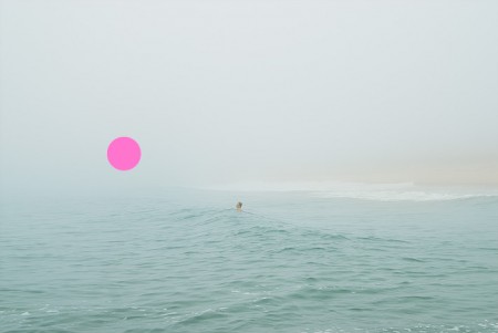
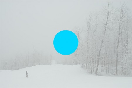
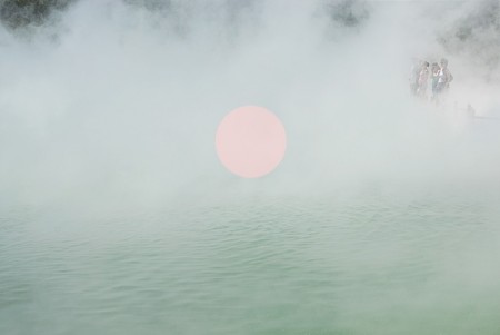
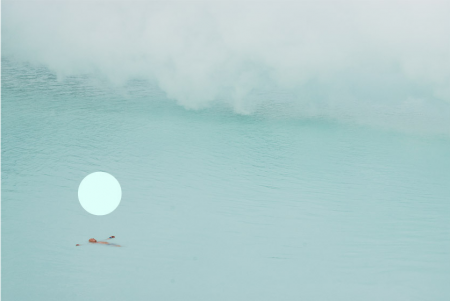
These shots by Carlo Van de Roer look like pure and unfiltered tranquility. I’ve never been to Iceland before, but this series captures what I imagine it would be like. It looks freezing and potentially dangerous, but still somehow soothing and comfortable. Probably the most immediately noticeable aspect of these images is the inclusion of the colorful floating orbs. Personally I love them, and I think they are the reason his work has picked up so much recognition. They are a unique touch that brings a little bit of extra magic to his already stunning photography. I’ve read he screen prints the orbs onto the photographs, but I can’t find any information regarding the concept behind the orbs. Perhaps it’s just an aesthetic choice, but I would imagine (and prefer) that there is some deeper conceptual reason for their placement.

20 Comments Leave A Comment
Tom says:
April 1, 2009 at 5:00 amsimply beautiful
Rent says:
April 1, 2009 at 6:56 amyes! …was just perusing his site the other day and really enjoyed these orb shots within a landscape. very nice and a great post indeed alex.
nicholas says:
April 1, 2009 at 7:47 amreminds me of an Album Leaf song.
greg says:
April 1, 2009 at 9:42 amThe photos are beautiful, but the dots are a bit gimmicky to me – simply a way to attract attention.
Rent says:
April 1, 2009 at 10:53 amI feel like the orbs represent some kind of omnipresence in the photos and they almost seem like relics or observers…I think that’s why I like them so much
Rent says:
April 1, 2009 at 10:54 am…or maybe that’s completely over analyzed, but as alex said, I’d like to think they have a deeper meaning that just an eye-catcher
James says:
April 1, 2009 at 11:53 amI guess the dots turn what are just really nice photos into something more contemporary and arty. I guess he wants people to see his stuff and think ‘ah yeah it’s the dot guy’. Personally I think his photos stand strong enough by themselves without the need for anything more thought provoking.
Tom says:
April 1, 2009 at 12:22 pmwhat I really like is maybe not the meanin,g but that a coloured circle can change (maybe even enhance?) a photo so much
Tom says:
April 1, 2009 at 12:22 pmwhat I really like is maybe not just the meaning, but that a coloured circle can change (maybe even enhance?) a photo so much.
alex says:
April 1, 2009 at 12:33 pmThere is also something to be said for the color choice and compositional placement of the circles. I think in each case the color and placement are spot on, and obviously very carefully considered. If he hadn’t got those right, this would be a different conversation haha
NAVIS says:
April 1, 2009 at 1:14 pmI think they’d be more compelling sans the dot. They’re very quiet photos in the first place and the dot disturbs that peace and their natural beauty. Although for some reason, the dot is kind of fitting in the last one. It does have that omnipresence thing going for it. I should take a look at these at larger scale because it’s hard to see what’s really going on in them.
Andrew J. says:
April 1, 2009 at 3:18 pm^^^^^I agree
Ichabod says:
April 2, 2009 at 12:14 amthis was clearly an april fools day joke guys.
Ichabod says:
April 2, 2009 at 12:14 amthis was clearly an april fools day joke guys.
Tardlovski says:
April 2, 2009 at 5:25 amlose the dots.
personally i don’t find the placement, size or colour in any of them particularly proper. the dot in the second one is just way too big, it overwhelms the photo and completely hogs focus in an otherwise amazing shot AND composition. i would have appreciated some more subtle, but still very colourful choice other than some of the most overplayed colour choices in the world today (cyan? magenta? come on!). the photos are so much nicer, let them stand on their own.
on a semi-related sidenote, i’ve always found ikue mori particularly adept at composing imagery, text, graphic elements and dots/circles in her work.
r says:
April 2, 2009 at 2:45 pmAt first glance, I hated the dots, but the second time around they became more meaningful. I definitely think it’s all about the placement, although they would be better without them…
Erik Dalzen says:
July 23, 2009 at 6:25 amThey aren’t just dots. They are orbs! Reinterpret that for yourselves.
Daniel Farrell says:
September 17, 2009 at 1:51 pmI saw this work when i was in college and it inspired me to
do a similar piece but instead of them floating in random space
mine where coving faces of people i had photographed. It worked
quite well but not as well as these images haha.
Fanny says:
March 8, 2010 at 4:39 amGreat!! Me likes sim-ple too