Classic Sci-Fi Covers


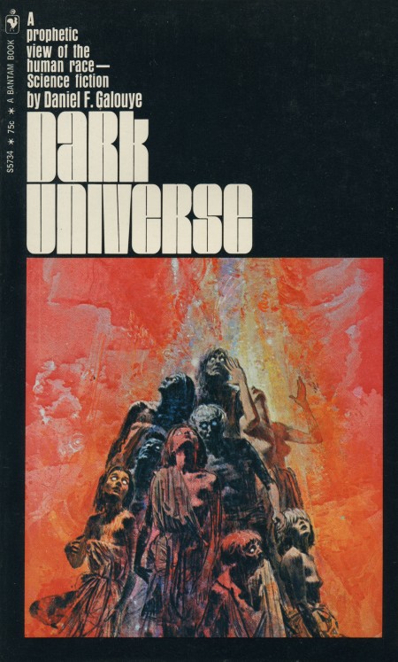
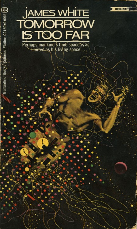
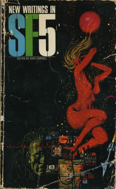
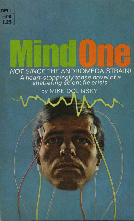
While digging around for Omni covers for last week’s post, I came across blog reader Eric Carl’s Flickr and his downright incredible set of vintage sci-fi / fantasy paperback covers. These really are mind-blowingly good and positively dripping with inspiration. I’ve never seen any of these before but I feel I’ve been somehow influenced by them anyways. They encapsulate everything I love about this period in design; just look at that typography! The “Dark Universe” cover is just off the charts good. Thanks so much for posting these Eric! Quick question if you’re reading this Eric: Do you actually own these? How did you come across find such a nice collection? Link
HUUUUGE bonus: can anyone name the font used in “Dark universe”? Is that even a font or do you think it’s hand drawn? Let us know in the comments.

27 Comments Leave A Comment
Daniel Carvalho says:
March 31, 2009 at 3:25 amI think your best bet is asking Tom Muller, I think I remember him posting about that Dark Universe book.
Chris Stevens says:
March 31, 2009 at 5:30 amI put the dark universe font onto whatthefont and while i didn’t get an exact match it did give me 2 similar fonts which are Jampact NF (from Nick’s Fonts Jampact NF) and Armada BlackCompressed (from Font Bureau Armada).
Hope that helps!
lydia says:
March 31, 2009 at 5:36 amWhat a great collection! Thanks to Eric for taking the time to scan these. btw I’m loving all the sci-fi related posts lately. *geeks out*
There was a post a while ago on io9 that links to some nice covers as well (the classic Wrinkle in Time one for example): http://io9.com/5038991/the-best-scifi-book-covers-of-all-time—and-space
I’m partial to all the old Ray Bradbury covers myself.
rafael says:
March 31, 2009 at 5:43 amIt looks a lot like a font called glacier, distributed by corel. I have 2 versions of Glacier and it’s pretty well executed, but as with all corel fonts, it seems to be a rename/reshape of some 70s typeface, probably done by letraset.
check it here: http://4.bp.blogspot.com/_FLtwrII-iKM/SPw9Drlbm2I/AAAAAAAAA3c/Ip6mIiixlr0/s400/Glacier.jpg
Harley Turan says:
March 31, 2009 at 7:46 am@rafael Similar sort of thing, but less ‘elegant’ and curved.
That ‘Dark Universe’ type really is beautiful! Studying it, everything seems to be made up from the same set of shapes, so I might have a go at tracing and creating the missing glyphs. I need some typography practice anyway.
Scott says:
March 31, 2009 at 8:50 amHave you discovered this blog yet Scott? Its one I check weekly for inspiration.
Scott says:
March 31, 2009 at 8:50 amhttp://www.sci-fi-o-rama.com
Have you discovered this blog yet Scott? Its one I check weekly for inspiration.
Matt Davis says:
March 31, 2009 at 9:46 amThese are the sickest inspirational pieces you’ve posted! That’s why the ISO50 blog holds the first spot in the design section of my bookmarks.
frank says:
March 31, 2009 at 10:28 amI don’t know about the font but clearly it should be called Univers Dark. :P
Kevin says:
March 31, 2009 at 11:52 amARGH! i was gonna post something like this on my blog tonight. i have a small collection of old Arthur C. Clarke paper backs from the 50s-60s. Earthlight, Childhood’s End and Glide Path, just to name a few, have super awesome covers a lot like this. DARN YOU SCOTT!!!!! :-)
Dave says:
March 31, 2009 at 1:42 pmOne of my favorite vintage paperback sci-fi covers is featured on Out of the Silent Planet by C.S. Lewis. I love the spherical spaceship, the hard shadows from the jutting rocks, and especially the “crystal” looking spires in the background with the orbs on the top. Amazing…
Dave says:
March 31, 2009 at 1:59 pmCheck out the “Out of the Silent Planet” book cover I just commented about here:
http://foxywriter.com/images/2008/1015_outofthesilentplanet.jpg
lydia says:
March 31, 2009 at 5:37 pm@Kevin Please post them anyway! :)
elstrausso says:
March 31, 2009 at 7:53 pmFound these great Philip K. Dick covers through cover browser:
http://thedept.com/blog/philip-k-dick
Eric says:
March 31, 2009 at 7:58 pmHey dudes, glad you like the stuff!
Yes, I do own all the books and magazines that I scan up to the Flickr account. I have found them all in two specific places- a used book store down the road that has a huge vintage paperback selection, and at a giant monthly flea market a local college (Pasadena City College) holds. Always lots of fun to pour through those places.
sarith says:
March 31, 2009 at 8:58 pmSo random that I even stumbled on your site today — I’m a designer but when I was in a physics class in college a few months ago, my professor’s name was Tycho Sleator. I was googling him for some reason and stumbled across your music site, only to stumble further into iso50 — and even stranger than that, I’ve been here before!
Anyway — I’m a devoted fan of Tom Muller, and he and I were just twittering a few days ago about classic sci-fi novels, as I happen to collect them as well. Anyway, yes that Dark Universe cover font was a direct inspiration for the cover he did for Worry Doll. Check it out:
http://hellomuller.com/work/2007/worry-doll.html
malarts says:
April 1, 2009 at 1:21 pmAll the 60’s and 70’s commercial art guys are amazing – I grew up reading alot of books like this, and I would totally judge them by the cover! The freakier the spaceship the better! Thanks for this post.
brandon says:
April 1, 2009 at 2:48 pmProps to anyone that can name the shameful 90’s album that lifted the artwork from SF5…
Tom Muller says:
April 1, 2009 at 3:28 pmCan’t remember ever posting about that book (the cover is in my Ffffound gallery though, thanks Carl! :D)
I am working on a font that is similar to the Dark Univers type though (as in fat and compressed).
Kevin says:
April 1, 2009 at 7:06 pmHey lydia (and everyone else),
Here are some of those Arthur C. Clarke books i mentioned in my last comment. Posted them on my MySpace blog. Enjoy!
http://blogs.myspace.com/index.cfm?fuseaction=blog.ListAll&friendId=74123093
And brandon, was that shameful 90’s album by “Monster Magnet?” ;-)
Daniel Carvalho says:
April 1, 2009 at 10:43 pmMaybe that’s why I thought of you then Tom. Probably saw the font you were creating and made some kind of connection due to the similarities.
brandon says:
April 2, 2009 at 9:44 amDing! Nice goin’, Kevin.. You know your awful 90’s swamp rock.
http://en.wikipedia.org/wiki/Dopes_to_Infinity
Kevin says:
April 2, 2009 at 1:23 pmonly thing i remember about monster magnet was that video of theirs where theyre flying thru space on what look like giant turds.
david says:
August 30, 2009 at 4:58 amyes, the sf5 cover was apparently used by monster magnet on their record dopes to infinity.
wild.
hexatron says:
August 31, 2009 at 10:55 am#7:
everyone click his link, beautiful stuff.
http://www.sc…i-o-rama.com
Sci-Fi art directory says:
October 14, 2010 at 1:01 pmGreat covers! Simple and pleasing to the eye.