Day For Night: Alex Cornell
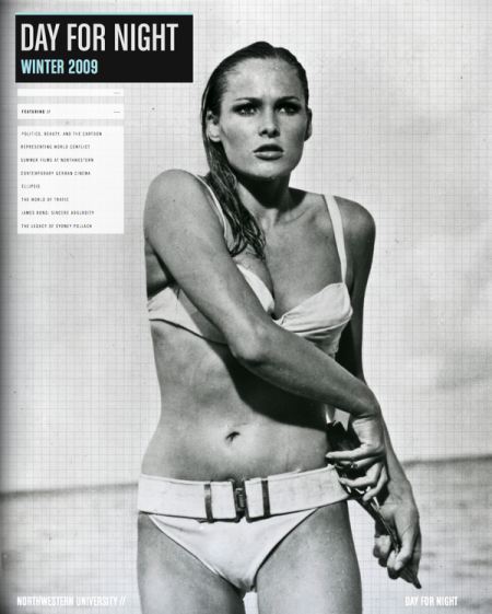
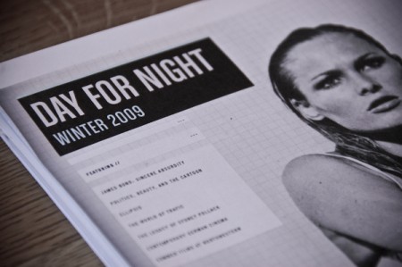
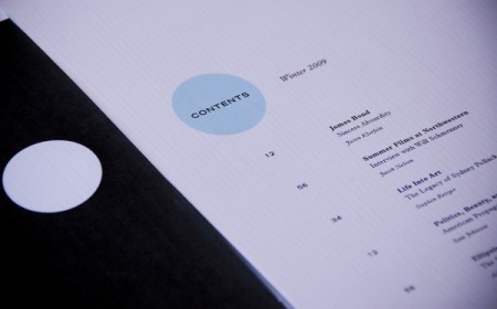
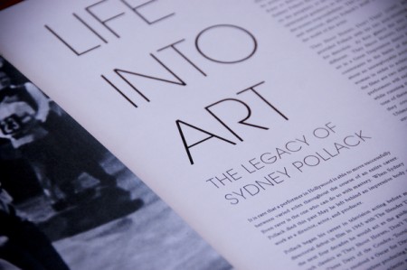
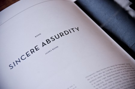
As you may already know, Alex Cornell — the same Alex who posts on this blog — is also my intern around the studio. A while back Northwestern University asked him to take on the daunting task of layout and design for their “Day For Night” magazine. The previous design was pretty much your run-of-the-mill college publication without much thought put into the design so this was a great chance for him to really evolve the visual language of the magazine. The big constraint was colors; apparently he can only use black, white, and one spot color of his choosing per issue. As you can see, the finished product is superb, Alex’s excellent eye for typography and layout really shine through in his first issue for the magazine. This project was featured (and deservedly so) by Behance last week and is up on Alex’s portfolio page there. Congrats Alex, very nice work!

25 Comments Leave A Comment
Daniel Carvalho says:
March 10, 2009 at 2:40 amExcellent, well impressed. The single spot colour actually gives it quite a bit of a punch and gives it a theme. Love the cover photo as well.
greg says:
March 10, 2009 at 7:35 amNice work, Alex!
Jon says:
March 10, 2009 at 8:22 amReally nice work, Alex! Great layout.
Shelby White says:
March 10, 2009 at 8:43 amAwesome work Alex. I saw these on design you trust yesterday.
Adam says:
March 10, 2009 at 9:28 amLooks good, nice work.
Joni Korpi says:
March 10, 2009 at 10:22 amAbsolutely smashingly awesome work. The “Summer Films at Northwestern” -spread is especially great. Love the “blindfold” idea :)
Alex N says:
March 10, 2009 at 10:45 amMay I ask what font is used for SINCERE ABSURDITY ?
alex says:
March 10, 2009 at 10:57 am@ Alex N – “Sincere Absurdity” is set in Neutra Text Demi Italic Alternate.
http://www.houseind.com/fonts/neutraface/
koneyn says:
March 10, 2009 at 11:15 amVery stylish work, Alex, congratulations! :) If I may ask – will you be able to change the spot color each time (if you would want to)?
Horacio says:
March 10, 2009 at 11:17 amI saw this on Behance. Great work ;)
NAVIS says:
March 10, 2009 at 12:47 pmI really think the camel toe brings out the overall design. :D haha
But seriously, great work. Love the Sincere Absurdity font.
AndresM says:
March 10, 2009 at 1:41 pmNice Nice Nice.. I bet the regular readers are gonna be suprised huh? I’m a big fan Avant Garde…it’s so chic without being pretentious.
Rent says:
March 10, 2009 at 5:12 pmgorgeous work alex…simple, clean, and that spot color is right on.
Garvin says:
March 11, 2009 at 4:13 pmI’ve been a fan of this site for sometime now, but this would be my first comment. I find myself returning everyday in hopes of finding some more work posted, and to see something great like this. Incredible how something so simple can be so inspiring. Thanks – g3
Luke says:
March 11, 2009 at 6:13 pmWas Alternative Gothic used for DAY FOR NIGHT? I really enjoy your work Alex.
Neil says:
March 13, 2009 at 4:48 pmLove the type. Great work!
Rent says:
March 14, 2009 at 8:11 pmnot sure if anyone has asked this yet…or if you even check this far back in the blog, but where are you going to school for all this alex?
alex says:
March 14, 2009 at 10:42 pm@Rent- Right now I’m at the Academy of Art here in San Francisco getting my Master’s. This magazine project was actually freelance, but the Pantone one I wrote about a while back was for school. Should have another school project process description up soonish
Rent says:
March 15, 2009 at 1:01 amvery nice…just getting ready to attend CCA out there so I was curious as to what I might be seeing. your work is great though, thanks for sharing it with us.
Renzo says:
March 15, 2009 at 7:45 amClassy the choice of Ursula Andress for the cover, what could be an Icon with such impact?
And quoting any of the imageries from 007 movies serie (at least those featuring Sean Connery) earns sudden and unrestrained commendation!
Awesome job!
Kudos
renzo
Zach says:
March 18, 2009 at 2:52 pmI have to say my favorite part is the contents page…love the mirrored circles; that was a very nice touch.
Trent Bigelow says:
March 31, 2009 at 12:03 pmJust beautiful! Is he available for future magazine layout/design work?