Kazumasa Nagai
Posted by Scott
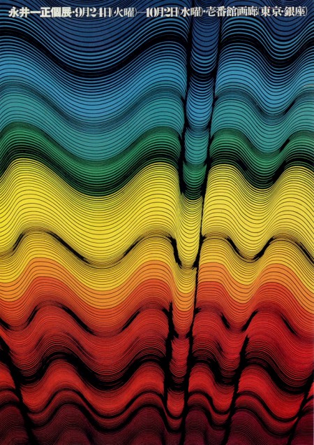
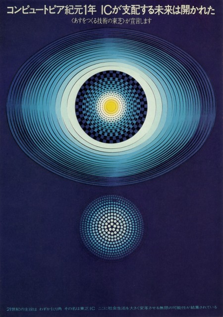
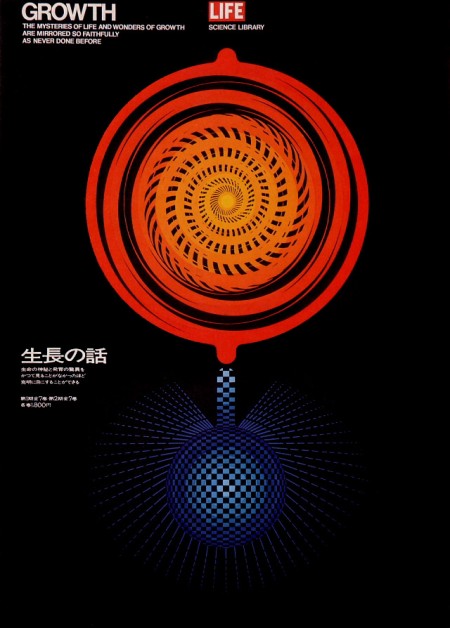
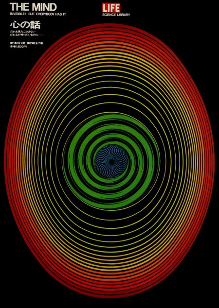
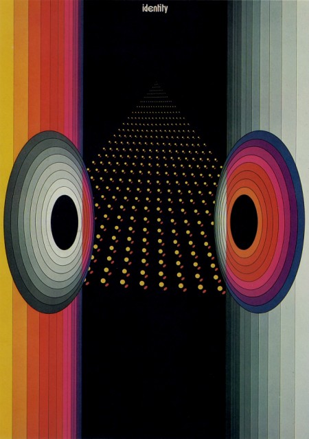
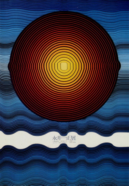
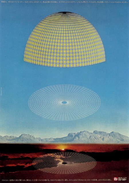

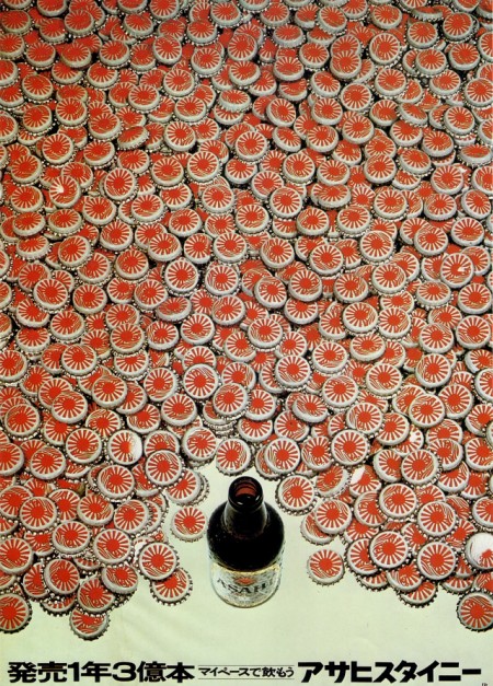
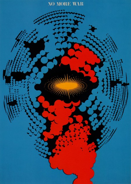
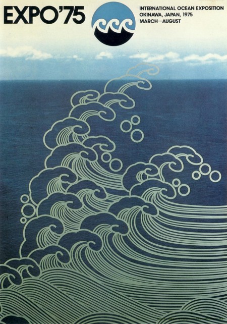
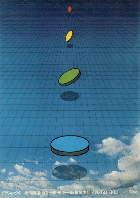
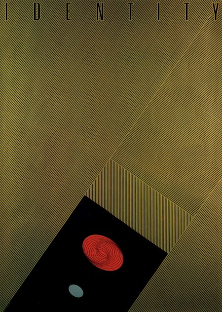
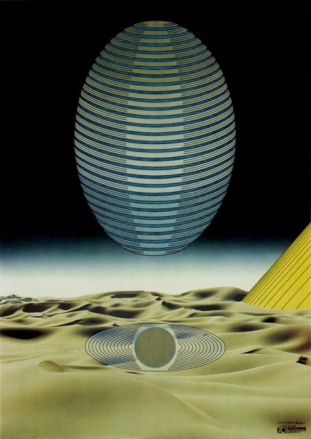
No clue how I got to 2013 without seeing Kazumasa Nagai’s work. Truly inspiring. Who are the posters artists doing this caliber of work today? Do you think the poster-as-artform medium is dying?
Via Pink Tentacle

7 Comments Leave A Comment
Pantograf says:
December 10, 2013 at 3:07 amWow. Amazing posters. Thanks for bringing them up.
omatic says:
December 10, 2013 at 6:43 amnothing comes close to japanese design between 85-95 i think it peaked and is now going down hill, same goes for video games(earthbound, cronotrigger, seaman), clothing(vintage comme des garcon or issey miyake), anime&manga(Katsuhiro Otomo, Hayao Miyazaki)just to mention a few, god i wish i were born earlier
KYLE says:
December 10, 2013 at 7:01 amthese are fantastic. the simplicity in showing complex shapes and patterns, colours, lineweights, and sense of space got me captured. not used to seeing these kind of things, but it truly is inspiring. thanks scott for sharing another great.
even the poster of the girl swimming, seems to be extra detailed but not one morsel too much. usually some desire to emphasise the boobs or some other feature is obvious, but this is a fair and clean picture of a girl swimming. beautiful
Brendan says:
December 10, 2013 at 8:22 amI certainly hope they are not going to die out. I think posters are probably my favorite medium for advertisements, and I hope to see a resurgence in the near future. Although I wasn’t a big fan of the new Daft Punk album at all, I thought their advertisement campaign was cool.
Posters are certainly my favorite to make, I prefer making them over logos or banners.
Andy says:
December 10, 2013 at 10:28 amThe posters are amazing! One thing that keeps me from thinking that posters as an art-medium is dying is the revival of more art-based posters in Switzerland nowadays.
A great example is the annual Motor Show in Geneva.
Have a look at the poster for next year: http://www.salon-auto.ch/en
Here you have all the posters since 1905. This is a great poster history.
http://2013.salon-auto.ch/en/affiches/index.php?idPage=5
I think the posters in the 80s, 90s and 00s are extremly ugly. But I think the last two (2013/2014) are amazing
Brad says:
December 11, 2013 at 5:16 amThese are amazing. I remember the last one from the cover of the January 1981 issue of OMNI magazine.
Martin says:
January 29, 2014 at 1:06 pmmore stuff by K Nagai: https://www.facebook.com/TheWorkOfKazumasaNagai