Sam Chirnside: Font Branding
Posted by Jakub
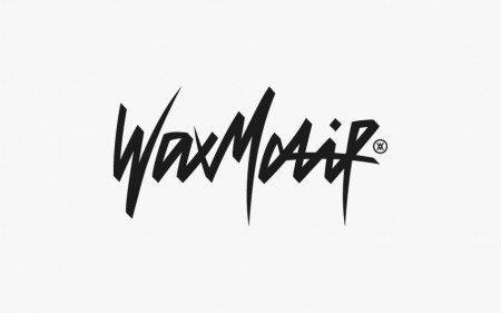
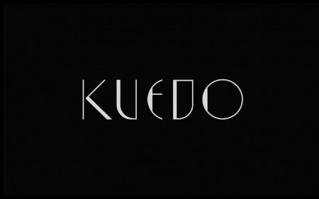
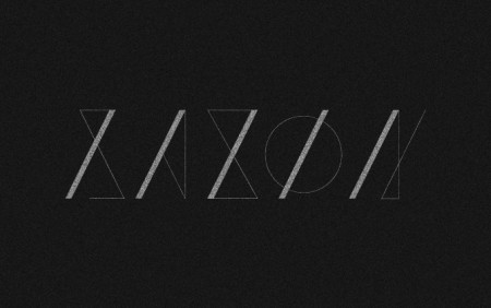
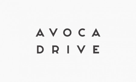
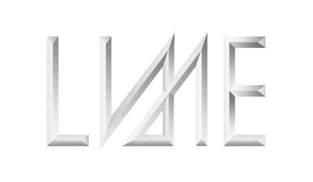
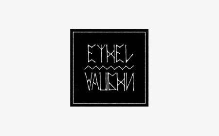
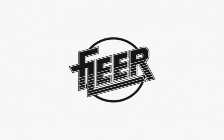
Sam Chirnside does some great font branding for musicians, I dug a little deeper into his catalog and grabbed up most of them. My favorite has to be the AVOCA type, its those subtle clean changes that takes the uniqueness up more than just a few notches.


8 Comments Leave A Comment
Camden says:
August 22, 2013 at 9:39 amwhere did you buy these fonts? they’re fantastic.
Lars says:
August 22, 2013 at 10:26 amGreat find! I was surprised, because that “Ethel Vaughn” Logo is the branding of a clothing store/fashion designer in my home street in Hamburg, Germany… See that typeface everyday
Lars says:
August 22, 2013 at 10:30 amhttp://samchirnside.com/Ethel-Vaughn. Great artist by the way.
Rudolph says:
August 22, 2013 at 3:29 pmCheck out this local Detroit font master Alex Sheldon. He has designed a layered font system for his Detroit font that is lovely. He is also an excellent designer that goes under the moniker match and kerosene
http://www.myfonts.com/fonts/matchandkerosene/detroit/
http://www.matchandkerosene.com/
Lance says:
August 23, 2013 at 2:28 pmThese are really great. Who ever thought a bevel could look so good.
Design + Conquer says:
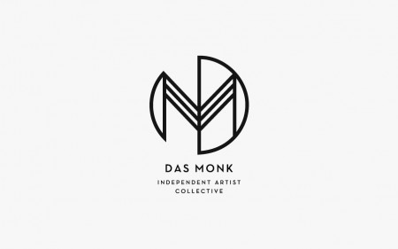
August 23, 2013 at 3:04 pmLovely! Particularly into the Das Monk logo.
FigureM says:
August 29, 2013 at 9:19 amGreat work. Anywhere I can purchase Avoca? Dont see it available on his site.
Lucian says:
September 4, 2013 at 3:50 pmA little bit off topic, but the colorful posters using these logos are awesome too.