Dolphins + Jaguars 2013 Logo Redesign
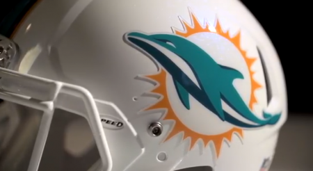

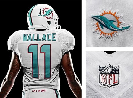
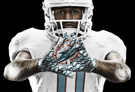
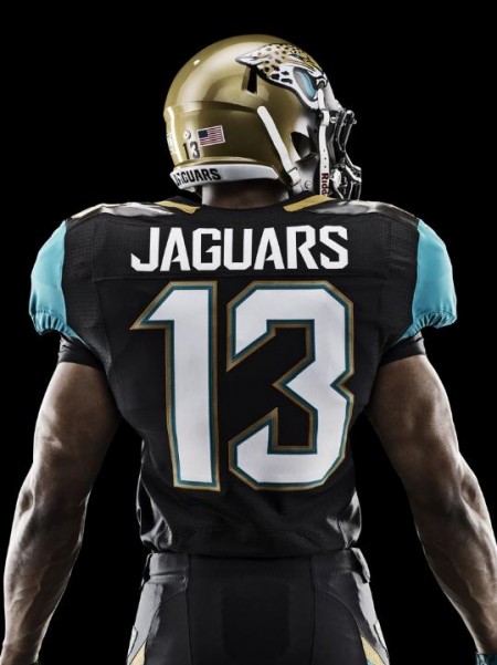
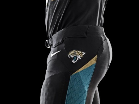
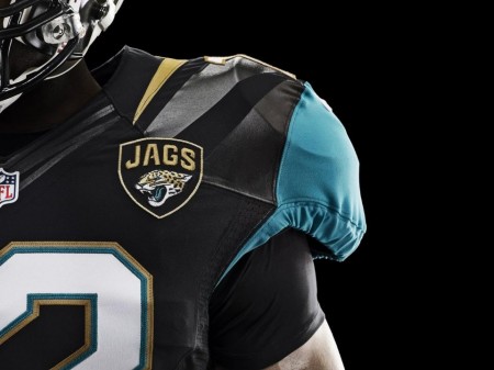
If you know me personally i’m a huge sports fans, i’ve always wanted to bring design and music fans together with sports fans anyway I can. If I had a dream job it would be hopping around in-between all the major sports teams and redesigning uniforms and logos. Nike did a great job here BUT… there’s a problem, a HUGE problem in my opinion, this doesn’t seem like what a passionate design would design, i’m in love with the fabrics, Nike always nails that department out of the park. The issue is that everything is completely evolving from the early 1990’s expansion boom, that gooey round 3D look or the Sin City “we’re the bad guys” thing. Both of these new logos suffer from that influence and thats the big bummer and the color scheme the designers have to work with. Also, i’m not going to lets simple designs get away with it either, look at the Minnesota Wild logo, you would think ISO50 might like it but no way, look at those trees, what a horrible effort.
To end on a positive note, I love what Nike did for the Oregon Ducks. I hope some of you comment in the comment section because i’d love to have a conversation about all of this.

29 Comments Leave A Comment
Max says:
April 30, 2013 at 4:58 pmI loved the old goofy cartoon Dolphin. I have a soft spot for funny logos, such as the ridiculous St. Louis Billikans logo.
Dolphins jersey redesign was nice, but I’m sad to see the orange go. I think the real winners were the Minnesota Vikings jersey redesign. They finally scrapped those awful jerseys of theirs and brought a modern, yet classic appearance to the field.
Rodrigo Suarez says:
April 30, 2013 at 4:58 pmI agree with you. I used to work at Nike (though on the Vision and Timing division) and I have to agree that this looks expected. iam more dissappointed by the Dolphins’ rebrand than by that of the Jaguars, but yes, it could have been som much more conceptual. Less didactic, less happy, less sissy. As a student some years ago, I developed a brand redesign for the Bengals that I’d like to share with you sometime, to get your opinion. I also feel the palette had a huge window for innovation. The untrained eye might not even notice the change. Go figure.
dunceface says:
April 30, 2013 at 4:59 pmthe dolphins logo looks like a toothpaste or airline logo…
mksp says:
April 30, 2013 at 5:03 pmHate the dolphins logo. It looks like a tattoo a college chick would get on spring break. Tribal sun background, cheesy dolphin. Just horrible.
Jaguars helmets are great.
D says:
April 30, 2013 at 5:04 pmToo safe. A couple years ago I did my own designs for the teams I felt most needed an update. Miami was screaming for something almost futuristic in my opinion.
I could send you a scan of my idea if you want.
Alex Smith says:
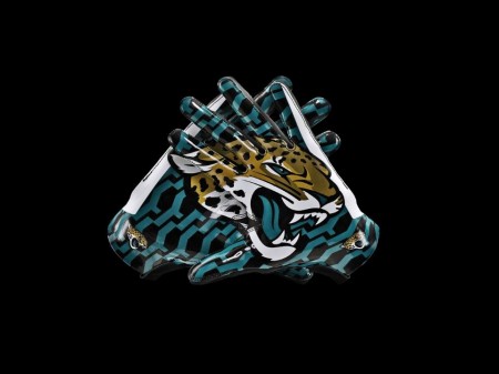
April 30, 2013 at 5:07 pmIn my opinion the simplicity of the designs is not complimenting the look of the uniforms, at all. Also the fact that they took out some elements of the old logo can look like it took something out of the teams identity and in one way or another changed the target audience at the same time. What is your take on that? The only think that I actually enjoyed were the gloves…
Mikey Corry says:
April 30, 2013 at 5:27 pmMaybe it’s because I’m in Western NY, but this is still my favorite sports logo: http://upload.wikimedia.org/wikipedia/en/thumb/9/9e/Buffalo_Sabres_Logo.svg/200px-Buffalo_Sabres_Logo.svg.png
Chris Hald says:
April 30, 2013 at 5:31 pmPersonally I really like what Miami has done. That old logo was just not my taste. I’m glad that they’re are keeping the Marine/Aqua blue to a minimum and keeping it all white (at least in those pictures, I’m sure this is only the Away game uniform).
I’m sort of indifferent to the Jaguars switch. It wasn’t good before but it’s not much better. I’m interested in seeing their new two color helmet though, it will probably either be incredible or really terrible. I’m also liking the Jags moving away from their blue-green color and brining the black and white forward.
On a related note – what do you think about (New Jersey) Brooklyn Nets total revamp of the uniforms, logo and everything? Personally I think they’ve done a terrific job. Before I wouldn’t want to get caught in any Nets gear but now I could picture myself buying a hoodie or shirt with their logo. Simple and elegant.
Jakub says:
April 30, 2013 at 5:41 pmI think the Nets redesign is good but WAAAY to safe. Its a shield with a ball on it, you’re already going black and white so you’ll automatically sell some merch so now make us an ICON.
I love the Sabres old logo but I always thought the Bufflao had a silly face
I wasn’t a fan of the gloves, it feels like something i’d feel awkward of owning in that transition period from middle school to high school
Miami needed a redesign but I agree that Dolphin is a serious no no, its fucking Seaworld 2005, if you’re gonna be silly then keep the helmet on him.
The Jaguars just started off with the wrong piece to begin with, awful colors to work with together plus a busy logo thats hard to work in so they put on a patch
Adam says:
April 30, 2013 at 5:52 pmI just wish the Dolphins were a team in the 60s because a retro throwback would be the medicine.
Owen says:
April 30, 2013 at 6:18 pmDolphin’s Management 1966-Present – “We need a bigger dolphin god dammit!”
TBH…. Not an awful redesign. The ‘hoop’ in the latest version is a little too loud for my liking, but in the end it’s going to result in a huge increase in the team’s apparel sales. That’s probably the main reason why teams redesign their logo in the first place.
I like the typography for the new Jags identity. Geometric and aggressive. Never really cared for their colours or logo though.
Personally, I’m a fan of teams going back to their older logos, like the Blue Jays did in 2011. Who’s crazy fucking idea was this? http://www.ollb.org/ollb/images/images/logo_torontobluejays.gif
Chris says:
April 30, 2013 at 6:50 pmThe old Dolphins logo had some retro charm and will be missed, if I don’t care about the team. As someone else said, they were in need of a redesign, but go simple and strong. Though to the designers’ credit, this look matches the soft team that is the Miami Dolphins.
I completely agree with the 90s expansion problem, and not just in football. The Jaguars logo is an improvement over the old one but still looks immediately dated. The color scheme is unfortunate but is no excuse. That helmet is a fucking joke.
Travis says:
April 30, 2013 at 10:37 pmThat new Dolphins logo is one that, knowing a few die-hard ones, is almost universally liked by their fans. I agree with people who’ve said that it’s a “safe” logo design, but that connotation doesn’t necessarily need to be negative. And the old dolphin had a helmet on. Gotta go, dude. Had an old-school look that was more like Welcome Back, Kotter than Saturday Night Fever.
The jaguar on the helmet/shield patch for Jacksonville does look like something outta Lion King, but you can’t deny how much faster and bolder the overall look they have is, compared to the old ones. Whether you agree on the color scheme or not, which I dig, I think it’s gotta be seen a fantastic upgrade as an overall look. That typography looks really sleek.
And yes, that was a Travolta/Disney movie 1-2 combo.
Charles Mertens says:
April 30, 2013 at 10:50 pmJakub, first off, it’s great to know that you’re a huge sports fan as well. If you don’t already, check out the blog over at sportslogos (.) net. Chris does a great job over there at keeping everyone up to date with rebrands and uniform updates.
Second, I don’t feel great about either of these. Personally my favorite rebrands in recent history have been what the Toronto Blue Jays did with going back to the minimal 80s inspired head, as well as the new Pelicans logo which I think is as spot on as humanly possible.
Lastly, for my senior thesis I am branding a fictional sports team as well as designing uniforms and printed materials for said team. Once I make some progress I’ll find a way to get it to you, I’d love to see what you have to say. Take care bud.
Tom says:
May 1, 2013 at 7:23 am“The issue is that everything is completely evolving from the early 1990′s expansion boom, that gooey round 3D look or the Sin City “we’re the bad guys” thing.”
You nailed it. The NFL and Nike needs a reset button for this Arena League look. So much opportunity. I had so much hope for Nike when they took over the uniform contract last year. I like what they did for the Seahawks.
To me the opportunity would be in a marriage of the bold lines of classic football and the innovative textures and finishes for which Nike is famous.
I’d be curious to which side is driving this look – NFL or Nike?
sean curtis patrick says:
May 1, 2013 at 8:21 amthe dolphin lost his helmet. boo.
Alex Parisi says:
May 1, 2013 at 10:59 amSince Nike partnered with the NFL, the rebrand of the Dolphins and Jaguars are by far the most disappointing. While Miami is underwhelming, Jacksonville has way to much going on graphically. Thankfully, Nike’s work on the new Minnesota Vikings set looks flawless.
NAVIS says:
May 2, 2013 at 12:48 pmAlright! Lots of love for the Vikings!
SKOL VIKINGS! Maybe 2013 will be the year…. AP needs a ring.
Brandon says:
May 2, 2013 at 3:42 pmA good video from the CD at Nike that designed the Dolphins unis here > http://basketfootball.com/how-we-work-nike-the-new-miami-dolphins-logo/ and then the Jags unis here > http://www.designboom.com/design/jacksonville-jaguars-2013-uniform-design-process/.
just so everyone is up to speed, Nike does not design NFL logos. They only implement the new logos into the uniforms and branding based on what Shandon Melvin’s group does at NFL Creative.
btw- not a fan of the tricked up Jags helmet. Also, I was hoping to see a front facing Jag instead of a mod of the original. My philosophy is if you’re going to redesign it, go a completely different direction.
Trent says:
May 2, 2013 at 4:16 pmWhile the Vikings are the least disappointing redesign of the year I still think there were some huge opportunities missed.
For one thing the new numbers that seem like they were supposed to be designed to lock together across the line don’t really follow through in their execution. Look at the new Cordarelle Patterson 84 jersey – why oh why wouldn’t they go with an open numeral 4? The closed 4 next to the spike serifed 8 looks so out of place. Excuse the pun, but it looks like someone dropped the ball on that one.
http://emedia.dev-cms.com/twincities/1500espn/images/mainwipe/1367010549-Vikings_draft_picks.jpg
Second, the ‘new’ color scheme could have been so much cooler. The Tampa Bay Buccaneers and Seattle Seahawks have both done such a great job of executing sophisticated, contemporary designer-minded color schemes that still make sense in that macho superhero/warrior-of-the-gridiron-on-steroids type of mind set that fans still so adore. So why not add a battleship grey a la the Oregon Ducks wonderful helmets? Or transition the Viking gold to be more of a Scandinavian blonde? Or maybe just maybe double down on their precious purple pride with some multiple shades of those sweet purple hues? Oh what might have been…
And finally, in my mind the typography in that hokey Vikings wordmark could have benefited profoundly from some serious TLC. For more on that check out this exploration on what might have been (the first design in particular)…
http://www.bkrdsn.com/b-inspired-nfl/
That said, at least it’s not as bad as the Dolphins or Jaguars. SKOL Vikings!
Brendan says:
May 3, 2013 at 12:17 pmI personally find the Dolphins’ rebrand quite awful. Looks like an advertisement for Seaworld or the like!
Football is serious and a high-contact, awesome sport that I love. As a Michigan Wolverines fan, I point to our uniforms, especially our helmets. The winged helmet is a bold and powerful statement…yet minimalist and withheld to some extent. And don’t even get me started on the Block M (Sexy).
But, yeah Jakub I agree with you, I think the designers for these teams need to take more chances with their new logos. I know they have to cater to all sports fans, even those who don’t like De Stijlist reminiscent, European minimalism, but I feel like we can find a happy medium!
Look at the proposed rebrand of Oregon State for example, I think it’s certainly a step in the right direction: http://www.behance.net/gallery/Proposed-Oregon-State-University-rebrand/8361697
Cheers,
Brendan
Anthony says:
May 4, 2013 at 6:55 amLove the Dolphins new logo. Miami has not drastically changed their old logo since it was first created. I like realistic looking representations (Redskins, Raiders, Old Patriots Logo, etc..) because its much more powerful than a comic strip design. The Dolphin with a helmet on design wasn’t good.
The Jags are awful. Personally, the teal was a fantastic color, no one in the NFL has that type of color. Plain Black/White are boring with no sense of texture, depth, personality. The Jags unis from 2010 were one of the top designs in the NFL. I do like the actual changes on the Jaguar itself though because its more realistic (sort of like the Lions changes for 2011).
Other NFL teams in need for changes: Bengals (Primary color should be switched from black to orange), Texans, Chargers (It should be a law that they have to wear their powered blues), Patriots (Bring back Revolutionary Pat logo, one of the best Sport logos of all time), Steelers (Best uniforms in the NFL when they wear their Retros with Yello helmets, white pants, striped socks, and black/gold jersey witht striped sleeves) and Panthers just to name a few.
fatrabbit CREATIVE says:
May 6, 2013 at 7:54 amThe entire state of Florida is apparently getting re-branded for the NFL – hope the “creamsicle” Tampa Bay throwbacks aren’t going to disappear! They’re an exercise in “so awful it’s great”.
The Jaguars’ new look seems to be a little overdone. We’re not sure how we feel about the front-to-back helmet gradient; the true test will be how it appears in motion. As for the Dolphins, the logo may look like an AquaFresh campaign, but we have the feeling it will grow on us. They didn’t stray too far from the classic color scheme of the franchise (though they did brighten the tones a bit).
Brandon B says:
May 6, 2013 at 8:44 amAw… Jakub, don’t hate on the MN Wild logo – it’s really the team name that sucks. It was a selected via a naming contest around the creation of the team. I think the logo does a good job of bringing it all together.
If you want an interesting read about the other (also awful) potential names, check out this article a friend of mine recently sent my way. Photos of the possible jerseys for these alternate names are also included. I think the Wild does stand at the forefront of the pack with these other options…yuck.
http://wild.nhl.com/club/news.htm?id=552722
Jakub says:
May 6, 2013 at 10:05 am@BRANDON B I’m not hating I just know if you had good designers around during the refining of the logo it wouldn’t have gone out like that, I mean look at the amateur tree efforts and the primary color selections, needs tweaks is all i’m saying
Aaron says:
May 7, 2013 at 10:28 amI bet that each redesign probably has some great versions presented to the executives. With so many hands in on the decision process it’s never surprising what the final product comes out as.
I would like to know how much pull Nike has when presenting this concepts to the teams.
Living in Jacksonville, it’s around a 50/50 split on the new uniforms. The two jag fans in the room like the logo but are split on the uniforms.
Just remember it could always be worse. You could have had Adidas try to bring back Zubaz for your favorite team.
http://www.sbnation.com/college-basketball/2013/2/28/4039756/adidas-jerseys-photo-ncaa-tournament
+ says:
May 7, 2013 at 11:59 pmLove the fact you are involving sports in the design conversation.
There is something about the Hartford Whalers logo that I have always loved: http://sarahpaolucci.files.wordpress.com/2010/10/hartford-whalers.jpg
Simplicity, and a perfect use of positive and negative space. Im not sold on the colors, but the logo itself is timeless.
Alice Josh says:
June 5, 2013 at 11:50 pmlogo redesign is another technique to give an other refreshing effect to your products or company name. Many well known companies like Adidas, shell and many more redesign their logos to re energize their brand and a brand fusion of music and sport is quite n unique idea i really like it
ikdesigns says:
June 16, 2013 at 11:45 amThis logo is not my favorite it looks so poor and i think it must look more stronger and dangerous