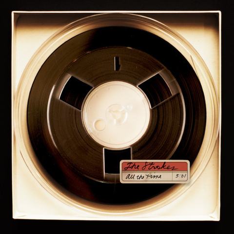
Comedown Machine Cover Art
Update – Got the credits on this (via Tetsuo in the comments):
Art Direction – Brett Kilroe, Fab Moretti*
Design – Brett Kilroe, Tina Ibañez
More Info
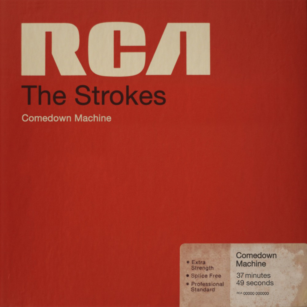
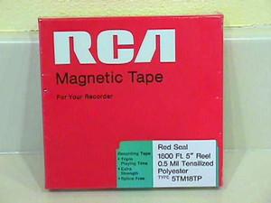
I don’t really know The Strokes’ music so I can’t speak to that but the cover art for their new album, Comedown Machine, caught my eye today. I absolutely love it. Sadly I wasn’t able to find much information on the designer / art director. Does anyone know who did this? The artwork is derived from the packaging for some old RCA Magnetic Tape and the oversized RCA logo is an apparent reference to the fact that this was The Stroke’s final album of a five album deal with the label. The execution is absolutely perfect; it appears as if they really printed the label and sleeve up, weathered / distressed them, and then photographed it. I’m wondering who pitched this idea, the band or the art director? At any rate, I want this framed on my wall.

10 Comments Leave A Comment
Tetsuo says:
April 1, 2013 at 3:14 amArt Direction – Brett Kilroe, Fab Moretti*
Design – Brett Kilroe, Tina Ibañez
http://www.discogs.com/Strokes-Comedown-Machine/release/4412919
TimmyG says:
April 1, 2013 at 8:38 amCheck out the new Black Rebel Motorcycle Club album cover as well, “Specter at the Feast”. Very similar, but is designed like a worn paperback. Same color palette though. More successful design and concept.
Scott says:
April 1, 2013 at 11:03 am@TimmyG-
Thanks, just checked it out. Just curious, why do you think the design and concept of the “Specter at the Feast” cover is better?
Anonymous says:
April 1, 2013 at 2:04 pmI think “Specter at the Feast” cover art is overdone — too much wear effect, straddles the cliche. However, I do like like the Stroke’s cover art, the aging effect on the sticker is just enough coupled with the late 70s-esque type and layout.
Scott says:
April 3, 2013 at 2:44 pm@annonymous-
I agree. Something about that sticker is so authentic it pulls it all together. The way that adhesive is degraded and soaking through the paper is really well done
Jeremy says:
April 4, 2013 at 6:34 amHere is more info on the designer, Brett Kilroe: http://runnercollective.com/
grey_skies7 says:
April 6, 2013 at 6:06 pmIt’s possible to not know the strokes music?
iklogos says:
April 10, 2013 at 6:14 amnice cover I find some technology and retro elements
Aaron Coe says:
April 30, 2013 at 7:45 pmIf you like the reel-to-reel boxes, I have a gallery: http://www.cuttingarchives.com/open-reel-tape-boxes/
William says:
June 23, 2013 at 2:06 pmthe cover art looks like an irony about the fact that Strokes were kinda suffocated and influenced by RCA managers, i.e., Strokes created songs but RCA rejected part of stuff and required other songs. It’s kinda a sort of feeling of release.