I don’t think is Trade Gothic, although is definitely a Gothic style.
I didn’t researched that good but I believe the title ‘analog’ is set in Brazilia, with some change in the width parameter, making it look more extended than already is. You can check at: http://www.myfonts.com/fonts/agfa/atbrazilia/
it looks like a stretched out akzidenz grotesque. the thicker versions of the font get the tear shaped “a.” but it looks stretched un-naturally. and obviously the “g” has been modified. but i dont really know, i didnt go to school for type, i just care too much.
Jesse is correct. The logo type has been stretched (probably on a photocompositor, judging by the era). You can tell because the vertical strokes are noticeably thicker than the vertical strokes. And I think your first hunch is right, Scott. There’s no reason to believe it didn’t begin as Trade Gothic Extended.

6 Comments Leave A Comment
Jamie says:
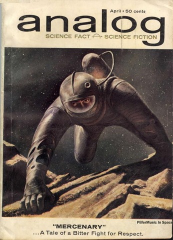
November 20, 2007 at 9:57 amthe lower case ‘g’ is different
Scott says:
November 20, 2007 at 2:37 pmGood call…any idea what it is? Maybe just a custom logo based on TG?
billybacon says:
November 21, 2007 at 3:53 amI don’t think is Trade Gothic, although is definitely a Gothic style.
I didn’t researched that good but I believe the title ‘analog’ is set in Brazilia, with some change in the width parameter, making it look more extended than already is. You can check at:
http://www.myfonts.com/fonts/agfa/atbrazilia/
bb
Christian (Élément Kuuda) says:
November 21, 2007 at 5:40 amThat is an awesome image, I love old school “in space” esthetic!!
C.
Jesse says:
November 21, 2007 at 8:48 amit looks like a stretched out akzidenz grotesque. the thicker versions of the font get the tear shaped “a.” but it looks stretched un-naturally. and obviously the “g” has been modified. but i dont really know, i didnt go to school for type, i just care too much.
Stephen says:
November 24, 2007 at 11:40 amJesse is correct. The logo type has been stretched (probably on a photocompositor, judging by the era). You can tell because the vertical strokes are noticeably thicker than the vertical strokes. And I think your first hunch is right, Scott. There’s no reason to believe it didn’t begin as Trade Gothic Extended.