Spoofing Shepard Fairey
Posted by Scott


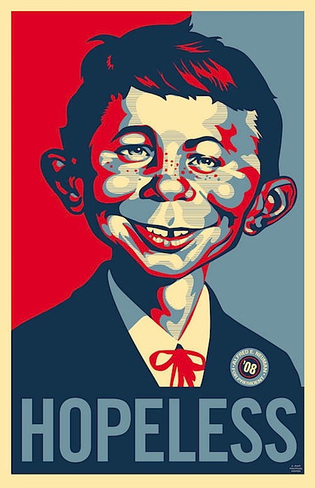
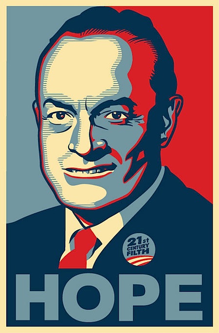
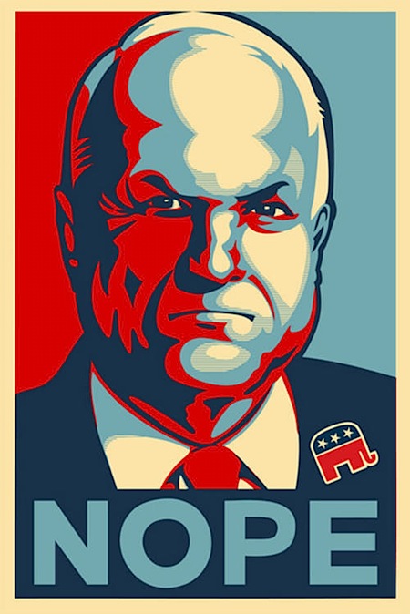
 One testament to the success of Shepard Fairey’s iconic (and nearly ubiquitous) Obama poster is the sheer number of spoofs that have turned up since he created the now famous image. The Village Voice has compiled a rather comprehensive collection of them; some are good natured jabs while others come off a bit more incendiary. Either way, it’s an interesting look at the flip side of the veritable phenomena and centerpiece of a revolution in the visual communication and branding of election campaigns. I particularly like the Mad Magazine take pictured above; as a kid I obsessively collected every issue I could get my hands on and it’s great to see them still at it. Link

9 Comments Leave A Comment
Daniel Carvalho says:
November 11, 2008 at 3:53 amYeah, totally true. I’d be immensely proud if I was Fairey, to create an identity that is synonymous to Obama.
Every time I see a spoof of this though, something inside of me always hopes that they fair a lot worse in aesthetics compared to the original by Fairey. Unfortunately, that’s rarely the case.
rafae says:
November 11, 2008 at 4:26 amI really like the dr. doom parody version of the poster.
Fairey always seem to have this sixth sense about pop culture, no wonder he got where he´s at right now. I guess he´l´be remebered for works like this one.
faber says:
November 11, 2008 at 6:43 amShepherd’s image will no doubt be timeless.
We can all strive to get to that sort of recognition and, as rafae said, “sixth sense of pop culture”.
I made my own poster to commemorate the election season, although nowhere near as cool as Fairey’s or Scott’s… I’d love to hear what some of you guys think:
http://www.cafepress.com/barack_wins
Corey Tegeler says:
November 11, 2008 at 7:57 amThe first one is on the cover of last months Mad Magazine.
JJ says:
November 11, 2008 at 12:53 pmFairey has made an epic career in (ripping off/sampled/or whatever you want to call it) just about every communist styled poster ever made in history. Which is fine by me since I like that kind of thing.
Its just funny to see people ripping off/sampling him for a change.
The obama poster he did was great!
The “WORKERS POSTER” you did was from a old Communist poster. What was the name of that designer?
jefta says:
November 11, 2008 at 2:49 pmit reminds me of Andy Warhol… good concept, you can go on forever.
Scott says:
November 11, 2008 at 3:23 pmJJ-
I researched the original design and apparently the identity of the artist has been lost to time.
this isn’t directed at your comment, I just wanted to respond to the idea that fairey is too liberal with his sources:
I know a lot of people would call “recontextualizing” a convenient euphemism, but I think that’s exactly what fairey does. I don’t know why some people want to slap the term “rip-off” on his work, it makes no sense. if you think shepard fairey’s art is ripped off, I don’t think you’re really understanding graphic design or art in general. whatever the case may be, his work moves people, millions of people, and that speaks more to his effectiveness as an artist than any argument about his sources. if more of his detractors would study his past and how he got started they might understand his work a little better.
Grace says:
November 11, 2008 at 5:50 pmThe best one I’ve seen is the one of the Joker and it says “JOKE”. So freaking awesome.
Daniel Carvalho says:
November 11, 2008 at 11:22 pmYeah, I mean one of my favorite design styles hails back from communist and Nazi propaganda. I’m not going to “watch my step” when I design in fear of by some chance, that I’m doing something similar that has already been done, especially if I’m fond it of the particular source. Communist styled artwork wasn’t actually unique in itself either in drawing methods.
Inspiration is a great thing, people’s work is more inspired than they might think, subconsciously from what they’ve seen before. But it’s the amalgamation of concepts and personal interpretation that makes a piece unique.