The World Of Stock Thank You Bags
Posted by Jakub
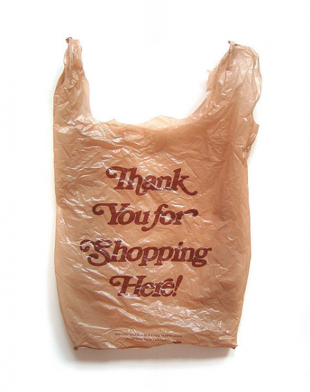
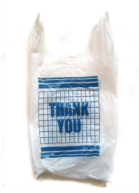
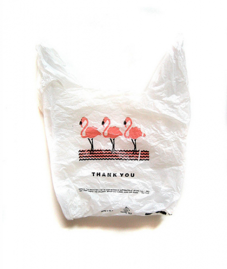
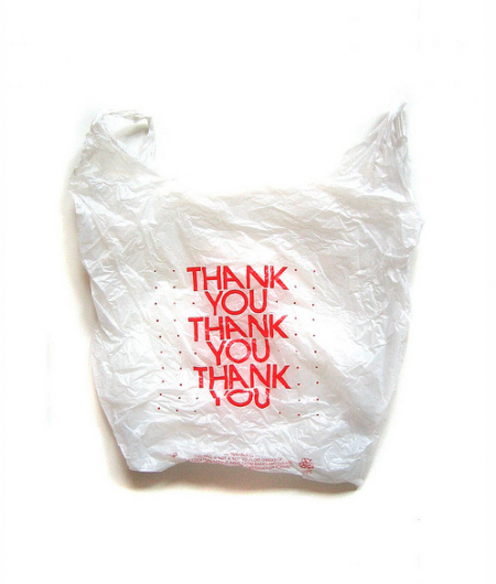
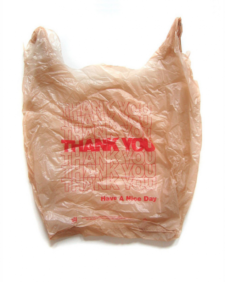
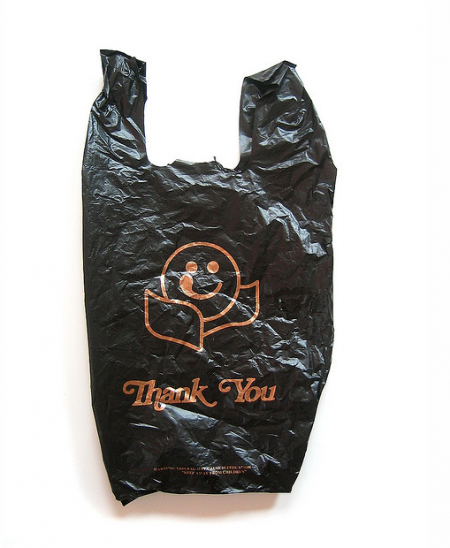
The Thank You bag is never really looked by anyone that doesn’t do design, it usually just gets thrown away but for me there has always been this appreciate for it. Like most things that are simple and that get tied into DDR/Cold War design, I somehow kind of enjoy the layouts of these.
via Mary and Matt

6 Comments Leave A Comment
Rob says:
October 1, 2012 at 11:27 amThis. Rules.
Alex / HeadUp says:
October 1, 2012 at 11:35 amThe Polish liquor store across the street from where Jakub and I used to live used my favorite shopping bags, black with gold ink, simple diagonal stripe pattern, small bits of industrial / recycling text tucked underneath. I ended up tacking one to my door because I thought it looked so nice.
Jakub says:
October 1, 2012 at 11:53 amThank black has to be my favorite, fat elegant shapes with the proper font and the tongue almost touching the eye
Steph says:
October 1, 2012 at 12:09 pmI have some serious love for the third one. The rough flamingos and the dainty, bold, all caps “thank you” nestle in the negative space is really doing it for me. It feels like a trendy vampire weekend promotional piece.
jenna humphrey says:
October 1, 2012 at 5:49 pmLove this. I used to collect plastic food packaging when I was little because I thought it was beautiful, and then my mom freaked out, and made me throw them away.
R says:
October 2, 2012 at 2:40 pmAs a curator, I am interested in getting in touch with these photographers to show these at our space — alas, their website makes it next to impossible to figure out how to contact them.
*Lesson to all artists: make it as easy as possible for people to contact you about your work!