Coloradore Posters
Posted by Jakub
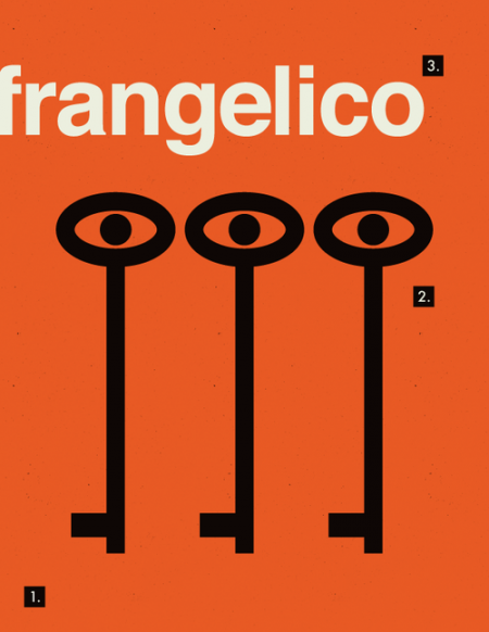
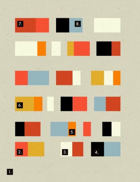
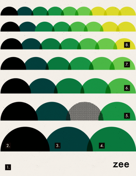
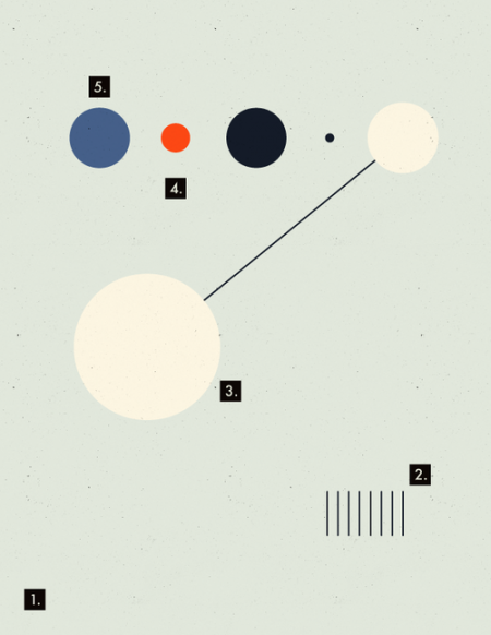
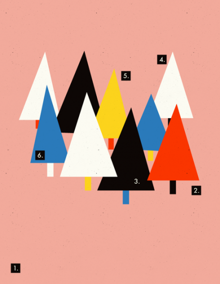
A poster a day is a task you never want to take on unless you like to frustrate and stress yourself out, instead take the energy you started off with and figure out a way to keep yourself motivated and plan a finishing point. This series from Coloradore is starting off great, I can’t wait to see more.
via coloradore

5 Comments Leave A Comment
Mário says:
September 18, 2012 at 10:32 amGreat ones!!
it would be funny to see some animations on this posters in AE!!
Daniel Salemi says:
September 18, 2012 at 2:19 pmWhat’s with all the numbers? My guess is that they telling me where to look, and I don’t like that. I think they would be stronger on their own. Good illustrations otherwise.
Andreas says:
September 19, 2012 at 6:42 amI think they ought to be distracting in some way. 1 is always placed bottom left and as the numbers raise, they’re placed higher. Maybe the numbers try to force us start looking at the posters from the bottom end, which is unusual for humans to do. I like them.
Hery says:
October 4, 2012 at 12:06 amIt’s a relief to find someone who can explain thngis so well
yasir says:
January 23, 2013 at 10:45 ami like your blog it look great to me.