UberConference: Process Post
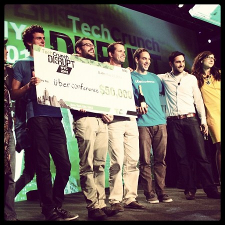
It’s been such a long time since I posted! This is largely due to the fact that I’ve been head-down on my company’s most recent product, UberConference, for the last few months. UberConference is basically a visual interface for audio conference calling. You can see who’s talking, who’s on the call, and control it completely via the desktop (and soon mobile) UI. We recently won the TechCrunch Disrupt Battlefield competition — you can see our pitch and presentation here.
I haven’t written a process post in a very long time so I wanted to talk a little bit about the UberConference process here. I’ll talk about the UI development as well as the video work. Keep reading to see the rest of the process. You can follow me on Twitter here for more frequent updates. Oh also, for a good time, call (424)-226-3111.

At Firespotter Labs, we work on a few different things. Nosh was our first, followed by the parody Jotly, then Nosh List, and now UberConference. While our work in the restaurant space has been successful — we seated our 1 millionth diner with Nosh List a week or two ago — a majority of our team comes from Google Voice, so getting back into telephony was a natural transition for our company.
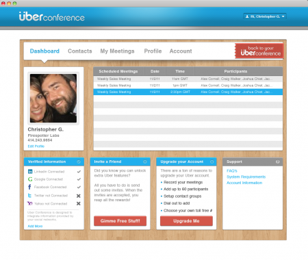
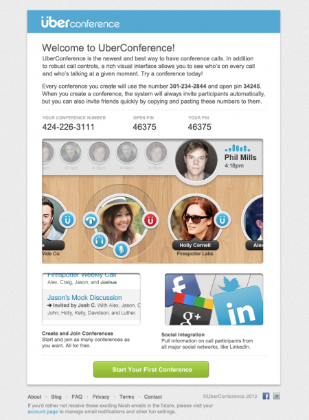
When the project began in September, our resources were split over the various other products we were working on at the time. I was working primarily on the first design of Nosh List and a redesigned GUI for Nosh (which we’ll release soon hopefully). Since I was busy finishing up Nosh List, I hired a contract designer to work on UberConference. You may remember the search. I hired Chris Gulczynski and he did some preliminary UI and branding work on the app. Some early screenshots below.
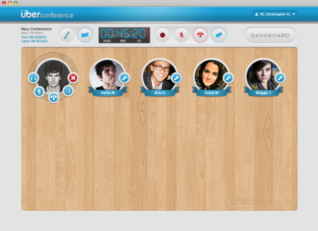
Eventually, we released Nosh List and my other projects finished up, so I was diverted back onto the UberConference project in January. At that point, much of the site had already been designed. The conference page was in good shape — the circular control panel was a particularly nice touch — but most of the rest of the site’s pages and interactions were in need of a revamp. It can be really tricky to change the primary designer mid-project, but that was unfortunately what we had to do.
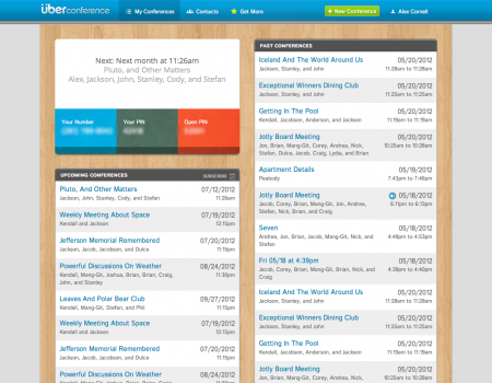
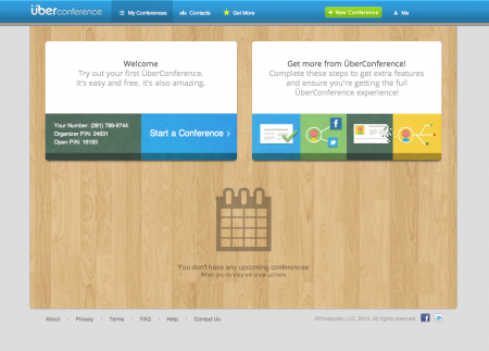
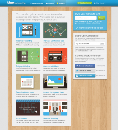
When I picked up on UberConfernece, there was a long process of deciding what needed to be done. Besides the conference page, there are a lot of pages that flesh out the experience, and these needed to be upended. We had been married to the concept of a ‘dashboard’ page for a while, and it became clear that it just wasn’t necessary. I settled on stripping the site down to three main pages: conferences, contacts, and profile. This involved reworking the main content areas as well as the navigational structure.
The eventual design for the conferences and contacts pages had each divided into two columns, using dynamically sized modules to hold the content. Since there are so many potential content scenarios, this seemed like the best way to have something that looked reasonable in most of the situations. It wasn’t an easy task to create a page that made sense full of content, completely empty, and everywhere in between. Sometimes I miss the static nature of print design…
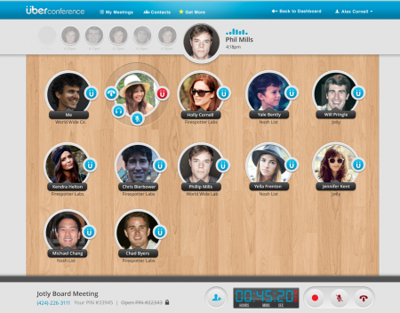
The conference page itself is where you have your visual interface for your call. All of the participants are displayed in circles with call controls available if you’re the conference organizer. I really liked this part of the early designs. The circular controls were a great way to eliminate clutter, while still making them easily accessible in a couple clicks.
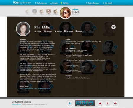
One of the main features, being able to see who’s talking, wasn’t actually added on until late. I remember the engineers coming out of a meeting one day and saying “we have an idea…”. Crazy to think the product almost didn’t exist with such a core feature. We also added the ability to learn about the individuals on the call via various social networks. I really liked the design for this; while it doesn’t always look as fleshed out as I designed the ideal scenario, it’s still a cool way to quickly learn about the call participants.
It’s easy to forget how many extra support features there are that need to be designed for each product: branded emails (countless!), password recovery, help and support, FAQ, blogs, about pages, terms of service, privacy policy, beta launch interactions, home page, email captures, share and referral pages, payment, account settings, not to mention marketing materials. It’s really insane how much more there is to design, even after the product itself is done and functioning.
When we decided to launch at TechCrunch Disrupt NY, all of the above did not exist, and so began an absolutely crazy couple of months. One particulary fun extra feature was the custom hold song I recorded. You can download it here if you like feeling like you’re on hold.
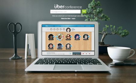
In April, the site was in pretty good shape, though there were still a lot of open feature requests and technical bugs. We use Asana for task management, and my cue was perpetually growing, regardless the pace I completed items. Despite this, it was time to start working on marketing materials for the launch. Since the launch was significantly more high-profile than usual, everything had to be tip-top.
Around this time, we hired Jon Wong (yes! from ISO50) on as a designer. He came in at just the right time, and designed some truly excellent stuff for the product. You’ll see his illustrations scattered throughout the site (some above). He also did our tshirts and a lot of the marketing materials we brought with us to Disrupt. We both hope to ramp up our ISO50 posting again — been so busy! Jon is currently working on the redesign of our Firespotter site, which is really exciting, the site has been needing a makeover for a while now.
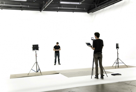
The first UberConference video project I undertook, which we’ve nicknamed the “white room” video, is actually still incomplete. The project spiraled into Chinese Democracy status quickly. I will complete it soon, just need to rewrite some of the voiceovers. Really excited to finish it though; the footage,shot with the Canon C300, looks terrific. I ended up making these other videos as backups since I knew I wouldn’t have time to complete the white room one.
The first was The Needs of Tomorrow, which is an imaginary learning show, presumably from the 70’s, about conference calling. I used footage from NASA tapes, as well as some old old old marketing video from AT&T to cut together this fake documentary on conference calling, and how UberConference saved the world from the horrors of the existing solutions. My favorite part of this one was the professional voiceover — it was great fun writing the script for such a cool voice. I edited in Final Cut and cut the sound in Logic.
While filming the white room video, we also shot a secondary video in the office space of the soundstage we were on. This one was written and shot on the spot, off the cuff, mainly for the purposes of our Techcrunch presentation. It ended up turning out pretty well and we’ve found people can really relate to the painpoints conveyed. A lot of people were visiting on the set of the white room shoot, so Phil and I coerced them into acting in these littles shorts.
The final video was the product walkthrough, which I did in emergency mode the day before our presentation. One way to make a video like this, is to use Screenflow and record the actual product as you mouse through it. Unfortunately, since my demo required approx 25 people to be on a phone call, I had to build the product in After Effects and basically fake all of the clicks and interactions. This sounded easy at first, but quickly turned into a giant hullabaloo of a project. The simplest animations on our site took a little while to recreate in After Effects. Once they were all done, I had to time and record a mouseover with Screenflow to sell it fully. I think it came out pretty good, and hopefully you can’t tell it’s an After Effects build.
That is a really high-level overview of the project’s process. I could probably write an equally long article of this length about each specific aspect of the site. I’ll probably do a post on the white room video if I ever finish it, but for now, check out UberConference and let me know what you think! We’re really excited to have it out there!



19 Comments Leave A Comment
Dave says:
May 28, 2012 at 8:27 pmVery cool. Congratulations!
mg33 says:
May 28, 2012 at 9:55 pmAlways fascinating to read these Alex. Might take a further look and see if any of the remote colleagues I work with are interested as well. We frequently use WebEx and our company’s conference call tool, but as we are an interactive marketing strategy team we’re always into trying new stuff. Interface looks refreshingly modern and easy to use. Nice going!
Abe says:
May 28, 2012 at 10:33 pmAlex, this is a great concept. Love the icon work and the retro video is such a nice touch. Keep up the good work on the designer/cofounder front.
Tim says:
May 29, 2012 at 8:28 amWhy did you go with the wood paneling?
Beebo says:
May 29, 2012 at 9:36 amNice work Alex.
BTW, that old-school UberConference vid is just begging for some thick and juicy Boards of Canada to back it up! (Whatever happened to those Sandison bros anyway???)
Juice says:
May 29, 2012 at 9:39 amBOARDS OF CANDA FTW!!!!!!!!!!!
Spencer says:
May 29, 2012 at 10:57 amThey asked some pretty hard questions. You guys did great presenting and coming back with good answers. Bravo!
Spencer says:
May 29, 2012 at 12:16 pmI don’t know what the right word is, but the ‘playful’ ‘simple’ ‘fun’ ‘friendly’ overall look of the app i think may be trend setting. I feel like most approaches to a conference call solution would be overly ‘techy’ or ‘professional’ looking. Pretty good stuff. Or maybe I’m not up on the current trends in the app world D:
Y. says:
May 29, 2012 at 1:50 pmHaha ,thumbs up on the Boards of Canada track ^_^
Dave says:
May 29, 2012 at 8:05 pmThe “The State of Conference Calling Today” video, very funny!
samus says:
May 30, 2012 at 1:40 amWe NEED new Boards of Canada. This isn’t a random request or general statement because I’m feeling nostalgic — rather it is simply a must.
Gabriel says:
May 30, 2012 at 11:27 amThis is great! Love the NEEDS OF TOMORROW, and the extra support features paragraph is golden. Can’t wait to play with UberConference.
Galump says:
May 30, 2012 at 8:25 pmThe NEED of tomorrow is some new BOC today!!!
tom okeefe says:
May 31, 2012 at 9:46 amI’m really dig’n Uber Conference. The only issue I have with it is that when I start a meeting and invite people to it they can not use it. They can only sign up and wait till they get a invite email to use.
Am I doing something wrong? I mean this can’t be the way it is… is it?
-Tom
Alex says:
May 31, 2012 at 9:50 am@Tom, nope you’re not doing anything wrong. At the moment, while we’re in beta, those users will indeed have to wait to join (we’re sending out invites quickly though, so hopefully not too long). We want to let everyone in as soon as we can haha.
It’s awesome that your conference participants are excited to try it out as well. Once they get access they will be able to see the conference just as you do, minus the organizer controls. Once out of beta, this won’t be an issue, but for now they’ll have to keep an eye out for an invite.
Soon!
tom okeefe says:
May 31, 2012 at 10:00 amThanks Alex–
I’m excited to start using this instead of GoTo, WebEx and FuzeMeeting. For the longest even though I worked for WebEx for a few years I was a huge fan of Fuze (a past client as well) Uber Conference out of box seems better then Fuze (minus some features) other past clients of mine had conference apps and are not even worth to mention as a player in this space.
so far 2 of 10 people from one of my teams have a Uber account… hopefully the rest of the team will get one soon so we can stat using this.
:)
T
Alex says:
May 31, 2012 at 10:02 amTom, does the rest of your team share a email URL? I can try to scoot you all to access now if there is an easy way for me to identify them. Shoot me an email if you like and I can put it through: alex@iso50.com
tom okeefe says:
May 31, 2012 at 10:37 amI’ll shoot ya an email. thanks Alex!!!
Anna says:
July 24, 2012 at 8:08 pmI heard dat Sabay will prepare the prgarom MUSIC Award this year right?It’s so good to see that event in our Cambodia cause we never have it before! But i wish that only singer that have own song (I mean the song that not copy from the other contry) who could get that Award because if a singer who sing the copy song and get that award all Cambodian will look so bad from the other country that we have star get a COPY award!Sic