Brand Minimalism
Posted by Scott
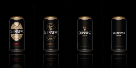
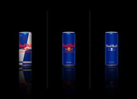
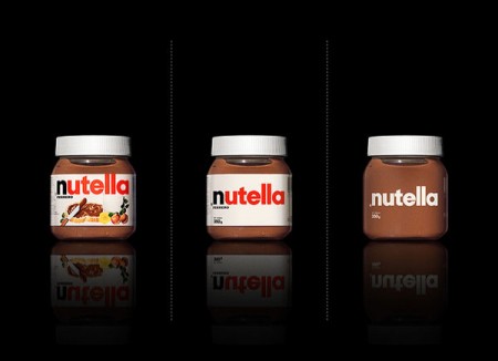
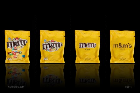
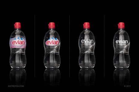
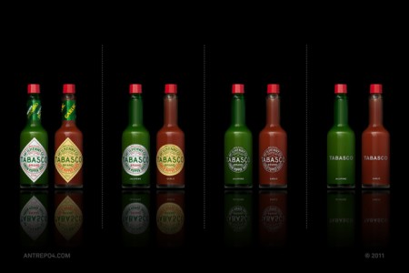
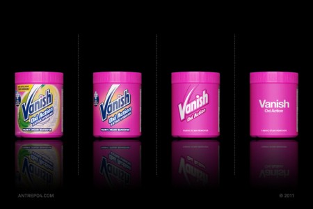
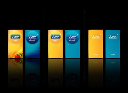
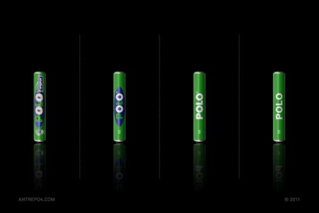
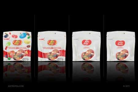
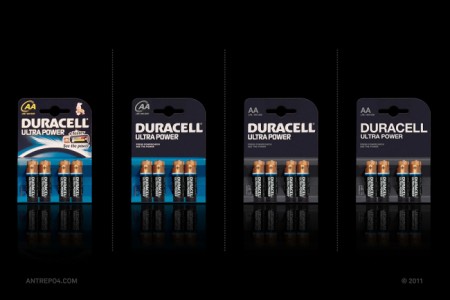
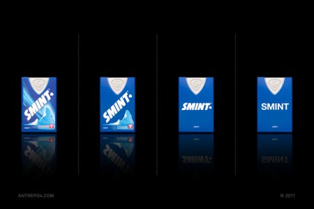
Mehmet Gozetlik decided to explore what would happen if he stripped down the packaging of iconic brands to the bare minimum. The results are fantastic and represent the kind of branding that always pulls me in. I’d love to see a real-world study on how effective these “minimal-ized” were on the general public (not just designers). Do you think they would do better?
My personal favorite results here have to be Jelly Belly, Nutella, and Guinness.
The Dieline via Jeff Toll

33 Comments Leave A Comment
Pablo says:
November 10, 2011 at 3:52 pmThis is a really nice exploration. It depicts both sides of the minimalism argument well. It works both in favor and against some of the brands as you can see how elegant it looks for some but yet how devoid of attitude for others.
Aliceffekt says:
November 10, 2011 at 3:52 pmThey would do better.
NEOkeitaro says:
November 10, 2011 at 3:55 pmAs much as I love minimalism, I think a world where everything would be minimal would eventually look and feel pretty sterile. Beauty shines more in comparison with mediocrity.
Kind of like the Stendhal syndrome: too much beauty is too much to handle.
Jon Williams says:
November 10, 2011 at 4:08 pmLove the reductionist approach, but setting everything in Helvetica (and, for the record, I love Helvetica) reduces name brands to generics. As Dieter says, less, but better. Stop at step 3 and you’ve got a winner.
Skwidspawn says:
November 10, 2011 at 4:57 pmI like that he put in the middle steps, because if you just look at the before and afters it becomes a study in “What if I eliminate branding completely and just type the product name on the product in Helvetica.” I love Helvetica, but there’s a reason that there are more typefaces than just Helvetica.
I prefer the second or third steps in most of these options, except Tabasco. For some reason I really love the “curled diamond” look and typography choices on the original Tabasco bottles.
Anonymous says:
November 10, 2011 at 5:19 pmI love minimilism but this study made me even more aware that there is a time and a place for it and it’s not always the appropriate tool. Like some of the commenters above i prefer the intermediate steps in most cases.
the exception for me is ‘evian’, the clean, purity of the minimalist approach totally ties in with the theme of pure water and is the one case where it adds to the brand identity. Vanish could work with this idea too, though helvetica isn’t in it’s favour here.
the worst examples for me were tabaso (it was perfect to begin with), m&ms (taken all the fun out of the brand) and Guinness (turns a rich heritage into something that resembles a deodorant can)
Nutella kind of works for me but maybe only because im a designer :) it does make it look a little more premium/modern/healthy now
Joycesu says:
November 10, 2011 at 6:13 pmI would predict that the sales on some of these products would fall if you were to swap them out with the current products. It isn’t because the designs aren’t beautiful, they are, but most people rely heavily upon brand recognition and the minimal branding on a few of these strays too far from the original.
There was a whole debacle with Tropicana and their brand update awhile back. The newer designs were wonderful, but the sales hurt so badly that they reverted to their older designs.
Sadly, I think louder branding and often obnoxious design aesthetic tends to be more eye-catching to the masses. I suppose this is where we designers should step in and reinvent the norm…
PT says:
November 10, 2011 at 7:11 pmI’d buy them all if they looked like that..
smudgeon says:
November 10, 2011 at 9:51 pmI agree with most comments above – the best fit is somewhere in between the original and the minimal, I think.
maren says:
November 11, 2011 at 12:35 ami find myself looking at all of these and saying,”yes, i so love that.. and i wish..”..
but perhaps the prevalent presence of “maximalism” reveals a contrast that makes me so appreciative of minimalism.
but still.. i wish :0)
i appreciate you scott
Karl says:
November 11, 2011 at 2:21 amI can definitely appreciate the aesthetic quality, but I don’t think they’d ever work in todays market. At least here in the UK, people associate branding like this with store brands, that is the cheapest value food you can get. Which doesn’t stand for quality. However I do find it interesting that there are a few minimalist brands around that still retain some class through subtle tweaks like font and simple gradients.
David Airey says:
November 11, 2011 at 4:02 amAs a Guinness drinker it’s probably worth mentioning that the draught can is already quite similar to the minimal example(s) above.
http://www.guinness.com/en-row/img/beer_photo_draught_can-new.jpg
The extra detail helps differentiate the fizzy “original” from the smoother draught.
Patrick M says:
November 11, 2011 at 6:06 amI like the idea that we can explore the essence of a brand without all the frills. Some work, some don’t. I disagree about the Guiness in the final stage. I like the second to last version though. Others that work are Nutella, Durex, and Red Bull, because they still contain elements of the original branding. Duracell is also one that works. I like the minimalist approach, especially if it strips away all the junk some brands like on their packaging. While I do not care for the final stage of Smint, I do like how the artist was able to strip away all the graphics that seem to do more harm than good.
Christoher B says:
November 11, 2011 at 6:43 amDon Watt did this in the 80’s for a Canadian grocery store chain:
http://www.canadiandesignresource.ca/officialgallery/packaging/no-name-graphics/
https://www.google.com/search?q=don+watt+no+name&oe=utf-8&rls=org.mozilla:en-US:official&client=firefox-a&um=1&ie=UTF-8&hl=en&tbm=isch&source=og&sa=N&tab=wi&biw=2560&bih=1219&sei=bTS9ToTVN-Hw0gHzvMH3BA
Ciara says:
November 11, 2011 at 8:12 amWow, that’s really awesome. I would also be pleased to see a little minimalism when it comes to consumerism.
Greg says:
November 11, 2011 at 8:34 amAs a Canadian the yellow/black helvetica “no-name” brand has a pretty wide spread, so when anything else tries to go to much in that direction it just ends up looking like a “no-name” product to me!
I agree with most of the comments that the intermediate designs were often significant improvements, while still retaining a lot of character.
Jonathan says:
November 11, 2011 at 9:05 amIVORY SOAP gets minimal:
http://www.underconsideration.com/brandnew/archives/floating_soap.php
phetens says:
November 11, 2011 at 11:58 amGot to agree with some of these posts. Love the minimalist approach and I love helvetica.
But helvetica isnt the answer to everything.
Stop at step three and your golden.
Asif Ahmed says:
November 11, 2011 at 2:24 pmI personally would love the last step. I don’t really define myself with these sorts of brands; they are things that I do buy however. They just scream less attention around the house and your purchases become more containers than advertisement.
Of course, from a sellers’ pov it’d never work; they want this stuff to scream.
JP says:
November 11, 2011 at 3:23 pmI love some of these aesthetically, but it reminds me of the difference between a recognizable, traditional brand and a “store brand” of the same product. Not that one is better and the other worse from a design standpoint; Target comes to mind as a store that takes a minimalist approach to its packaging and comes out on top in many cases. That said, based on looks alone I wouldn’t pay more than a quarter for that package of M&M’s, SMINT, or Durex.
fr says:
November 11, 2011 at 4:55 pmI agree that the second or third step on many of them was nice. Tabasco was a total failure. Why would you lose the diamond shape? If anything, a simple white diamond label with no text would still be recognizable as tabasco but the minute you make it round it becomes generic.
reminds me of FOOD
http://2.bp.blogspot.com/_VyZEHKINMCc/S5g2vV763rI/AAAAAAAAA78/7qO8wOwYeS4/s320/Repo+9.jpg
Jason says:
November 11, 2011 at 9:41 pmVery interesting post! Collectively, I think these make a very strong general statement about the power of reduction in design. Individually, some are more successful than others.
Nutella / Red Bull / evian / — the final iterations get my vote…
Guinness / m&m’s / Vanish / Durex / Smint /Polo — 2nd-to-last iterations…
I think it’s important to note that there is a critical element missing in these images—context. These package designs have a functional purpose—to stand out amidst a sea of clutter. In some cases, minimal design might support that function wonderfully. In others, it may not.
Durex and Duracell are two examples of the risk in taking minimalism too far. In their last iterations, both seem to have wandered into “generic” territory. That would be an especially-disastrous move for Durex, since it would make their product look like a freebie from the local clinic.
Tabasco—looks great at every level. Amazing brand!
-J
Luis Mercado says:
November 12, 2011 at 1:17 amThe minimalist redbull can it’s amazing
Tim Gosnell says:
November 12, 2011 at 1:46 pmThe Tabasco and Nutella ones made me stop in my tracks. It’s neat that the product can provide the color to the design.
Tony says:
November 12, 2011 at 10:09 pmI think it takes the life right out of some of these, a couple look decent, nutella for instance.
But could you imagine if they all did go this minimal? What a bore the shelves would be.
Brooke Cantu says:
November 13, 2011 at 4:21 pmso wonderful. I so wish this were for real.
Nick Robinson says:
November 14, 2011 at 2:38 pmAfter looking at the stripped down versions, I feel a certain frustration in my brain like I need to unravel a knot inside it. Always too much stuff. Particularly the Nutella. I mean, we already know what our products are…but if everything were minimalistic I think branding would lose its variety.
The minimal branding Screams out at you, but not if everything else on the shelf was designed the same way.
golukas says:
November 14, 2011 at 4:30 pmI like the tabasco and vanish exersice.
The result is beautiful, so here is the question about which is the prior when the project is ejecuted, is the fact aesthetic or art VS function.
Thomas Milam says:
November 14, 2011 at 7:46 pmAHHH, this feels nice. So calm when I look toward the right. So amazing. Would this reach the average consumer shopping for these products?
Also, it puts more “visual weight” on the product. If the product can’t “carry it” then it all fails. Crappy product in nice packaging or great product in crappy packaging…still sell? I guess brand perception plays in as well….
Jon says:
November 15, 2011 at 2:45 pmI too would like to see a real-world-study, but I’m afraid the minimalized designs just wouldn’t work that well. As stated, most consumers are not designers. And I suppose, deep in our heart, we want a painting of Nutella spread on da bread… too bad though.
John Macpherson says:
November 16, 2011 at 6:47 amAbsolutely love these designs, so authentic. Would sales increase? To folks like id say yes, but also would be great to see a weekly rollout to test in your every day consumer.
sheer static says:
November 16, 2011 at 7:55 amSales may increase, and production costs would also decrease as a result of the ability to print the packaging using 1 or 2 process colors.
Boy Hood says:
November 22, 2011 at 9:39 amI don’t think this is an example of minimalism. This is merely… simple.
If I lived in a world where typography was the only aspect of design, I wouldn’t have become a designer.
And I can’t see how anyone would say this is an “exploration”? All of the brands have the same conclusion – centered text. That’s not an exploration… that’s a formula.
And this has already been done before with generic food and products… so you’re crazy if you say that this is “authentic” by any stretch.
Hmmf