Trading Card Designs – Part 1
Posted by Jakub


When I look back into my childhood I try and figure out why I have such a intense passion for certain layouts, design and unique printing. I’m sure some of it just stems from trying to revive nostalgia, though sometimes I think it all comes back to my obsession with collecting sport cards, I think I was at 40k+ cards at one point and every Beckett Pricing Magazine imaginable. I’m only showing the tip of this iceberg so i’ll make it a series, we’ll start with some classic O-Pee-Chee and Fleer and once we get into the deep cuts i’ll share some real favorites but pretty much that Cam Neely one is a favorite.

27 Comments Leave A Comment
rory says:
November 7, 2011 at 1:19 amDONRUSS MVP SERIES
NAVIS says:
November 7, 2011 at 3:22 amI probably own the most Frank “The Big Hurt” Thomas cards and memorabilia than anyone on the planet. And I didn’t even like the White Sox. Some obsessions can’t be explained. Oh and my sister has a mint condition Chili Davis card signed. What’s the Beckett value on that and a mint condition Kerby Puckett card signed from 1993? Topps I believe.
uglylogo says:
November 7, 2011 at 4:09 amI was a big collector myself, and even tried to design my own cards! These are beautiful, I will look for my own favorites tonight :-) Good post!
brad conrad says:
November 7, 2011 at 6:48 amUnfortunately my O-Pee-Chee hockey cards are long gone. Too bad too; I had the cardboard “locker” with all the division complete and filled.
I like the Cam Neely card as well and, unlike the opinion of a lot of people, that is my favourite Canucks uniform.
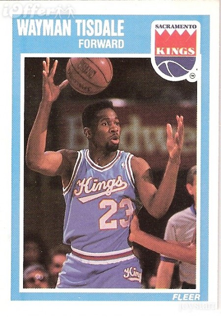
bob deboo says:
November 7, 2011 at 6:58 ami like this a lot! use to be a collector too. did you know that Wayman Tisdale is a smooth bassist?
Brandon says:
November 7, 2011 at 7:20 amOh man. I have a complete set of those ’92(?) Skybox.
Jakub says:
November 7, 2011 at 8:24 amSooo happy to see many of we’re in the same boat, more stories!
I have over 400 Pavel Bure cards.
Tim says:
November 7, 2011 at 8:30 amOh hell yeah
Beebo says:
November 7, 2011 at 9:31 amWhen Upper Deck was introduced to the sports card market in 1989, the “premium” card design was born. It really was a nice card with the glossy varnish, modern white border and foil stampings. It was quite revolutionary when compared to Topps, Fleer, Bowman, Donruss, etc, as the value per pack was significantly higher than others. I’m sure you’ll be featuring all of those 89-91 Upper Deck series designs soon.
C42D says:
November 7, 2011 at 11:26 amgeek
Owen says:
November 7, 2011 at 11:32 am@BEEBO What you’re saying is correct, but I don’t imagine those have quite the same appeal to someone like Jakub.
TY says:
November 7, 2011 at 12:09 pmtough..I’d rather see Neely in a B’s uniform
Chris says:
November 7, 2011 at 2:35 pmOh man this took me back. I’ve been saying for years now to my baseball buff friends that my knowledge of the game ended in 94 when I stopped collecting. That’s about when there were way too many brands and sub brands of cards and I couldn’t keep up.
Anyway I love some of those aesthetics too. Speaking of unexplainable obsessions surrounding baseball card collecting, I’ve got a complete set of Daryl Strawberry cards – wow, what a waste that turned out to be. I also have a few rookie cards from Barry Bonds – again, waste.
Anyway, keep it up. I’m going to have to pull mine out of storage and check out the designs.
John Mata says:
November 7, 2011 at 2:39 pmI was lucky enough to turn designing trading cards into a career!
http://www.eight-zero.com
Chris says:
November 8, 2011 at 6:28 amJohn – your designs look great!
hollister clothing says:
November 9, 2011 at 11:22 pmWe are not from China and you don’t worry that you will get the fake products.
joe says:
November 11, 2011 at 11:06 amLove the Wayman Tisdale. He was also an amazing Jazz bassist in his post-NBA days.
Rusty says:
November 30, 2011 at 2:35 pmThose Skybox cards from 1990-1991 were the best. Donruss Diamond Kings were also geometric/weird. However, I appreciate the understated direction that 1987 Topps mlb cards took with their woodgrain.
Erik Wallace says:
December 4, 2011 at 5:19 amNice collection, the O-Pee-Chee logo on the Hockey card is gorgeous. I only remember the 1984 baseball cards by them that looked dead on the Topps set.
Alex Wakefield says:
December 9, 2011 at 2:27 pmI was always a big fan of UD ’91 Hockey and Stadium Club ’92. http://3.bp.blogspot.com/_RON9qbjIJD4/RuIvdv6klAI/AAAAAAAAAFE/uV2U8Sv4nm4/s320/tsclindenfront.jpg
Ryan Sieg says:
December 13, 2011 at 6:31 pmYou just have to love the Skybox design.
mike d says:
December 20, 2011 at 5:10 pmBill Ripkin rookie card before correction…
Urson0Xk says:
December 29, 2011 at 8:14 amHGSQGu http://www.2KFk8UxzgR3t2CjpiGYlWRZr9NzJwIs8.com
pHLMEZJ7 says:
January 24, 2012 at 4:08 pmggNDiZ http://www.RUWE5gOde94HqsfDYIh3uBfJfSMdiDSG.com
john says:
February 22, 2012 at 12:05 pmhttp://www.freedrive.com/user/22d9c3f78c554cbe2403020535ddc85c
john says:
February 22, 2012 at 12:35 pmhttp://www.freedrive.com/user/22d9c3f78c554cbe2403020535ddc85c
Peter Egan says:
March 13, 2012 at 3:53 pmSeeing all those photos sure brings back a lot of memories from my card-collecting days… I wonder where all those cards are, or if I even still have them.
They’d probably be worth a good bit of money by now if I’ve still got ’em somewhere.