Jotly: Share Everything with Everyone
UPDATE: It was fake, but now it’s real. And it’s going to win everything. Download it now.
Ever since I started working in startup land, I’ve felt the need to ingratiate myself in the ever-buzzing world of *tech*. This means staying up on other companies, the blogs, and the general Silicon Valley scene. This can be very repetitive. People get funded, apps get released, and companies buy things. Sometimes a conference happens. Having spent the better part of the last few years neck-deep in this hullabaloo, I figured it was time to parody it.
As I’ve written before, I currently am working on Nosh. Download it now please, it will give you some context. One of my periodic jobs is to drum up support for our beloved application. Of course we do this the normal way (press releases etc), but when I have a free weekend, I like to try and make something crazy and unusual to help things along. I call it the Skunkworks project (achieve victory by any means possible). We had great success with the 404 page, and the Jotly project was my next move. Continue reading for the full process behind the project.
Background
There is a formula you can follow to construct a startup. Ready? Follow these steps and you will have significant amounts of PR coverage and users by tomorrow I promise:
1.) Make a new social network. Friends, followers, whatever. Name it something <5 characters. 2.) Double check to make sure it's mobile, local, and social as hell. 3.) Probably need to have someone famous start using it. Ask Ashton Kutcher. Tech celebs are best, as tech will be you audience. 4.) Don't forget the social layer. Facebook! Let people share to Twitter! Google Places? Maybe even let people share the fact that they just shared. 5.) Photos better be involved too. Photo groups! 6.) Optional: Pick some strange new rules for this network: Maybe you can only be friends with people based on your physical proximity and geofencing. Of course I'm joking with the above, but this really isn't that far from the startup SOP. I thought it would be fun to follow these rules and package it all up into one ridiculous app, taking everything to the absolute extreme. All the while hopefully walking the line carefully enough that some people would immediately get the joke, and others would be think it was real and try and download it. Note: Yes I am aware that Nosh sits somewhat in the crosshairs of this project's satire. Thank you for noticing. I can make fun of myself right? Haha anyway, Jotly takes all of it to the extreme. Nosh is too useful and badass to fall into Jotly territory. Judge for yourself.
Planning
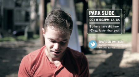
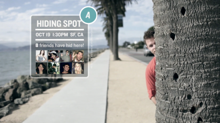
Since I hadn’t the time or the skillset to actually release my fake app, I had to do everything else to paint the picture. This would mean: brand, website, screenshots, and the centerpiece of the project, a promo video. I liked the idea of an app that would allow you to “rate everything!” and decided to run with this. The promo video was to be the focus, with a website and brand cocoon around it to make getting press easier.
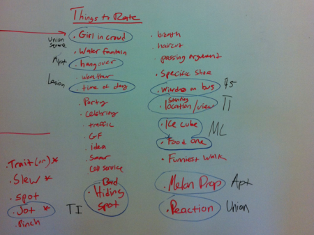
With the rate everything idea in hand, I took it to my creative compatriot Phil Mills and we fleshed out the app promo. The main thing was that the app would be really good at rating literally everything. Especially things that would provide absolutely not utility whatsoever. We brainstormed all sorts of things the app could rate — anything that was somewhat useful (traffic, TVs etc) was tossed out. We preferred if the app was used to rate pointless things like people’s expressions, the time of day (ex. 4:32pm), or maybe flies (ha! yes I know). And of course everything would be shared with everyone at all times. Because everyone cares what you do. At all times.
The name of the app was very important. It had to be new and different and certainly couldn’t already exist. It also had to feel like one of the startups we were making fun of. The word “Jot” was our favorite and we decided on this. As I was flying to LA, I saw that Chase had literally just released an app called Jot (of course), so the name needed to be changed. We tried jawt, jott, jaut, jtt, jottt, jaat, etc. Finally settled on Jotly. The whole no-consonants thing was an idea for a while, but jtt doesn’t really make any sense (not that that matters…)
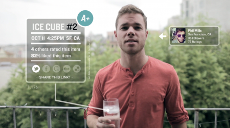
For the video, we decided the best approach would be to show Phil walking around town rating things. The different features of the app would have to all be done with special effects. We planned for it to be under 1:30 and made a list of about 30 things that would be funny to rate. Phil and I generally write best on the go, so we picked our favorite 10 things and figured we’d film those and whatever else we thought funny along the way. I think we ended up using only three things from our original list. Everything else was filmed run-n-gun between locations, using whatever we found around that looked interesting.
Filming
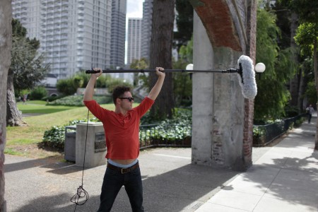
We filmed as much as we could in the few hours we had that day. The few shots we knew we needed to nail were the intro and the outro. We also needed a little bit of dialog to help the shot sequence flow together. These shots were written on set as usual, with all of us crew brainstorming sentences, before having Phil memorize them quickly. I tried to shoot everything else in a way that would allow me to edit it together in any order. Since we didn’t have much time to plan, this was the most versatile way to do it.
The whole video was shot on the Canon 5DMKII with a 35mm lens. I had a 24-105mm on hand just in case, but ended up only using shots that were filmed with the 35. I mistakenly shot most of the video with an aperture setting of f/1.4 which was just crazy — almost every shot was slightly out of focus. Of course I didn’t notice this on the LCD screen, and by the time I reviewed the footage at home, it was too late and Phil was back to NYC. I was able to salvage a bunch of footage, but you’ll notice that the depth of field in almost every shot is insanely shallow. Felt pretty silly about this, but something had to go overlooked given the speed at which were trying to film.
I recorded the audio with a Rode Video Mic mounted on the camera. This was the audio I eventually used in the final product, although it was originally intended to be the backup. The primary audio device was another shotgun mic on a boompole, feeding into a Marantz Solid State Recorder PMD661. San Francisco is often extremely windy, and I had this mic outfitted with a Rode suspension Blimp for wind protection. The two audio sources ended up getting very similar results, so for simplicity’s sake, I just went with the camera mounted audio. Had I had more time, I would have synced everything with the Marantz takes.
Editing
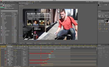
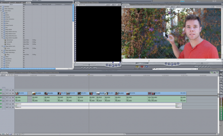
I started by placing all the clips in order in Final Cut 6 on my home desktop. I cut out any shots that had useful ratings or weren’t funny fast enough. When I had the film at approximately the right length, I exported a full quality version to be imported into After Effects. I’ve experimented with different methods for going between FC and AE, and I have the most success exporting/importing the entire film, cut together, rather than do things piece by piece. This method can make AE run a little slowly, but it seems to be the most reasonable.
There were about 13 different sequences that needed effects and I worked through each one in order. Before animating anything in After Effects, I would quickly mock things up in Photoshop over screenshots. This helped me quickly nail down the look/feel of each shot so I wouldn’t have to waste time in AE. Stylistically, I wanted to stay pretty close to the Stranger Than Fiction look. The whole cascading type thing was one of the first things I learned in AE, and since iPhone animations weren’t going to be possible for this one, I thought the STF type thing would be a good substitute. Nice to have a cool jumping off point anyway.
A lot of the effects rely heavily on motion tracking — just about any time a graphic appears on screen, it’s physical coordinates are dictated by something else in the shot. I got pretty good at tracking while working on the 404 and I was overeager to implement it in as many places as possible. I felt like this helped the video read as a more professional effort as well, since motion tracking looks pretty cool.
One complication was that I was headed for eye surgery one week after we shot the video. As it happened, I had one day to edit the project and ended up working up until the very minute I had to leave to go to the doctor. I was able to complete the effects before leaving, but I had to do all of the sound effects on my laptop using the dreaded Final Cut X. Still not ready to actually make the jump to FCX. The magnetic timeline really messes me up.
Website
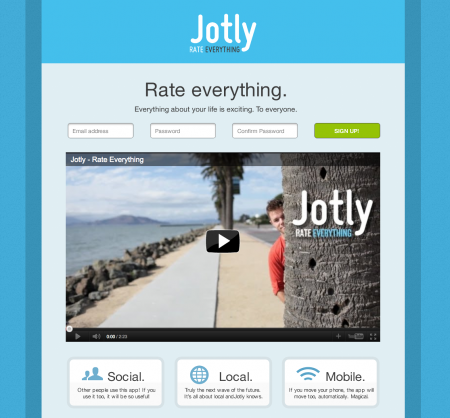
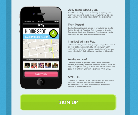
Post-surgery, there was still lots to do. Originally the plan was to just release the video on its own, but I worried it wouldn’t catch people’s attention quickly enough. To remedy this, I thought a website would be a great vessel to send it around in. The ridiculous startup concept formula I wrote about above has a companion ridiculous formula for design. To make the website and brand for Jotly, I just used this formula and painted by the numbers. You need to be fluent in the language of gradients, drop shadows, and basically the entire Photoshop FX pane before getting started. Here is the startup design formula:
1.) Use lowercase letters and name your company something punchy and cute.
2.) Use the color blue and texture the shit out of everything. Leather on wood on metal on brushed steel on white? Fuck yes.
3.) There need to be signup buttons and share buttons everywhere at all times. Even if you’re already logged in, there need to be a copious amount of sign up buttons.
4.) Giving away free iPads via a retweeting campaign is generally a decent way to start things off.
5.) On the website, your “catchy” tagline should be really big in a lightweight typeface.
6.) You need to advertise three features of the app using little modules. This is crucial for success.
Again, joking with the above, but it’s based on empirical findings. Everything on that list has been implemented by a very large percentage of startups. Go to the front page of Dribbble and you’ll see this startup style blown out to the maximum. Rounded corners, textures, blue, icon sets, “UI kits” and insane lighting effects are absolutely everywhere. It’s like some sort of Photoshop FX arms race.
I used Virb to build the site since I was not at the office and was without any or our engineering magicians. Virb is generally one of my favorite codeless site creators. To make things easy, I chose a one column design and made every assets exactly the same width. This let me basically construct the whole thing in Photoshop.
Follow Up
If you click almost anywhere on the Jotly website it will take you to Nosh. I was optimistic about Jotly getting at least a tiny bit of press and I wanted Nosh to be able to benefit from this, at least in a small way. I redirected all click traffic to our signup page. This of course, was meant to be slightly ironic, as much of Nosh is conceptually similar to Jotly. During the week Jotly was getting press, our Nosh signup numbers increased by a multiple of 15. Here is a good article!
The whole Jotly project was really a cathartic exercise for me. I generally consider myself to be a very minimal designer. I like black and white. I like four typefaces. This last year, I’ve had to step out of my comfort zone, not only with what I design, but also the design work and visuals I consume daily. Creating Jotly allowed me to regurgitate all of this in a visual cleansing of sorts. It was insanely fun and great practice for future projects. While I may not want to stylistically replicate anything “Jotly”, my AE skills improved a lot and it was a great exercise in working fast. And Nosh is a few users closer to world domination.

15 Comments Leave A Comment
Melvin says:
October 31, 2011 at 1:51 amjust downloaded it and it looks great! nice to see a bit off the process.
Overlapps says:
October 31, 2011 at 4:22 amYou forgot a nice app icon :)
Crazy and great video!
Adam says:
October 31, 2011 at 11:12 amThis is actually a real app called Oink coming out this week by Milk Inc.
http://www.fastcompany.com/1789065/kevin-rose-milk-oink-app
d|| says:
October 31, 2011 at 11:28 amI could see myself using Jotly a lot. Jotly would probably make me get out more and do something.
Chris says:
October 31, 2011 at 2:37 pmyour seagull sounds from the beach shot are the same sounds from the app/game “harbor master”
Adam Westbrook says:
November 1, 2011 at 3:15 amThe accidental uber-shallow depth-of-field adds an extra layer of parody of all the DSLR film makers who make videos like this and prioritise their f-stop over the story. Nice work!
rek says:
November 1, 2011 at 1:29 pmNot nearly ridiculous enough! I can see this as a real app, used exactly as the video portrays, and being a success!
C42D says:
November 3, 2011 at 5:58 amJust signed up for nosh. its a genus idea. good luck.
Jordan says:
November 3, 2011 at 8:24 amThe vibrating camera is maddening. Either buy a rig or something or stop filming with a DSLR camera (or, o, the horror, use a tripod). It’s really annoying, also, that it’s f/1.4. Apart from that –– love the entire idea.
Tony Wong says:
November 3, 2011 at 10:44 pmAs D|| mentioned, Kevin Rose just released Oink and it is definitely being taken seriously!
Tim - web says:
November 10, 2011 at 11:26 amapp – Nice idea! I like the video – presentation. follow u.
Cyber Design says:
November 24, 2011 at 12:35 amAn amazing post. It’s nice to read a quality blog post. I think you made some good points in this post.
Web designers
Ryan says:
December 15, 2011 at 12:17 amGreat article — very interesting to see what went into producing this. I think I’m also missing my calling as it seems like this is something I would do and yet instead spend all my time doing all the techy/programmy stuff…
Designarcade says:
January 11, 2012 at 2:25 amYes download will add salt to it. This type of detail post helps designers a lot to create amazing unique design.
Kouichi says:
February 26, 2012 at 11:11 pmThe Importance of a Well-Designed App Icon Wondering what the efceft of a well-designed app icon will have on your app sales? You may be surprised to know that it?s actually hugely important .