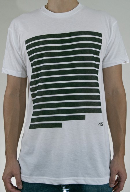
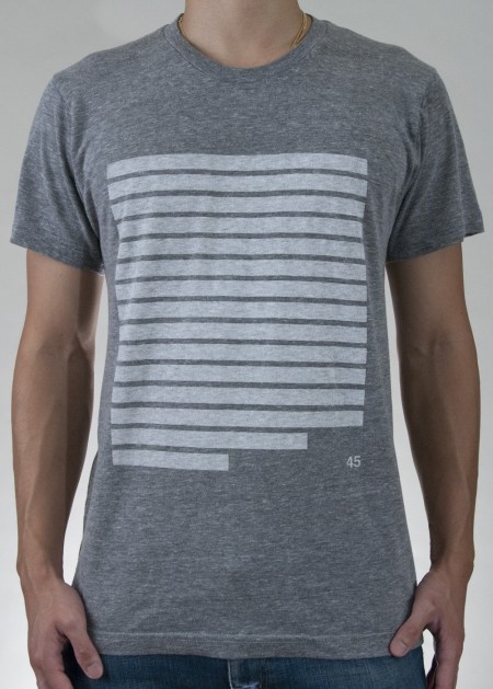
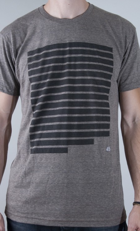
NEW ISO50 Shirts : 45 White Grey Coffee
Posted by Jakub


Just so you guys know Scott put an attractive line of shirts together this week under the name 45. I actually asked him recently about the approach of these and he told me that he only makes shirts that he would want to wear and not just some tee that are branded, made a lot of sense, its funny when a designer can’t or won’t wear their own shirts but still offers them for sale, would love your thoughts on the design.
Here are links to the store so you can grab your favorite one:

12 Comments Leave A Comment
Austin says:
October 7, 2011 at 6:02 pmpretty cool design, I personally prefer the white on grey… just wondering, what is the inspiration behind the design and then number? also curious on the inspiration behind the “fives” and “echo circle” shirts. keep up the amazing design work! i just had to buy the new tycho shirt and deluxe version of the LP. so beautifully mind-blowing in every aspect!
Shelby says:
October 7, 2011 at 6:10 pmAwesome! I’m all about the first version of the shirt. The optical balance created by the “45” is on the money.
Isak says:
October 7, 2011 at 10:58 pm“Scott put an attractive LINE of shirts together this week under the name 45.”
Get it? Haha.
captcha says:
October 8, 2011 at 6:35 pmAwesome! How did he do it?
gerald_wyse says:
October 9, 2011 at 9:36 amwhat the hell does it mean? im all for nice design, but this seems a bit lacking. why not 48 or 42 or 38? why not throw some integers in there?
Wietse says:
October 9, 2011 at 12:04 pmWth its thick lines and a number! -first thought
Doobidoobidahdah wamwam sheeen thududududud
This is a musically enchanced comment if you read like me
James says:
October 9, 2011 at 4:53 pmNice design!
Could you tell me what the length of the L and XL shirts are? It doesn’t seem to be on your fitting guide.
Cheers,
James
gerwin says:
October 10, 2011 at 3:15 amReally digging the black on white one. Cheers
sj says:
October 10, 2011 at 8:55 amwhat does it mean?
Jerzees Tees says:
October 12, 2011 at 4:55 amJerzees Tees – Exclusive range of jerzees tees, sweatshirts, sweatpants, hoodies and jerzees cardigan. Buy wholesale jerzees pique polo and cotton t shirts at Apparelnbags.com.
Zach says:
October 13, 2011 at 10:48 amI’d be concerned with someone bootlegging this, but I don’t think people that would bootleg stuff would bootleg this; and if they did bootleg this I don’t think they’d be able to find the right market. ow ow!
45 is a great angle.
Zach
Drew says:
October 15, 2011 at 5:41 pmI’ve enjoyed some of scott’s apparel designs in the past, but this one seems too simplistic. I guess there are only so many directions you can go with single color silkscreening and vectors, though.
If I had to choose one it would be the white one though. The contrast is much more striking and appealing.