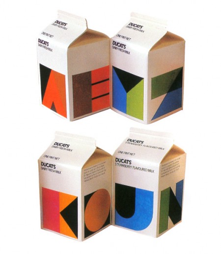
Ducats 1980s Milk Packaging
Posted by Shelby White

Tears of joy would stream from my eyes if this were under my tree Christmas morning. It is now that I can fully appreciate the simple solutions of such design—less is more. It just makes me sad to know that the chance of this ever happening again on mainstream packaging is slim to never.
Via Wanken / Re:collection

4 Comments Leave A Comment
Simon says:
August 12, 2011 at 3:38 amArla, Sweden’s largest dairy producer, has some neat packaging.
Sadly the packages got a little polluted by a company merger, which caused Arla to change their logo to that green ellipse. Their original logo was the red cow, which they still keep on their milk packing, in addition to their new one.
Simon says:
August 12, 2011 at 3:54 amActually Arla has changed their new logo several times after the cow, the first one after one was an amorphous red blob, and they restyled the green ellipse a bit. They were all forgettable, so no wonder I forgot about it.
It’s strange that they clearly seem to understand the value of their old logo, and keep it, yet they keep designing new ones.
Here’s another neat package they have, it’s for highly pasteurized milk.
Odiseo says:
August 18, 2011 at 7:53 amI love this post. I also happen to love muu milk from Iceland :)
http://www.flickr.com/photos/roshambo/5704116592/
Hout Bay says:
August 24, 2011 at 7:49 amMy sentiments exactly, I am going to blog about this too.