Discovery: A Visual Eulogy
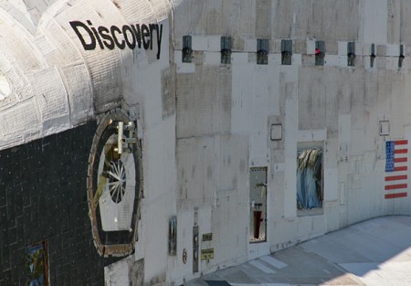
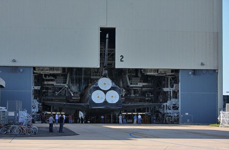
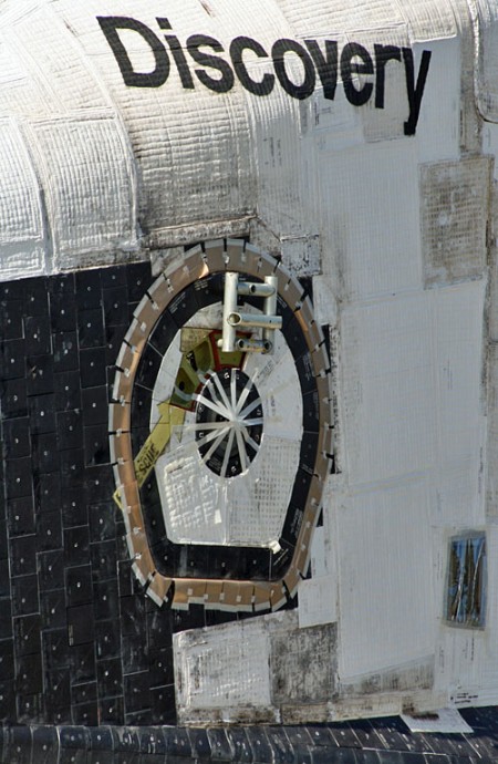
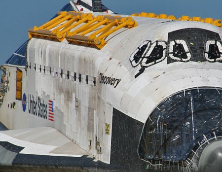
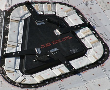
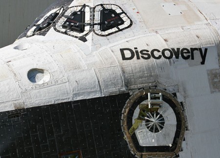
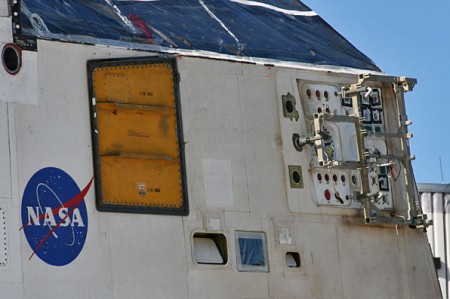
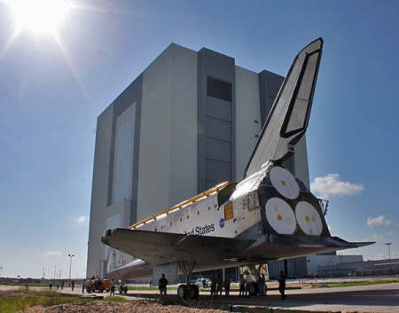
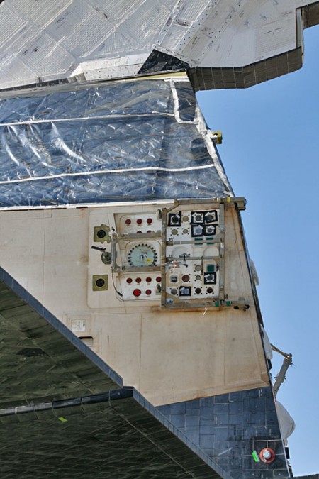
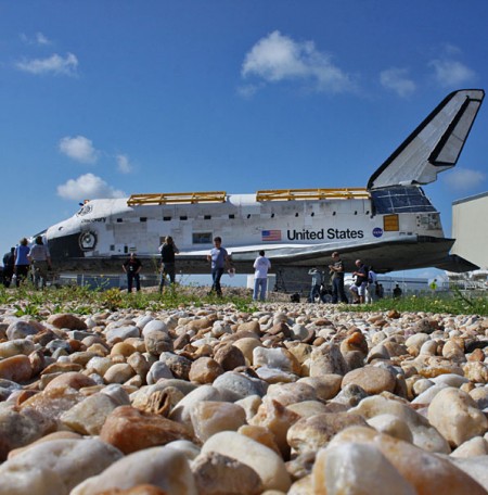
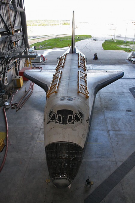
I’ve seen a lot of beautiful, moving images of the Shuttle lately but none have felt so intimate as these by Justin Ray for Spaceflight Now. Something about these photos of the now decommissioned spacecraft, engines removed, mission complete, bring the idea of it to life like none I’ve seen thus far. It’s the textures and details that highlight what an incredible machine this was and what a profound achievement for humankind it represents.
And look at that lettering! I’ve never seen it so close; it has such a handmade feel to it at this scale. The logos and typography of the Shuttle program always intrigued me, they seemed to represent the idea of the United States as a brand, an ideal to be consumed by the rest of the world. Then when Canadarm was installed on STS-2 it became apparent that even other — less crazy — countries felt the desire to push themselves as a brand in space. Of course, pushing your national space-brand became a bit more accessible with the ISS, but the US and Canada used Helvetica and were way ahead of the curve so I’d say they won whatever prize you get for most recognizable space-brand.
I wonder what we all gained growing up in a world where the Shuttle existed. I know it was a big part of my consciousness as a kid and probably had something to do with how I felt about my national identity. For me it symbolized the combined efforts of some of our greatest minds collectively reaching for a better understanding of the world we live in. For some — and perhaps rightly so — it probably represented a colossal waste of resources in the face of more earthly problems. Maybe it was both, but I I’ll personally miss it as a symbol of what we as humans can achieve when we work together.
More Pictures at Spaceflight Now

11 Comments Leave A Comment
blake Barton says:
July 22, 2011 at 5:50 amGREAT insights Scott. Thanks for sharing this!
wounded.knee says:
July 22, 2011 at 7:00 amlistening to jakub’s tracks and scanning these pictures..it occurs to me that in the age of information overload, this blog is a rich source of data orgasm.
these pics show the patchwork/quiltlike tech ingenuity on this beast. showing its age in this light. is that velcro on the window panels?
intimate indeed.
end of a marvel.
hello soyuz
Joaquim Marquès Nielsen says:
July 22, 2011 at 9:18 amWhen looking at these photographs — especially at the surface of the shuttle — I get associations to an old elephant, with its ancient and rigid hide full of scars, each telling its own unique and important story…
chazz4444 says:
July 23, 2011 at 2:29 amExcellent post. A great insight of what it was like growing up with the space shuttle program.
Mike thegreenkingdom says:
July 25, 2011 at 5:13 amCool pics and a well-written post Scott. I love the “used spacecraft” Star Wars look of that the shuttle now has.
Zach McNair says:
July 25, 2011 at 4:20 pmMan, I couldn’t help but feel a strong sense of sadness when seeing these photographs. Unlike many of the other space craft deconstructions that still look like they did they day they last flew, Discovery’s deconstruction makes her look like an elderly woman stripped of her dignity. There is much beauty in her raw state, but I can’t help but think that I’m walking in on an old woman before she’s had time to finish dressing.
On a positive note, it really is fascinating how much ingenuity had to go into making these special crafts. There are millions, maybe billions of pieces that had to be crafted in order to make a shuttle. The amount of team work that went into taking this thing from paper to final product and then from final product to keeping the craft alive and fully functional must have been astounding. What kind of things could be made if we all had those types of teams at our disposal.
This is not only an end to this particular era of space flight, but this is also an end to this era of ingenuity. I highly doubt that future crafts will require such big teams of people coming together with analog systems (pencil and paper) to create solutions for existing problems. Future teams will probably be one main dude with an iPad doing a quick search, a couple of touch screen gestures, and a *push to send* and instant solution fix.
Christopher says:
July 25, 2011 at 8:38 pmThese are super intimate. You can see that craft bears a lot of stories :)
dylaneveryhwere says:
August 21, 2011 at 4:35 pmI swear that thing is built out of legos!
dylaneveryhwere says:
August 21, 2011 at 4:35 pmI swear that thing is built out of legos!
Anders says:
September 24, 2011 at 1:19 amI agree about the branding idea. It’s almost like NASA and the Shuttle program are the modernist, contemporary, almost bauhaus wing of the US government with the supreme court and the white house being more conservative and grand.
Amazing photo set! Thanks for sharing!
r08 says:
September 25, 2011 at 9:18 ami just spent the past week on florida’s SPACE COAST. (cocoa beach) and had no idea such a huge community was built around the space program. (it all started during the space race)
it is really cool to see all of the local businesses that incorporate the space shuttle design into their existance, but now that the discovery is gone, i wonder how that will change the look and feel of the place. I do realize there will be shuttle launches in the future, but being that the discovery is so iconic, i wonder how that will change the community.
my personal favorite business was the “Space Coast Credit Union”