Firespotter Logo Design Process
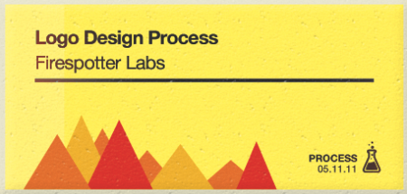
While it’s fresh I thought I’d write up the process behind the Firespotter Labs logo I designed. This was an incredibly fun logo to design and probably one of the quickest, at least when contrast to some of the luxurious multiple month (!) design explorations I’ve done in the past for school or other companies. That said, it was exceptionally challenging; it’s hard to take a step back and think objectively about the company you’re a part of.
Before this, I had already designed a couple logos for some of the products we’re working on now. I had to break out of the “consumer application” design mindset I had been entrenched in for a few months. For the mothership, we needed something that conveyed that we were a lab full of crazy people brewing up cool things, while simultaneously appearing to be trustworthy gentlefolk worthy of venture support.
Color Explorations
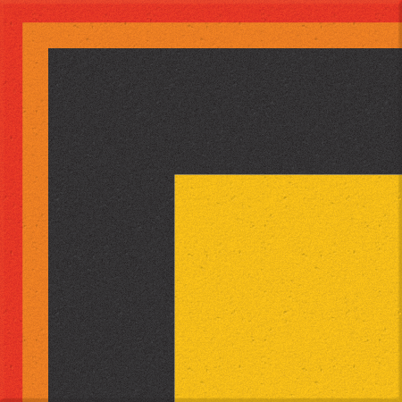
When I started working on the logo I went back to some of the color explorations I had been experimenting with during an earlier branding exercise for one of our products. I thought I might be able to get some inspiration since I had remembered liking some of what I had been playing around with. I do these every once in a while: square designs, really quick just to get a vibe. Usually looking for a color palette, but sometimes the implications can be farther reaching. In this case, I was attracted to the orange/red/black palette. Not a surprising choice given the fiery nature of our company’s name.
Initial ConceptsGiven that the name is Firespotter, I knew it would be difficult to avoid using flames or some kind of spark-like imagery. Of course I never want to do anything that’s “expected”, but I felt like this was a case where it was OK to leverage the implied visuals of the name. Fire, after all, is pretty damn cool looking on its own. I started thinking about the various ways I might be able to depict fire in a cool way.
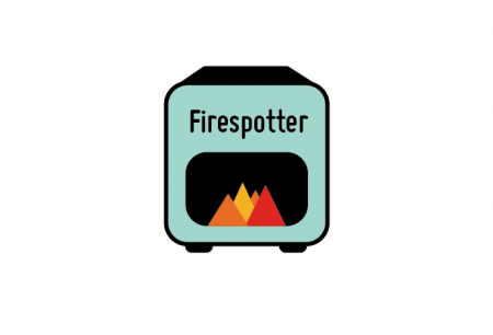
The first thing that came to mind was an oven. People were always (rightly or wrongly) describing us as an incubator, and the idea of us baking some tasty idea-treats sounded pretty fun to me. I thought it would be a somewhat clever way to use fire without being too overt. Above you see my first pass with the oven idea. Conceptually I liked it, but as a logo it really fell short. It felt clumsy and really lost its power at small sizes. The fire was lost inside an oddly colored box, was the way I eventually perceived it.
Ugh yeah, just looking at it I have the uncontrollable urge to re-render the oven.
A Fun Deviation
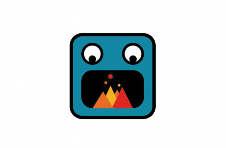
Before moving onto more serious seeming logos, I deviated a bit and drew the logo above. This one was a favorite of mine just because it makes me laugh every time I see it. RAWR! Fire in my mouth! I don’t know, it gets me every time. What I liked about it was it felt very irreverent. Imagine if this was the logo for a venture-funded startup…this guy doesn’t look like he would know what to do with millions of dollars, but he certainly looks like he would have a good time with it. As fun as he was, needed to rein in the crazy a little bit.
I added the little ember bubbles in the meantime, which I really liked. I felt like they gave it a scientific feel, kind of the way lab beakers are often depicted. I was really into making it feel like the fire was the result of some scientific experimentation. Additionally, they provided a nice visual counterweight to the really heavy flames. I spent more hours than necessary positioning them above the flames just right and moved on.
Fire in the Hole
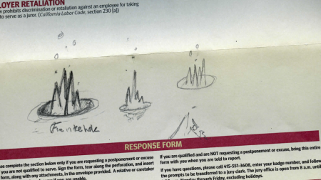
I started thinking about a phrase Craig had reminded me of one day: “Fire in the hole”. A prefect phrase for our startup actually, defined as, “an expression used to indicate that an explosive detonation in a confined space is imminent”. I suppose we like to think of our disruptive apps as said “explosions”, and the slow moving and antiquated markets we move on are the “confined spaces”. This was an evocative concept to me and I drew up some sketches involving fire in an actual hole. I drew three and these are shown above, on a fancy piece of Jury Duty paper of course.
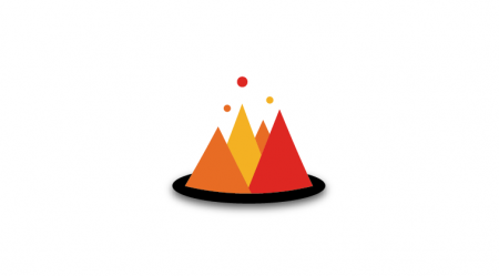
I drew those three sketches and then moved to Illustrator again. I’ve never really been into the infinite sketching phase thing. When I lock onto a concept I like, I jump on the computer. When I started with this idea, I wasn’t happy with any of my attempts to render a “hole”, so I put the fire on a disc. The idea was that it would float around and light exciting idea-fires every which way. Unfortunately, it looked a lot like a floating island with mountains on it. Perhaps a good logo for a summertime ski lodge, but it wasn’t quite right for the concept I was after.
You’ll notice that the flames themselves haven’t really changed from the very first logo I concepted. I was happy with the color and shape, it was just a matter of where they were going to live — whether inside of a characters mouth, on a disc, or in a hole.
Final Logo
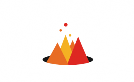
The final logo finds the fire coming out of a hole, the final and rather literal execution of the “fire in the hole” concept. The flames as mentioned remained largely the same at this point. Really, the final isn’t all that different from the disc version, but it’s a crucial difference in my opinion. Putting the fire in the hole made the whole thing a lot more interesting. I start to wonder odd conceptual wonders like “what is this hole?”, “who started this fire?”, and “what’s actually burning?” It’s exciting for me to think about.
Overall too I felt like the mark was the right fit for our company. It felt fresh, cool, and was able to use fire imagery without seeming lame. I think this has to do with how simply the fire is drawn. A really glossy, shiny and curvy-wurvy flame set would feel way wrong to me. This one looks vibrant to me and indicates that exciting things might be happening around the people that started this little triangle fire.
It has its limitations of course: for example it’s actually quite difficult to use against dark backgrounds. The hole gets lost and then the curve of the flames looks off. You can change the color of the hole, but that is a strange necessity. Similarly, the logo is made up of three different colors, which for me is unusual considering I almost always start a logo in black and white to ensure its potency in any paper situation. But overall these are small problems and the fire logo endures onward.
Eventually I have some ideas about animating it with stop-motion. I could cut out this logo from construction paper in minutes and I can visualize a pretty cool diorama animation. Just need to find a free weekend somewhere in the next 10 years…

29 Comments Leave A Comment
Graham says:
May 11, 2011 at 8:22 pmThanks man. This really makes me feel better about my “lame” or unfinished ideas, that are always a necessary part of my process. When other people put up a design process, I always feel that they’re cutting out a lot of stuff they don’t want people to see. I’m always pretty reserved and afraid of showing people concepts. You just lay it down and explain why. That’s why I shouldn’t be afraid, because I can explain myself, I just don’t believe it.
Oh, and respect for dropping out of school.
Porto Novo says:
May 11, 2011 at 9:39 pmKudos, amazing how much better the final looks without the shadow/disc idea. I actually really enjoy the top “logo design process” art a lot, reminds me of my sleepless nights in high school studying out of old chemistry books. And I agree with Graham, I enjoy the honesty that comes with all of the iso50 guy’s process posts, the steps/concepts you lay out make the final product that much more interesting to us.
Congrats, and best of luck to you and everyone at Firespotter Labs!
Dean Oakley says:
May 11, 2011 at 9:44 pmNice work. I’m pretty sure everything looks better coming out of a hole.
Kathleen says:
May 12, 2011 at 5:23 amThe final logo is killer. You should totally use the fire mouth one for a spin-off project – hilarious!
Thanks for sharing your process.
Riley says:
May 12, 2011 at 7:10 amI have to say I was a little disappointed by this post–no other iterations/concepts? No other strong contenders? Love the final logo though, and thanks for putting your sketches out there.
Alex says:
May 12, 2011 at 8:26 am@RIley – Yeah it’s crazy, that was it! You should see my illustrator file. I was surprised how quickly I got to the final mark. I think a lot of this had to do with the fact that I had been working on 3 other logos at the time, for our products, and was kind of in logo mode. When it was time to do Firespotter, I was already really warmed up I guess.
Mariposa says:
May 12, 2011 at 8:47 amThis is a fantastic look into your mind, Alex. Thanks for sharing. Absolutely in love with the final product!
Brennan says:
May 12, 2011 at 8:50 amIt would be really awesome to see a gently burning animated version. Maybe when you mouse over the logo on the website or something, it would start churning.
Great work, either way!
Kurt Lorenz says:
May 12, 2011 at 11:53 amGreat work, I love the fire in the hole reference… Reminds me a little of this piece: http://cargocollective.com/paultebbott#228425/Chemtrail
Kurt Lorenz says:
May 12, 2011 at 11:54 amGreat work, I love the fire in the hole reference… Reminds me a little of this piece: http://cargocollective.com/paultebbott#228425/Chemtrail
Alex says:
May 12, 2011 at 11:58 am@ Kurt – Me as well! I actually have that Paul’s Chemtrail poster hanging in my apartment. An excellent work.
HIs poster and my logo also remind me of the Expo ’67 triangles: http://wanken.com/blog/2009/03/20/expo67_2.jpg I think that was probably my first inspiration for this
Matt Davis says:
May 12, 2011 at 1:35 pmReminds me a lot of these too:
http://designers.mx/patterns_process/
http://www.flickr.com/photos/matthewlyons/4226800378/sizes/z/
It’s a clean mark, but for a revolutionary new company it seems something else that’s not shapes and Helvetica might work better.
Bas says:
May 12, 2011 at 3:03 pm@Kurt: That’s also immediately popped into my head. I very much like the logo nevertheless! Especially the bubbles, it suits ‘fire’ but also makes it into something more.
fr says:
May 13, 2011 at 8:46 amMatt, that Patterns & Process thing is just a crop of the Expo 67 poster Alex linked to right above you ;)
Christopher says:
May 13, 2011 at 12:51 pmExecution is good! I really wanna see how – nevermind, I just figured it out-the one color version-I like it :)
Mike says:
May 13, 2011 at 12:56 pmSometimes things just come together quickly (always the best when this occurs). There’s something to be said for not overthinking it…
crho says:
May 13, 2011 at 10:38 pmWhat I like most was the part about the thought/inspiration or moment of the craig reference to the fire in the hole .. feels like a casual conversation between people involved and inspired and just riffing (possibly talking about something entirely different .. who’s craig?), but onto something. Foundation pillars of what an effort is about, and that’s the fun and important part. Believe in the idea, even before you represent it to a public audience, and you have what you need. Details of the final logo aside (one likes things, one doesn’t like things about it) it’s that moment that I think is the strength of the post and of you as a designer.
web design says:
June 14, 2011 at 6:28 pmGreat post, loved the process, thanks
Pharme87 says:
August 6, 2011 at 12:09 amHello! cfdeadk interesting cfdeadk site! I’m really like it! Very, very cfdeadk good!
Pharmd135 says:
August 6, 2011 at 4:36 amHello! fedggea interesting fedggea site! I’m really like it! Very, very fedggea good!
Pharmd196 says:
August 6, 2011 at 4:42 amHello! gegebge interesting gegebge site! I’m really like it! Very, very gegebge good!
Pharma693 says:
August 6, 2011 at 5:08 amHello! aeedefa interesting aeedefa site! I’m really like it! Very, very aeedefa good!
Pharmb565 says:
August 9, 2011 at 6:51 amHello! ddfaeef interesting ddfaeef site! I’m really like it! Very, very ddfaeef good!
Pharmc181 says:
August 9, 2011 at 6:52 amVery nice site!
Pharme701 says:
August 15, 2011 at 12:16 pmHello! dbdekfk interesting dbdekfk site! I’m really like it! Very, very dbdekfk good!
Pharma523 says:
August 15, 2011 at 12:17 pmVery nice site!
slippyfish says:
September 7, 2011 at 3:46 pmInteresting – I didn’t see it that way at first, thinking that the image on the top (logo design process) was the logo, which I interpreted as a range of mountains on fire, and because you’re in a fire watch tower, can observe the burning mountains all around. But ‘fire in the hole’ is good too.
Anonymous says:
September 9, 2011 at 1:44 pmNice work! I really enjoy your process as well as the successful result!
Tim says:
September 9, 2011 at 1:45 pmNice work! I really enjoy your process as well as the successful result!