Kristin Agnarsdottir: Knoll Paint
Posted by Scott


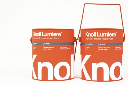
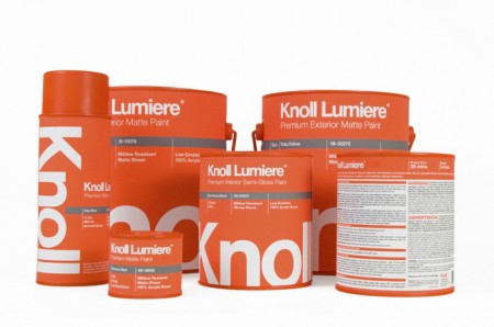
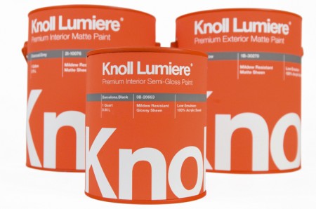
Knoll paint! Sorry, it’s not real. These mock ups were made by Kristin Agnarsdottir for a package design class. Really amazing stuff, and I was just complaining about how bad packaging is these days.
More over at Kristin Agnarsdottir’s site (cool logo too!)

7 Comments Leave A Comment
Chris says:
February 2, 2011 at 6:47 amHer portfolio is insanely impressive!
Alex says:
February 2, 2011 at 7:47 amThe layout is beautiful, but the neon orange screams “industrial paint” to me, not “house paint”. I’d feel like it would only come in white and beige.
Greg says:
February 2, 2011 at 7:55 amscott: being a woodworker, I’ve always been impressed with “sikkons” brand design on their products.
JD says:
February 2, 2011 at 8:26 amVery nice work. Alex obviously doesn’t recognize the importance of brand recognition. Can you imagine Knoll in beige? Need to read up on your design history Alex.
Dylan says:
February 2, 2011 at 10:24 amYes. as soon as I saw this I thought – i bet he’s taking back what he said about package design.
Christopher says:
February 5, 2011 at 1:37 pmThis is the shite that I’m talking about. The world would be a much better place if there was some thought put into packaging
Laura McAvoy says:
April 13, 2011 at 11:29 pmThey look great! :D I like the play of colors in this mock up. It’s like I’m looking at a website, though, the design would be a header. Very nice!
To Alex, if you wanna know what industrial paint is all about, check this, Indianapolis Industrial Painting