Old Spice Campaign Stats Poster


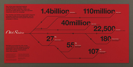
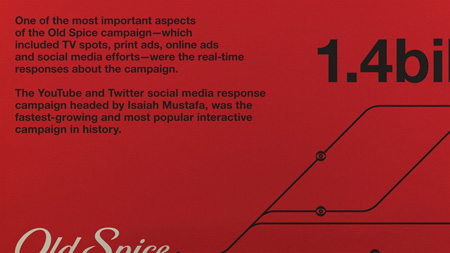
If you’ve heard recently, the Old Spice guy Isaiah Mustafa is back. His return makes this the perfect time to share with you a project that I (Shelby) completed a few months ago for fun. The goal was to create a refined and informative infographic. At the time of creating this the Old Spice campaign entitled “The Man Your Man Could Smell Like” was in full swing. Wieden + Kennedy were the brains behind the whole campaign and the results of their vision led to an exponential amount of social media buzz, exponentially exceeding the expectations.
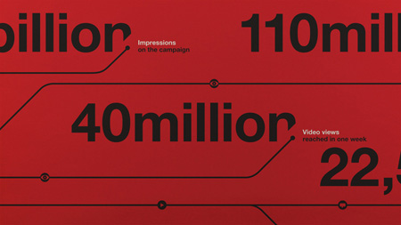
The question was how do I design for this. Do I pair the design with what the brand has established or do I take an alternate route? At the time I was heavily inspired by the international typographic style and Massimo Vignelli. This explains for the minimal layout and geometric line angles similar to the New York City subway maps. This direction didn’t come immediately. I had toyed around with various versions that were far from being relevant to Old Spice or being easily readable. Although with the final version having the least amount of information, it felt the most appropriate.
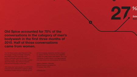
Data was collected from the marketing firm Symphony IRI.
Typeface used: Helvetica Neue Ltd Std

8 Comments Leave A Comment
Daniel Carvalho says:
February 1, 2011 at 3:01 amEven though there is very little information presented, I really love it. It looks great.
Chris says:
February 1, 2011 at 8:53 amCool work. My favorite parts are where you masked out the logo and large type.
Jakub says:
February 1, 2011 at 9:22 am“By Mennen!”
David says:
February 1, 2011 at 11:11 amI think this conveys the information in a very nice and clean way. The slight cut off of each large number and text is a nice touch. Loving the thickness and slight curves in the lines. Somewhat organic but defined enough to give off a sense of accuracy.
The only thing I did not like was the masking of the logo. Yes, for stylistic purposes I can see how it definitely fits in with the rest of the composition.
I feel that the identity itself is important, and doesn’t need to have the treatment. To me it gives off a sense of mysteriousness, while letting the numbers speak for themselves. (which for what you were going for seems appropriate)
Dunno, just like the “classic” feel the typography has when I look at it as a whole.
Nice work though, very nice.
Cassie McDaniel says:
February 1, 2011 at 11:59 amLove the graphic. I have one little niggling detail to point out, though: There is a grammar mistake in the first sentence in the upper left corner. Take off ‘One of’ or change ‘were’ to ‘was’ and you’ll have correct subject-verb agreement. Perhaps you could even change ‘about’ to ‘throughout’ which could be clearer, but don’t let me get carried away. =)
Daniel Carvalho says:
February 1, 2011 at 1:19 pm@david, regarding the masking of the Old Spice logo, I must mention that Old Spice did in fact use that exact same clipped version of their logo in some of their marketing material. I’d imagine that’s where Shelby got the inspiration to clip the other bits of type in the design.
David says:
February 1, 2011 at 10:39 pm@Daniel
Thanks for pointing that out. Interesting selection in my opinion. Something bold to try out. I commend them for doing it none the less.
Adam Morse says:
February 8, 2011 at 12:19 pmShelby,
How did you go about getting the data from Symphony IRI? Did you put in a media request or was it buried somewhere within their massive website?