Erik Nitsche
Posted by Shelby White


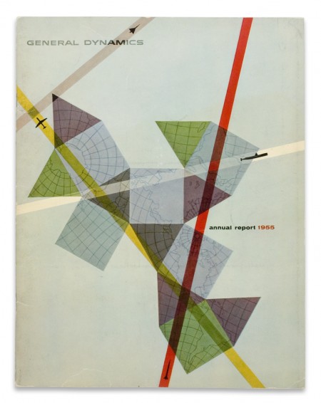
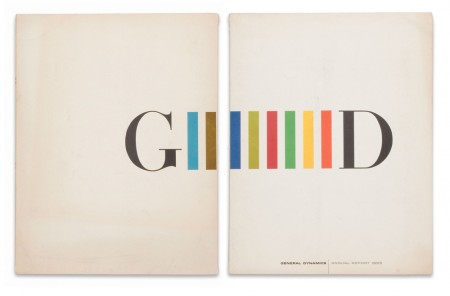
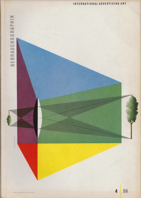
Clearly we’re fans of Erik Nitsche as we’ve posted a number of times about his work in the past. These three pieces are some of my favorites. The first and second were annual reports completed in 1955 and 1959; the third is a cover that was designed in 1956.
It’s really a shame the Flickr stream that held Nitsche’s work is now down. These images were found here.

5 Comments Leave A Comment
For-w-art says:
January 14, 2011 at 8:03 amMan that first one is just soo damm sexy & actually realy modern.
JGM says:
January 14, 2011 at 9:52 amI would love to have the name Nitsche, I would totally have pronounced it as Nietzsche.
haha
Cool artwork, too.
Michael Raiden says:
January 14, 2011 at 1:26 pmMmmm. These make me feel good and would make wonderful T-shirts.
Seth McNew says:
January 17, 2011 at 7:45 amThe first time I saw the work of Erik Nitsche, It really changed my Ideas about design. I did a design job for General Dynamics and it was supposed to reflect the look Nitsche crafted for them. As a result I got to see some of the original giant prints that were done for trade shows of the day and various others works by Nitche. I’m a huge unabashed fan of his work.
Kevin says:
January 18, 2011 at 1:14 pmFound one of his classical album designs for $5 recently. definitely worth putting on your list of things to look for at record stores/resale shops.