More Color For Blue Note


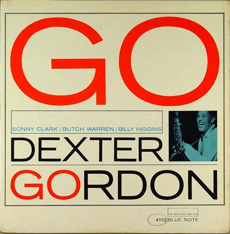
In the last Blue Note post I went with the more duo-tone offerings but with these 4 covers we see a bit more color injected into the compositions. That Dexter Gordon one is choice, this sort of stuff really needs to be offered in poster form. I always wonder who actually owns the rights to these images, I assume EMI does (they now own Blue Note), so that doesn’t bode well for future large format prints.
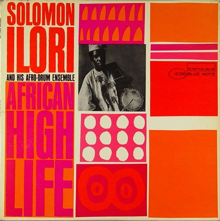
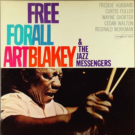
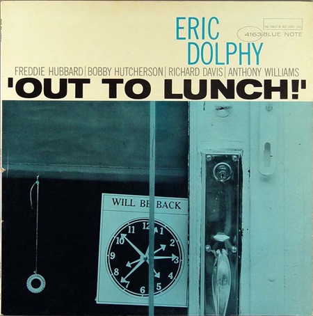
Massive bonus round: Name all the fonts used on these covers.
By the way, if you missed it last time, there was quite a nice debate running in the comments after the original Blue Note post. Worth a read, some good opinions from people in there. But no matter how good your opinion is, you can’t sway me from my original position: Cream > White!

7 Comments Leave A Comment
Esben Thomsen says:
July 22, 2008 at 4:55 amSolomon Ilori is a compressed Helvectica.
The jazz messenger is.. Im guessing – DIN 1451?
Dextor Gordon is Trade Gothic
Brad Blackman says:
July 22, 2008 at 7:06 amGO/Dexter Gordon looks to all be Trade Gothic Extended.
Solomon Ilori looks like some compressed Helvetica. (Or Haettenschweiler)
The Art Blakey is Trade Gothic Condensed Light and Franklin Gothic.
Eric Dolphy is mostly TGC and some horizontally stretched gothic. (Look at the U — the inside curve doesn’t match the outside.
Esteban says:
July 22, 2008 at 7:08 amDextor Gordon is Trade Gothic; ¡yes!.
Solomon Ilori is a compressed Helvectica. It must be…
“Out to lunch!” should be extended Helvetica then…
“Free for all Art Blakey & the jazz messengers” is Franklin Gothic Condensed.
The artists names are in News Gothic.
john says:
July 22, 2008 at 10:26 amforget the cover, out to lunch is a classic album!
Lucas says:
July 22, 2008 at 11:29 amCream > White
definetely!
No doubts about it!
Nice covers!
bobbygrotesk says:
July 23, 2008 at 9:54 amTrade Gothic for the win.
Such a beauty.
Dave says:
August 2, 2008 at 7:12 amCheck this out:
http://www.gokudo.co.jp/Record/BlueNote4/index.htm
Huge collection of jazz covers, most notably from the Blue Note catalogue. It’s also nice to see the covers displayed chronologically, so you can get an idea of how ideas and styles developed over the decades.
If you enjoy a specific album cover for its design, check out the music so you can get an idea of where these designers drew their inspiration. Truly some of the most innovative, emotional and technically impressive acoustic music ever produced in this country.