Plancast Penguin // Development Process
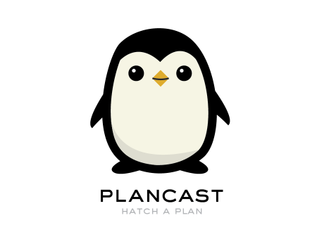
I was hired about three months ago to design a logo and consult on the brand identity for Plancast, a local San Francisco start-up founded by Mark Hendrickson and Jay Marcyes. As you can probably guess from the name, Plancast a way to broadcast your upcoming plans to your friends; or as it’s often described, Foursquare for the future. The site is exceptionally easy and helpful, and I encourage you to check it out.
By the time I joined on Plancast was up and running, but they were without a logo or distinctive visuals. I began work in December and we agreed on the finished logo a few weeks ago. The project was easily the hardest I have ever completed — as well as the most fulfilling. I almost destroyed myself developing this logo and I am really excited to share the process with you here.
The Brief
The first thing we discussed was the dual visual representation of a product that is as fun as it is useful. A tricky combination! Mark wanted Plancast to feel fun and exciting, but also seem like a product that could actually help you. It had to feel reliable and well crafted. It had to be accessible and interesting. “Quirky” was included as a possible adjective, but with caution.
We also discussed the need for an imagery-based logo as well as a typographic one. Unlike many start ups, Plancast was to have a symbol that could stand alone to represent the brand. I agreed with them completely on this point; I think if you can pull it off, having a stand alone mark without type is always a good idea. I get the all type thing of course, but it can be a wasted opportunity not to at least try for an icon.
I researched tons of other start ups and immersed myself in that world for a long time. You spend enough time digging around and you find a lot being done right and a lot that is completely missing the mark. Vimeo for example was one site that we discussed as having successfully achieved a good balance of fun and utility. I liked how, even without a crazy logomark, they were able to portray an exciting world inside the site. There is a unicorn chilling on the bottom of the page and it still feels like a completely normal site. Balance achieved!
Initial Concepts and Sketches
Immediately thrown out the window was anything relating to broadcasting, radio signals, or antennas. These were the first things I thought of and this made them very unappealing. It’s tempting to go this route, with “broadcast” basically in the name of the company, but I knew I’d have to work harder than that. Would have been way too obvious and expected. These sketches were disposed of.
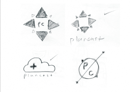
Next I started thinking about directional symbols and compass roses. Since so much of what Plancast did was centered around your physical location, I figured this could be a decent route to explore. It still sounded boring, but I thought it could be cool if I was able to render a slick enough looking symbol. Below you can see some of these attempts.
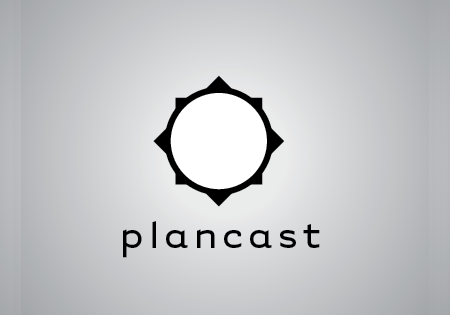
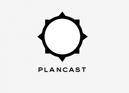
When these ideas were presented (along with 8 or so other options in this vein), the general feeling was that, while they looked cool and sophisticated, they were almost too refined. There was no fun! This was a wake up call for me — I was coming off of my Playboy project where everything was to be minimal and restrained — I had forgotten how to visually convey fun.
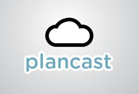
One idea I did kind of like was the cloud logo below. I always liked comparing the word “plancast” to “forecast” (because you are basically predicting/forecasting your upcoming plans with the site). The cloud, and the compass rose sun above were riffs on this concept. Still not quite fun enough though. (Though I had fun Twitterifying the type below. The typographer in me died a little bit)
Directional Shift / Character Introduction
Mark and I started to discuss the possibility of using a character for the logo after the initial passes weren’t that exciting. I love character logos and this was a very exciting shift for me. I dove headfirst into the world of character design. I can recommend the following books that helped me wrap my head around effective character rendering:
Character Design Today
Pictoplasm 2
Character Design Collection
Below you can see some of my first sketches with this new direction in mind. I liked the idea of using a robot because they can look pretty much however you want them to. People aren’t able to say “hmm yeah I guess I know what that is, but you drew the feet a little weird.” I was excited to invent my own little species of electronic Plancast robo-buddies.
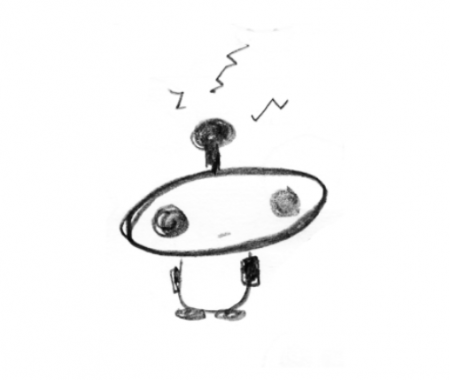
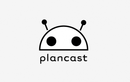
Oh if it wasn’t for reddit and Android (and every other robot logo)! I designed a number of robot characters that were basically rip offs of either of these sites or robo.to. It took me a while to realize it, but after time away from these designs I realized I wasn’t doing anything new. It was just too close to existing characters. There was also no soul. Look at the robot above. Do you want to make plans with him? I think not.
Progress Evaluation
At this point, January was coming to a close and I didn’t feel very optimistic. I had projected completion by January 28th and I was running very low on ideas. School was about to start and I needed to finish things before that happened. I had generated hundreds upon thousands of sketches and ideas and nothing was at all exciting to me. How do you visually convey plans! I obsessed over this and drove myself completely insane.
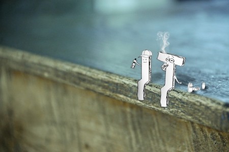
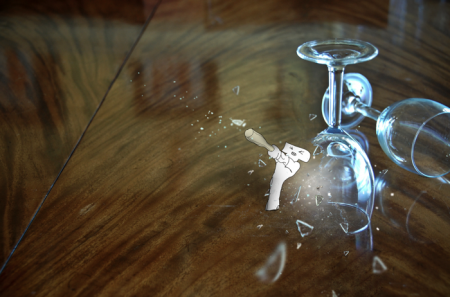
For inspiration I started digging around for some of my weirder projects. One, which I rarely show anyone because it was so bizarre, was a book where a group of wild roaming letters realize they exist inside of a book and try to escape. This helped to spark a few ideas and get me off of the boring or expected track I was on. I continued on with a new sense of optimism and excitement. A couple of spreads from the book are below (one where the letters were docile and one where they begin their attack on what they perceived to be the belongings of the owner of the book. Like I said, a weird project):
The Penguin Comes into Play
Mark and I continued to meet and discuss the project. Throughout, Mark basically served as art director, and as founder of the company, he knew exactly what he wanted out of the logo. He was remarkably good at conveying these ideas to me.
During one of our discussions we started kicking around the idea of using an animal character instead of a robot. The question then becomes, which animal makes the most sense? My first thought was a lemming — since they follow each other everywhere — but they also have a reputation for batch suicide…I figured this was not something Plancast wanted in their brand message. Which other animals follow each other around?
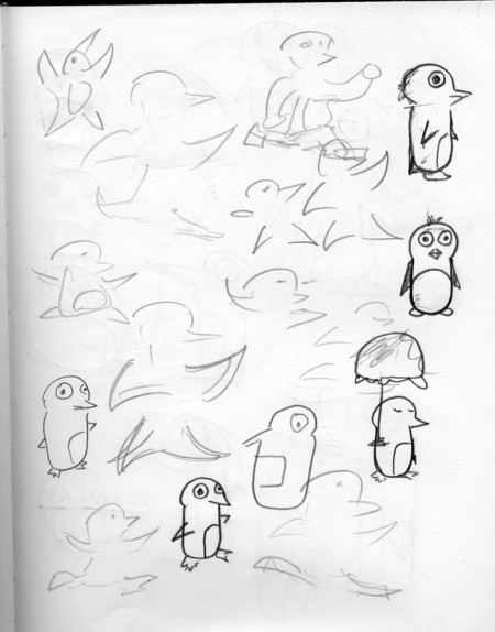
Penguins! This sounded like a good idea and I began sketching. Like the users of Plancast, penguins follow their friends around all over the place. Whether it’s to go swimming, or marching, penguins are always following each other around and making penguin plans. This is the main concept behind the penguin choice.
We also had discussed the similarities of Plancast with Twitter. In both cases, you are broadcasting what you are doing (present or future, depending) to your friends. One crucial difference being that each ‘broadcast’ on Plancast is, on average, of more weight than your average tweet. On Plancast, you actually intend to do what you send out and there is no space for innocuous meanderings as there is on Twitter. Of course, we love Twitter for this, but the concept of having “weightier broadcasts” was intriguing. Given that Twitter’s logo is a bird, why not make Plancast’s a heavier bird. A fat happy penguin for the win.
At the end of the day, people love penguins — so even without the conceptual duo above, a penguin seemed like a good choice. We wanted the character to be approachable, friendly and cute — all things that penguins can easily portray if rendered correctly. (The Linux penguin for example looks like he would be a chill guy to hang out with).
With this new direction in mind, I began drawing penguin upon penguin. If you could only see the Illustrator document I have with all of the penguins in it. It is unbelievably massive. Having had fairly good success drawing a fox for my last logo project, I wasn’t expecting to hit such a wall trying to draw a penguin. Below are a few of my attempts:
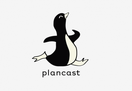
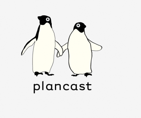
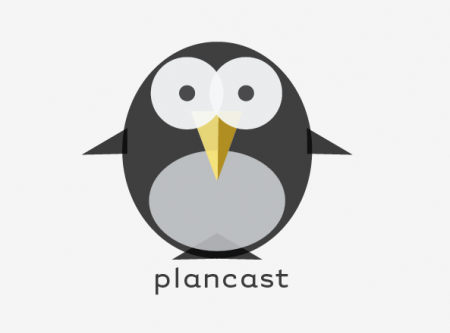
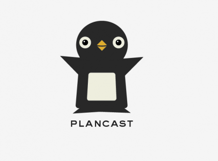
Each of the above was at one point considered (by me) to be the new logo. Each had a lifespan of anywhere between three hours to three days. Eventually they all fell by the wayside as both Mark and I didn’t see what we were hoping for in the penguin. There wasn’t enough personality, they weren’t cute enough, they just weren’t right.
The Final Penguin
The goal at this point was “cute”. We were happy with the concept of a penguin, and some of the previous ideas were working, it just wasn’t cute enough. I remember just about all of this project development very clearly (given how intense it was), but I remember when I drew the penguin below the best. I was driving myself crazy trying to rework a previous design and I finally gave up in a fit of confusion. I decided to start over completely (I had been recycling eyes and fins here and there).
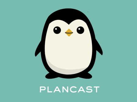
I had been working with the tagline “Hatch a plan” and thought it might be funny if the penguin somewhat resembled an egg. People wouldn’t pick up on the connection I knew, but I liked hiding this little conceptual easter egg in there. Once I drew the basic shape of his head I knew I was on to something. After about 20 minutes I had the smug little fellow below and everything felt like it clicked into place.
I really can’t explain how this one felt different than all of the other penguins I had created. He definitely had more personality, but I didn’t feel like I had done anything differently to conjure this visually. There was a magical twist that occurred somewhere along the line and I wish I could explain what happened so I could repeat it on future projects. In the end I felt like I wanted to make plans with this one — he looked like he had his situation figured out.
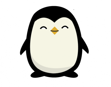
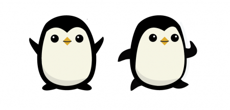
The great thing about this penguin was how easy it was to put him into different situations. Different expressions and positions of course, but also uniforms or anything! The idea being that the logo is not one specific pose of the penguin, but rather the penguin character as a whole. Whatever he happens to be doing at any given time is the logo at that moment. You will always be able to recognize him as the Plancast Penguin, but he is always up to something new. He’s got big plans after all.
Typography
I hate to shortchange the typography portion of this logo, but compared to the icon development, it just didn’t take nearly as long. We locked in on this typeface from the beginning and never found anything we thought was more successful. The choice to go with all caps was very deliberate and I really enjoy how it stands out amongst the infinite world of lowercase start-up logos. The juxtaposition of the cute cuddly penguin with a very serious typeface is a pleasing one. Going back to the original goal of portraying a fun and useful product, this penguin/typeface combination does this effectively.
Conclusion
Well that’s it. As I said, the hardest and most fulfilling project in my career thus far. Mark Hendrickson was great to work with throughout the process; easily one of the most judicious clients I have ever encountered. Each time I would come with a design he would clearly explain what he liked and didn’t like. No waffling or confusion. A refreshing change!
There is still much work to be done — tshirts, business cards, etc — but it’s all fun now that there is a happy Plancast Penguin in existence.
Don’t forget to check out Plancast!

67 Comments Leave A Comment
Julian says:
March 10, 2010 at 1:59 amFantastic work. The outcome is my favourite of all the concepts.
Lincoln Patrick Furrow says:
March 10, 2010 at 2:10 amAgain, I’m blown away at how awesome you are. It’s always inspiring to see a well-respected designer’s thought process, and one so detailed as this is even better. Thank you for the insight.
James says:
March 10, 2010 at 2:30 amOh, congratulations! Fascinating to read and inspiring to see that when you kept your chin up and kept the brief in mind you can eventually reach a brilliant solution. Nice one!
James
Rushit P Dubal says:
March 10, 2010 at 4:13 amHi Scott,
Nice to see your blog & creativity
m Impressed by the way you work
My name is Rushit
M from India, working in an advertising agency
as a client servicing Exec.
I want to learn designing tools to design
like you.
I love the way you make these all creative
Pls Reply me on only_rushi4ever@yahoo.com
Jacob says:
March 10, 2010 at 6:25 amNice work Alex! Thanks for detailing out your process.
Bigsky says:
March 10, 2010 at 8:17 amGreat work on the process.
It’s just really disappointing how it is executed on the actual site.
Once you’re past the first page the penguin is no longer around and everything is so generic.
There’s no help or how-to section so it’s hard to know what Plancast actually is or does.
Alphonse says:
March 10, 2010 at 8:18 amExcellent. Can’t say the site does justice to it though.
That first set of comps is beautiful, especially the third one. I’d tuck it away. Its really too good not to be used by someone/something.
Rudolph Pokorny says:
March 10, 2010 at 8:40 amI agree with Alphonse. The logo is fantastic. The use on the site…not so good. I would have loved to see the logo remain in the teal-ish square you showcase it in.
The type on the site separated from the logo is too strong.
Fab logo though! Just wonderful!
Mark Hendrickson says:
March 10, 2010 at 9:56 amAlex did a fantastic job with this logo, especially since he started off with very little direction and figured things out along the way. He took my harebrained ideas well and came out with iteration after iteration, each helping us to figure out what style was most appropriate. When he finally showed me the final penguin design (whom we’ve dubbed “pepper”), my gut reaction was “that’s it!”. I couldn’t be more satisfied with the result, and it was a pleasure spending the time we did to get to that point.
I also agree with others in the comments saying we don’t do the design justice on-site yet. I just wanted to throw it up there so people could appreciate it! We’ll swing back around and give it better placement throughout the site. A penguin’s environment is important.
Jaymon says:
March 10, 2010 at 10:12 amI agree with everyone that the use of the Penguin on the site isn’t as good as it could be. That’s mainly because the site design is in a state of flux as we keep getting hit with wave after wave of traffic and we have to turn our attention elsewhere.
My guess, the Penguin will play a much bigger role around the site in the future as we slowly redesign the site.
Also, Alex is an amazing designer. I loved the Playboy logo redesign but I love the Penguin even more. I can’t wait to see the Penguin dressed up like Santa or something for Christmas :)
Abby W says:
March 10, 2010 at 10:59 amWhere is this unicorn on Vimeo? Great post!
Ramune (every.seven) says:
March 10, 2010 at 11:15 amThanks for posting your process. I am going through a rather ridiculous logo design situation right now with a client who sounds quite the opposite to yours (he has vague ideas of what he wants, but keeps waffling).
I love the idea of a penguin and especially love your final choice. I also noticed the egg connection before I read that you wanted him to be egg shaped. Nicely done!
NAVIS says:
March 10, 2010 at 11:35 amAwesome job Alex. Your eye for typography is ridiculous. You make it look so easy.
Also, this quite possibly one of the funniest posts I’ve read on this blog. I lol’d like nine times. Maybe 12.
Alphonse says:
March 10, 2010 at 12:20 pm@ Ramune
Best to avoid these types of clients if you can. If you hear the words ‘I don’t know what I want, but i’ll know it when I see it…run!
christopher scott says:
March 10, 2010 at 1:04 pmGreat write up Alex; you’re an awesome service to the design community by exposing your methods like this. As a self-taught designer, I tend to canonize articles like this for their honesty, and usefulness. Great design, and congrats on an amazing project!
Tsuperb says:
March 10, 2010 at 2:56 pmExcellent logo and typeface, and the process behind it really shows that this career is not as is easy as people thinks!
Keep rockin’ it Alex!
Ian Houghton says:
March 10, 2010 at 3:10 pmNice work on the final logo Alex (I also liked your first ‘compass point’ approach), it’s cool how much versatility character logos have – I’m envisioning the penguin poking his head out of an egg on the ‘new plan’ page. :)
Jason says:
March 10, 2010 at 4:35 pmThe cloud looks too much like soundclouds identity. Good call not going with it.
Coenie Sutton says:
March 10, 2010 at 10:29 pmHey,
Well done. The is the “cutest” logo I have seen in a while. Thank you for sharing the process.
Tony Park says:
March 11, 2010 at 1:44 amAs everyone else has said, this is an excellent insightful post. Thanks Alex.
Without going into specifics, can you say a little about the contract arrangement you had with Plancast? I ask because I’m always intrigued how those arrangements can influence creativity and also relations. For example, when working to a fixed budget, when I’ve found myself in this kind of situation and there are this kind level of revisions, I’ve felt increasingly pressured and frustrated with either myself or the client that we haven’t arrived at something suitable.
On the other hand, if the contract is purely time-based, it’s easy for the client to feel similarly frustrated that they aren’t getting value for money.
LUKE MORGAN says:
March 11, 2010 at 2:04 pmWow, thanks for sharing!
Chris says:
March 11, 2010 at 7:59 pmI really like the final penguin as well as a few of your other ones. I honestly like the skipping one the best because it’s got a real old school cartoon quality to it. I also prefer the lower case Plancast. I feel like the uppercase Plancast is very serious and structured while the penguin is squatty and cute. Doesn’t seem to fit in my eyes. Just some unsolicited criticism. HA!
However I really respect your design abilities and taste. That’s why I frequent this site all day long even though the posts only change once a day.
I second everyone’s comments on showing your process. I always love seeing how others think and work. Thanks for that!
Chris Ball says:
March 12, 2010 at 2:17 amGreat work Alex.
I particulary like the honesty of this post, with the cul-de-sacs and dead ends all detailed.
I was going to say he looks a little like Wheezey from Toy Story but I did a quick check and they’re completely different. Not even the same species of Penguin.
Brent says:
March 12, 2010 at 10:02 amAlex, this work is amazing. I love seeing your process and I like the ‘final’ version a lot. The fact that you’ve been working so diligently since December is a reminder to me to remain patient with clients/customers. :) Thanks for the post!
mp says:
March 12, 2010 at 1:21 pmGreat work here and thank you for sharing your process. Interesting use of the penguin. My first thoughts after seeing it were, wow – that’s new, current and fresh! My second thoughts were the associations with linux and twitter.
What’s the typeface you’re using?
Dan of Twistedfork says:
March 13, 2010 at 10:26 pmI like this Alex. :) Thanks for sharing the process. Always nice to look at the different work processes of people. Cheers!
Naina Redhu says:
March 15, 2010 at 10:57 amI second Tony – I would like to get some idea regarding the contract – I suffer from the same anxieties as Tony and while we have lots of designers sharing their processes, me included, we don’t have anyone talking about contracts. In the past, I’ve worked like this for fixed budget projects simply because I knew I’d hate myself if I stopped at mediocre. But I’d like to know how others deal with the situation as well. I’ve also had clients who were ok with my billing them extra for extra iterations and concepts. But that’s rare.
Crystal Yan says:
March 15, 2010 at 9:33 pmAs a young aspiring/amateur designer, I loved this post! I was one of the early-ish users of Plancast, and I love it so when I saw the new penguin logo, I was pleasantly surprised and wanted to know the story behind it. Thank you for this! Totally cute. :)
Tam Houetin says:
March 16, 2010 at 10:49 amAs a fledgling designer myself it’s fascinating to read about the process that led to the final logo design. Thanks so much for sharing it with us.
maria says:
March 17, 2010 at 2:37 am*standing ovation*
I really enjoyed the process. I think that typo is determining to get a balance between formal and informal (in the good sense of the word). Congrats for the great work!!
Dan Eris says:
March 17, 2010 at 4:00 amGood work here Alex. I definately think the organic style of the final logo works better than the more geometric designs that preceeded it.
Nikki says:
March 19, 2010 at 5:17 amBased on how adorable your logo is (I’m a penguin freak, don’t judge), I joined Plancast.
Logo design: WIN
Victoria says:
March 20, 2010 at 6:12 amThis is brilliant and truly inspirational! I totally saw the egg before you mentioned it! Well done! I love your process.
Sarah says:
March 20, 2010 at 9:51 amNice work, your penguin is really cute!
Have you ever been to Tokyo? They have a penguin for their transit payment system logo that is everywhere. http://www.jreast.co.jp/suica/
katie says:
March 21, 2010 at 12:31 pmThat little guy knows just what he’s doing. He’s got big ideas. He’s going places.
^_^
I’m not in the design world, so as a purely objective consumer I can say: I totally want to know what this character is up to, and it makes me want to investigate the company/product to find out. A great success, I think.
Jake says:
March 21, 2010 at 6:36 pmAlex-
Great walkthru on your process. I love to see how people work through ideas, it gives me encouragement. Great finished design.
Jake
Andrew says:
March 22, 2010 at 8:14 amAlex
Love the final mark, and thanks for sharing the process. I’m also working on branding a startup (in the Midwest). Would you mind sharing a list of 10 or 20 startup identities that you looked at for context? Much obliged.
Cheers.
Andrew
Peter says:
March 22, 2010 at 4:00 pmIt’s Pepper, right?
patrick james says:
March 22, 2010 at 9:22 pmVery cool! Love the type. I gotta say though, it reminds me of chilly-willy. That’s a good thing. Wonderful job Scott.
Dusty says:
March 24, 2010 at 3:05 amThe link on your homepage to this spells ‘design’ wrong!
Otherwise, very cool take on the logo. Found it through
Dusty says:
March 24, 2010 at 3:06 amDidn’t show the link!!
underconsideration.com/brandnew
Shannon says:
March 26, 2010 at 7:45 amI really like the final logo. I can appreciate the process you went through to create the final piece. In reading it I can see how it was a difficult one. Great job!
S
Anthony Brown says:
March 26, 2010 at 11:30 pmAwesome job! As the Penguin keeper at the SF Zoo, I’m a big fan of Penguin art! Would love to see some of the other Penguin sketches you made.
Ralf Breninek says:
March 29, 2010 at 1:51 amI love how the logo turned out and the textual concept on which the idea of using a penguin is based.
Whats kind of disturbing me is that the upper left edge of the white skin / feathers looks a bit edgier then the right one…
Greets
Ralf
Kris Robinson says:
April 1, 2010 at 7:04 pmLooks great! What an awesome blog post…
Charlene Grace says:
April 22, 2010 at 1:36 amPenguins have always been my favorite animal, and I’m a total fan of your final logo design! The first time I saw this logo, I thought the penguin was the CUTEST little thing! If you ever decide to make this cute creature into a stuffed animal, I would buy one in a heartbeat!
Jotae9 says:
May 10, 2010 at 5:58 amTo be honest, I have not paid full attention to every preceding post. Instead I made a quick & vertical read, just to see almost every comment here is all ovation, applause and people satisfied whit what they see, regarding your penguin logo.
Sorry. Call me blogtroll if you wish, not my intention indeed, but if I, for once, would come up to a client whit a logo and a concept such as this, I’d probably get fired (unhired, actually).
No… it’s not like seeing Linux, how come… Ah… Penguin books… c’mon, it is not the same…
Now, seriously, didn’t you have had time or budget enough to give the screw another turn? That solution is tought to be of a 1st level Design School student.
Sorry to be that hard, but I litter hundreds of proposals like this every week. From myself and from my coworkers. All of us push our very boundaries further than expected.
Someone had to tell it.
Cheers.
David Crawford says:
May 17, 2010 at 6:30 amYeah, I guess I will be another person not to gush about this solution. I am not so much concerned that it is a strait kawaii styled penguin knockoff (http://bit.ly/bHITDm) as I am bothered by the unrefined illustration style. Notice the odd curve on the top left side of the penguin – and how it doesn’t match the right side. Notice the unrefined black line for the mouth.
It is not a terrible logo. But, I think it needed to be pushed further and needs better refined. It nice that you have had success with this logo – but I am sure you’ll look back on this one in a few years and see what I see.
Good luck with it all.
David
outsourcing process says:
May 19, 2010 at 4:32 amIt is not a terrible logo. But, I think it needed to be pushed further and needs better refined. It nice that you have had success with this logo – but I am sure you’ll look back on this one in a few years and see what I see.
David says:
May 19, 2010 at 4:40 amSPAM!!
nizam says:
May 19, 2010 at 5:21 ammkinfotec is outsourcing company & data entry data converation projects will done
David Crawford says:
May 19, 2010 at 6:02 amYeah, so spam.
Handbags says:
December 6, 2010 at 3:58 pmwow, I usually dont read these types of blogs cuz I think the industry is going sour but im feeling this so im gonna bookmark this site good looking!
Purse Parties says:
December 7, 2010 at 10:32 amwow, I usually dont read these types of articles cause I think the industry is falling off but im feeling this so im gonna subscribe to this site thanx!