POGO / SOKO
Posted by Alex
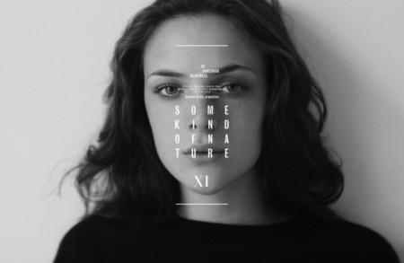
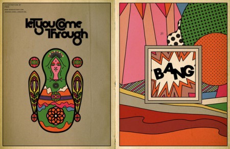
If you’re in need of some editorial or layout design inspiration, head over to the Behance site for POGO. I’ve just been cruising the archives of all issues of the online magazine SOKO. There is a ton of great typography and photography throughout each issue and I’m sure you’ll find something you like. Content-wise, it’s mostly fashion we’re talking, but it’s really just a playground for POGO to go crazy and design what they like. I also included their video Voyeur, because the color and post-processing is so good it made me forget I have to go to work tomorrow.


9 Comments Leave A Comment
Alex says:
July 6, 2010 at 2:39 amThis is a handy resource. Although their website is a bit trippy.
Cameron Ballensky says:
July 6, 2010 at 4:22 amThey also keep their facebook page updated very regularly. I suggest following them on there too.
http://www.facebook.com/pages/POGO-design-studio/173139949630?ref=ts
brooks says:
July 6, 2010 at 3:44 pmCould everyone please promise to never use EITS or Sigur Ros in any more videos? Especially extremely unfitting ones.
Chris Deutsch says:
July 7, 2010 at 5:16 pmThe sun-drenched pic of the girls is AMAZING!
Daemian Smith says:
July 7, 2010 at 7:17 pmHi there,
Glad you like the color on the video. I did it myself!
And to Brooks Reynolds… “extremely unfitting,” eh? You mean like when people who take extremely boring photos have to resort to using tilt-shift lenses?
brooks says:
July 9, 2010 at 9:20 pmChill out dude. Some nice post-rock should help you with that.
The video is tight. Just really not down with the song in it.
Vitor says:
July 12, 2010 at 9:28 pmI’ve loved yours posts… I will be back soon :D