And per se And


I’m embarrassed to say I cannot draw an ampersand from memory; when I do it always looks like an unfortunate treble clef. Regardless I think the ampersand is easily the coolest symbol in any character set (or ever…). There are many reasons for this assessment.
First, it’s a complex symbol. Often times an ampersand would look more at home amidst a group of kanji characters rather than a cluster of geometric letters. This makes it very interesting to look at and you end up perceiving the overall shape, rather than the distinct path of the lines. Second, it can exist in many different forms and still be understood as an ampersand. I suppose this is the same for most letters, but the ampersand varies the most substantially between typefaces (thus allowing for the most potential random awesomeness). The creativity of the typographer is best (or at least more freely) expressed through the ampersand. Lastly, it stands for the word “and”, which if I were a symbol and I had to stand for something, would be a pretty damn good choice. Very optimistic and inclusive. I suppose the only sad thing about the ampersand is its relative absence from written English. (Though Wikipedia tells me it’s making a comeback via text messaging. I’ll have to get on that…)
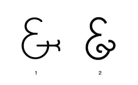
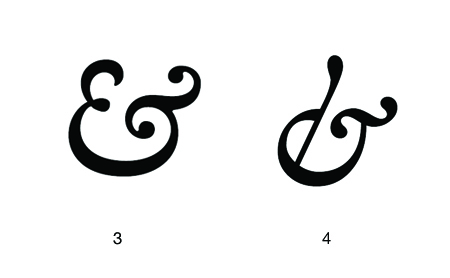
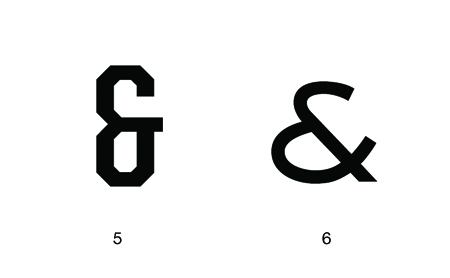
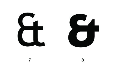
I can’t write a post about ampersands and not mention the best blog ever: Ampersand. And another one! 300&65 Ampersands. Above I’ve collected just a few of my favorite ampersands; not a definitive list by any means. Links are below:
1. BernhardFasD
2. Caviar Dreams
3. Caslon Semi Bold Italic
4. Hoefler Text Italic
5. United Sans Condensed Bold
6. Sackers Gothic Medium
7. Trebuchet
8. Aller Display
And yes I know the Mother and Child logo is the coolest thing ever. I know there are more killer ampersands…list your favorite here.

24 Comments Leave A Comment
Ignacio says:
February 4, 2010 at 12:12 amSackers is my favorite typo of all time.
Brennan says:
February 4, 2010 at 6:22 amOh no!
I’ve been using them as shorthand in my own notes for a while, but I just realized that I’ve been drawing them backwards all this time.
Dang. Oh well.
Also, interesting glyph research: the difference between ampersands and asperands.
faberdesign says:
February 4, 2010 at 6:53 amAlex, I assume you’ve seen Haäfe & Haph? http://www.haafe.com/
Ampersands are on an internetty zeitgeist high these days… (although when are they not?)
RA_OUL says:
February 4, 2010 at 7:11 amThis might be the best ampersand I have ever seen: http://www.flickr.com/photos/andandandcreative/4138801384/
This one is pretty rad as well: http://neusblog.com/2009/01/ampersand/
Nikki Selene Lamagna says:
February 4, 2010 at 7:18 amI am in love with the ampersand. I made a choice when I redesigned my personal site to always use the ampersand instead of spelling out ‘and.’ The elegance of the ampersand in Baskerville font takes my breath away each time I see it!
rent says:
February 4, 2010 at 7:19 amthe united and sackers gothic are are just perfect. great links too, alex…enjoying this ampersand website.
Squaregirl says:
February 4, 2010 at 7:57 amThis is awesome. I just got engaged, and was thinking an ampersand would be the perfect design element for my invitations and website.
I’m personally a fan of the House Cast Aluminum Ampersand.
http://www.houseind.com/objects/accessories/castaluminumampersand
Squaregirl says:
February 4, 2010 at 7:57 amOh, and, the ampersand Jina uses at Sushi & Robots is pretty fab as well.
http://sushiandrobots.com/
Rempty says:
February 4, 2010 at 8:11 amAlways loved the Cooper Black ampersand.
http://www.thedesigncubicle.com/wp-content/uploads/2009/02/cooperblack.png
Jon Mutch says:
February 4, 2010 at 10:28 amI’ve made a poster series around various ampersands. Love em!
http://cargocollective.com/jonathanmutch#221700/Ampersand
Derek says:
February 4, 2010 at 10:50 amBaskerville Italic has a nice ampersand. Mrs Eaves has a nice italics ampersand. Most of Emigre’s ampersands are really nice. And my new favourite ampersand is from Youworkforthem’s Agostina. It’s similar to the Caviar Dreams up above.
Justin says:
February 4, 2010 at 1:32 pmAmpersands are the BEST.
http://www.flickr.com/photos/justinchildress/4247264878/
Taylor Steele says:
February 4, 2010 at 2:57 pmHuh. Interesting.
Swap it! Encrypt it! | Transfer files – Send large files
http://www.swapitencryptit.com
Ethan says:
February 4, 2010 at 4:33 pmNice, I’ve been growing particularly fond of Hoefler Text lately. Ampersands are super cool, and I’ve found can often be a big factor when choosing a typeface…
Sébastien says:
February 4, 2010 at 5:33 pmIf the Mother and Child logotype is the coolest thing thing ever,
then you should check other masterpieces designed by Herb Lubalin.
Like the logotype for Ampersand Productions
and Pistilli Roman.
Gjermund says:
February 5, 2010 at 2:54 amI guess it’s fair to mention that ampersands are actually a ligature of “et” – the Latin word for “and”. A lot of these makes a lot more sense that way.
Kyle says:
February 5, 2010 at 7:53 amI love the ampersand on Kanye’s 808s & Heartbreak album cover.
I don’t know what typeface that is, but I’ve been trying to train myself to draw ampersands like that myself.
Jeremy says:
February 5, 2010 at 12:05 pmThen you should all check out this shop in Portland, Oregon. Easily one of the best design/photo/ephemera shops I’ve ever been too. One could spend hours there…
http://ampersandvintage.blogspot.com/
Cheers.
sr rodríguez says:
February 6, 2010 at 8:17 amLove them as well.
Ampersands always make me think of kanji as well.
Kanji (as chinese and korean writing as wel, so far it comes to my mind), are finally just clusters of gemoetric symbols as well as ampersand. Kanji coming from original arcaic chinese symbols.
Korean is intelectually so inspiring. Each character is a syllable, combining in one item the letters which form that syllable.
Ampersand is exciting since it’s an example of roman alphabet behaving as these oriental cases, soooo cool.
Tim says:
February 8, 2010 at 6:44 amSome lovely blogs there
A couple of years ago some guys at my college did a project where every student designed their own ampersand. There were some nice results, you can see some of them here:
http://www.samsweeney.com/ampersand.html
cmykinky says:
February 10, 2010 at 10:58 amMy favorite ampersand is Caslon italic, and I agree that if I had to be any symbol/ligature I would be an ampersand. I am so in love with ampersands, that I got it tattooed on my inner left wrist, the hand I create with. Maybe cheesy to most, but it means the world to me, & reminds me to keep on creating.
Pegasus says:
February 17, 2010 at 8:35 amGjermund in post 17 is correct. (knowing origins in design can be SO helpful!) And what’s more, you all should never have trouble drawing an ampersand ever again if you remember it comes from the latin word “et”. Just go back and look at all those lovely examples with that in mind.
irz says:
March 25, 2010 at 11:55 amInspiring :)
And I thought I am the crazy one seeing beauty in such minute details of the world.