Albert Exergian: Minimalized TV
Update: Thanks Wilamagamid for pointing me over to Blanka, where you can purchase these prints.
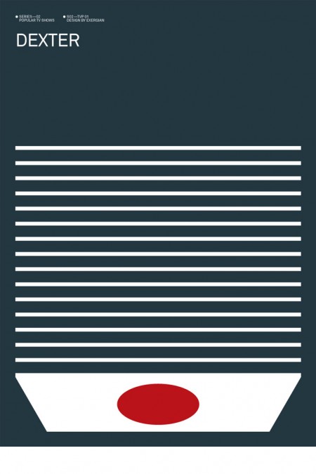
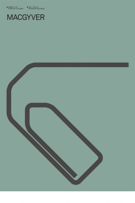
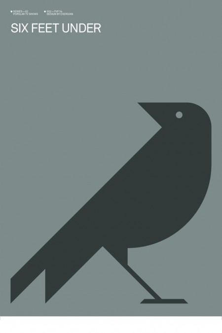
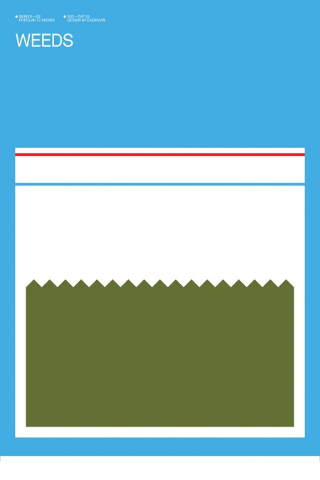
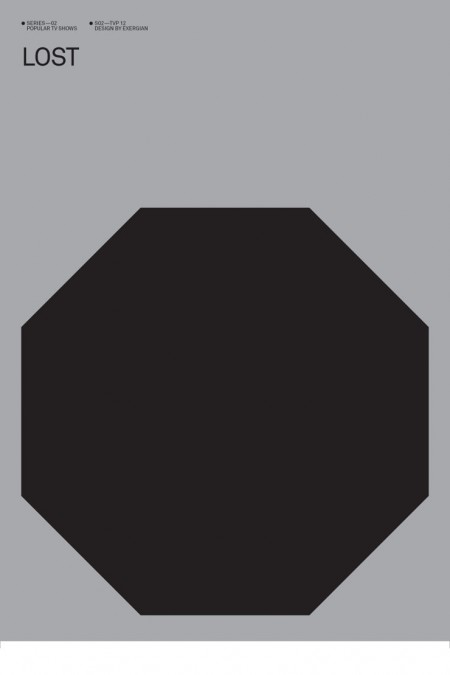
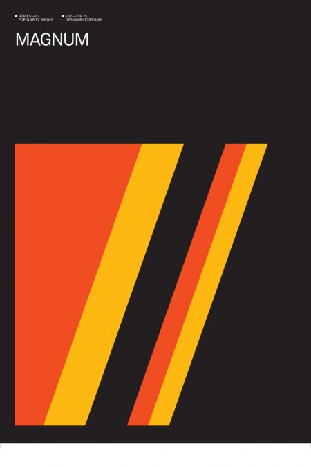
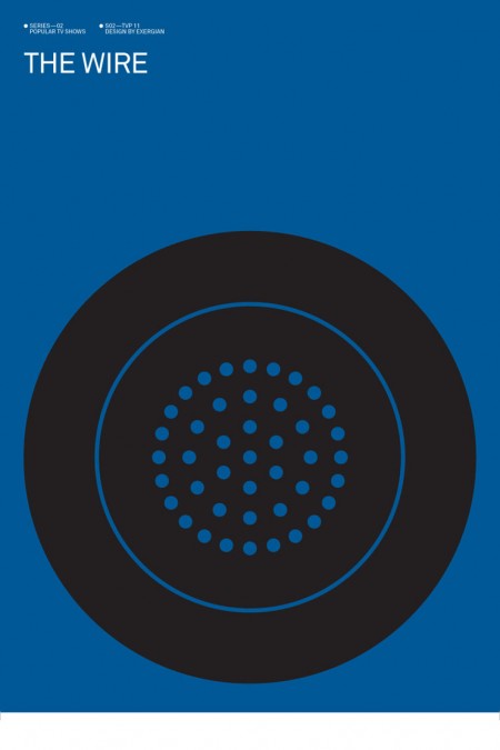
Albert Exergian created this series of posters depicting popular television shows boiled down into their most simplified forms. He describes them as “A HUMOROUS VIEW ON TV CULTURE” but they don’t strike me as being particularly humorous. Intriguing is a better word, Exergian’s sense of efficiency is uncanny. This would make a great set of screen prints, if only he were selling them. I guess he might have some legal issues though. Although, he’s only really putting words on a page; does writing “Dexter” (my favorite poster by the way) constitute copyright infringement? I hope not. Anyways, if anyone knows where to get prints of these, please let me know.
More posters at Albert Exergian’s portfolio (scroll down)
Update: Found better images over at Blanka, but the following gripe still stands! Major tangent here: Sorry for the white lines around the edges, I got these directly from Exergian’s site and that’s how they came. This brings up a HUGE gripe I have with Photoshop: If you don’t flatten a file before you resize it, the edges tend to show through to the transparent background so when you save as JPEG, it ends up with these annoying white lines. I have no idea why this is so, but it is. I guess it’s time for another “Dear Adobe” post.

27 Comments Leave A Comment
Wilamagamid says:
December 10, 2009 at 3:59 amActually, Scott, they are being offered as prints here:
http://www.blanka.co.uk/Art/Exergian/Iconic_TV
And a question to you and the readers here who view his other posters. I can’t figure out what the Miami Vice visual device is. Can anybody offer a guess?
©®© says:
December 10, 2009 at 4:32 amThese are great. The six feet under one I would have liked with the iconic tree instead of the (very nicely renered) bird.
©®© says:
December 10, 2009 at 4:40 amto rephrase that in a way that actually makes sense: I think the most effective of the series are the ones that actually reference an object or item/symbol from the show itself – scrubs with the colors of the scrubs, lost with the hexagon, dex with the slides, kojack with the pop, Charlie’s angels with ‘charlie’ rather than just an illustrative idea (6FU, prison break, xfiles etc. while still great little pieces of design, less effective in that they lose that direct reference thing).
Tim says:
December 10, 2009 at 5:16 ama very similar idea here in Design>Films in Black & Red:
http://www.ollymoss.com/
thesalesdept says:
December 10, 2009 at 5:57 amthe bird for SFU references the Raven I think…it’s in the beginning of the show along with the tree.
Kyality says:
December 10, 2009 at 6:10 amThe poster for Magnum is easily the coolest. You can also spot this color scheme on the chopper Wes Anderson used in Fantastic Mr. Fox… nice little touch of intertextuality.
Mark C. says:
December 10, 2009 at 6:27 amI dig the Magnum poster because of the colors used. However, I think that conceptually, the Macgyver poster is the coolest.
Bas says:
December 10, 2009 at 6:41 amBriliant. Just briliant.
Olly Moss’s posters are also very clever.
Jasn says:
December 10, 2009 at 7:34 amI was hoping to see one for Breaking Bad.
Wilamagid:, Miami Vice is a pink straw with lines of coke.
Chris says:
December 10, 2009 at 7:37 amLove the posters, but I have a side note for your next Dear Adobe.
I want to be able to save a group or layer by right clicking on it and selecting save as or save for web. That would bring a whole new efficiency level to saving out transparent pngs or jpegs for web.
Currently I just duplicate the layer or group into a new file and save it out. Anyone have a better way to do this using the current system?
Jay Williams says:
December 10, 2009 at 8:20 amTo compensate for the Photoshop resize issue, I sometimes apply a solid white or black background layer behind the graphics, which for most of my work solves the problem. That being said, it’s an annoying problem either way.
I don’t know about you, but I’d much rather have the next version of Photoshop have NO new features, and instead be faster, smaller, and more optimized, like Apple’s Snow Leopard release.
Dan says:
December 10, 2009 at 10:21 amI’ve seen these posters everywhere and I don’t really see something that makes you think “wow”. In fact, they are pretty boring and the illustrations are weak.
There’s a lot of people out there making stuff like this. I’m pretty sure that if you take one of that posters and put the name in Helvetica, on a bigger size, the guy from AisleOne, will call it a masterpiece. Or something like that…
Design is becoming a bore. Sad days
alex says:
December 10, 2009 at 10:32 amthe macgyver one is pretty funny.
Scott says:
December 10, 2009 at 12:59 pmWilamagamid: Thanks, updated.
Dan- Yeah, they’re simple, and I honestly don’t think I would be blown away by any one poster by itself. But taken in as a whole, I thing it’s a great set and a great concept. I love the Olly Moss ones too, and I think they do a better job of standing on their own individually.
Alphonse says:
December 10, 2009 at 3:29 pm@ Dan
I agree….somewhat.
I don’t feel design is becoming boring, I feel its becoming too hip for its own good. Things like this were sort of cute at first, but now I cringe.
http://www.flickr.com/photos/39580174@N07/3692239181/
Bobby Chombo says:
December 10, 2009 at 3:56 pmYou have to admit, the macgyver one is pretty humourous.
These are great designs, the dexter one is also probably my favourite.
Daniel Carvalho says:
December 10, 2009 at 4:01 pmthe guy from AisleOne, will call it a masterpiece
Haha, Dan made me laugh.
As already mentioned by Scott, I don’t think they particular strong individually, but for me, when looking at all of them together like that, I just think, wow, that’s incredibly clever. It’s that, quote “efficiency” that’s so well executed, being able to capture a key iconic symbol that encapsulates an entire series is pretty impressive.
But, on Dans note, I think it’s good to question the “authorities” on subject matter. So many sheep. Very few brains.
I particularly like the Dexter one and Macgyver one, classic shows. Time for a monologue.
Wilamagamid says:
December 10, 2009 at 4:56 pm@Jasn,
Coke lines and a straw… just couldn’t see that, but now seems obvious. I think the pink straw is ultimately distracting. The idea is good, but could’ve been realized better.
@Dan,
I agree with you…somewhat as well. These are great exercises in breaking down an idea to its simplest form. It’s something I’ve come to appreciate about the Modernist masters. I think Design is in a sad state these days because of how computer technology allows for every idea to be thrown into a piece, to be turned “off” and “on” by indecisive art directors and clients. Before the digital era (which I am on the cusp), ideas had to be committed to early with creative decisions in the hands of artists since they had to produce even rough comps on boards.
If anything, these pieces serve as a reminder that graphic design is about visually realizing key words and conceptual ideas so they are attention grabbing, memorable, and if we’re lucky…timeless.
blackabee says:
December 10, 2009 at 8:10 pmI concur on this white line issue being in the next “Dear Adobe” post. Major buzzkill.
Alexander says:
December 11, 2009 at 1:44 amhi scott,
some of those prints are being sold at blanka. be sure to check them out – http://www.blanka.co.uk/Art/Exergian
Albert Exergian says:
December 11, 2009 at 9:10 am@ scott
thank you for posting my work on your blog.
its an honor.
the annoying white lines are the result of illustrators ‘save for web’
i never thought the posters would be posted on your blog one day
@ to everyone
thank you for the (more or less) overall positive response.
@ dan
how do you filter down a split second of a five season tv show like e.g. the wire to make a relevant statement about the complexity, conflict and social tragedy? its completely impossible – its naive to think you can. so the posters are my personal point of view. nothing more, nothing less.
but please, feel free to do it better … much better … make it ‘wow’
@ Wilamagamid
miami vice poster – cocian lines and a straw.
the colors refer to the shows logo.
@ ©®©
the x-files design refers to mulders sign on his window
@ thesalesdept
you are right, the raven refers to the opening titles
@ Jasn
there will be a breaking bad poster along with some others in the future
(sorry dan)
@ Alexander
all the posters are available at blanka
even if they are not shown on the website
write them an e-mail and they glady produce any design for you
@ simular designs
it seems that there are several simular projects out there, mainly on the theme of movies, music and games. you can find some of them here:
http://kottke.org/09/04/media-packaging-mashups
i personally like the posters designed by brandon schaefer and darren firth
final punchline:
yes, antonio carusone of aisleone liked the posters a lot ;-)
adam says:
December 12, 2009 at 7:02 amNice work simple and interesting
Adrian says:
December 12, 2009 at 9:26 amGreat Series, but im missing the Poster for My Name is Earl. :(
For-W-Art says:
December 14, 2009 at 1:31 amI’ve seen them arround but boy are they amazing :-)