Max Huber
Posted by Alex


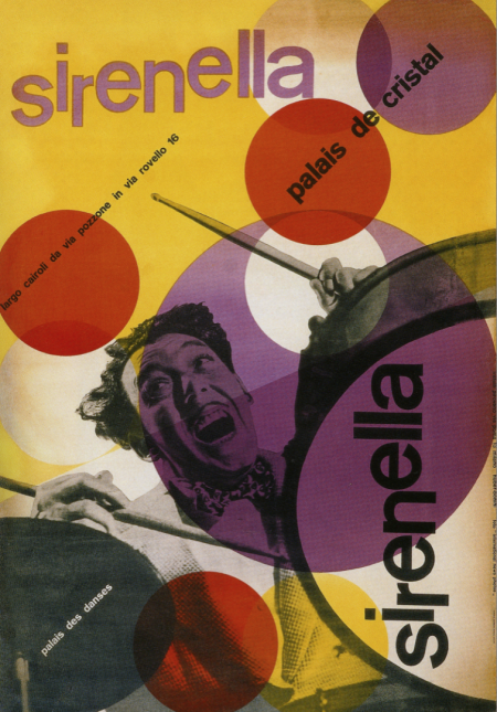
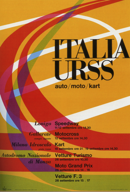
I’ve got a few projects coming up so I’ve been browsing through some of my old design books for inspiration. These two posters by Max Huber kick-started my mind into creative gear. I really like the color palette at work in both; really unusual and effective. The second one is all about the type for me. Didot Bold in all caps always does a good job. I was recently in Switzerland and am really bummed I missed out on the Max Huber Museum. Next time I guess.

7 Comments Leave A Comment
Adrian says:
July 7, 2009 at 3:39 ambeen there for two times. a nice museum with a kinda small but good exhibition.
Mark C. says:
July 7, 2009 at 9:56 amThe color pallete is INDEED pretty awesome! Good stuff…
BrettAndrewMiotti says:
July 7, 2009 at 4:17 pmLove Max Huber! ‘just got the book on him from Phaidon.
greg says:
July 8, 2009 at 8:29 amYes, these hot motherlickers are indeed geeeeeeenius!
Alex N says:
July 9, 2009 at 4:25 pmIs this letterpress ? I’m thinking litho and silk screen or some combination of media. The type on the first poster reminds me of something you’d letterpress but the rest is a mystery to me…
sacha says:
July 15, 2009 at 6:15 amlook: http://www.maxmuseo.ch/ its just 30 min to my home in bellinzona switzerland