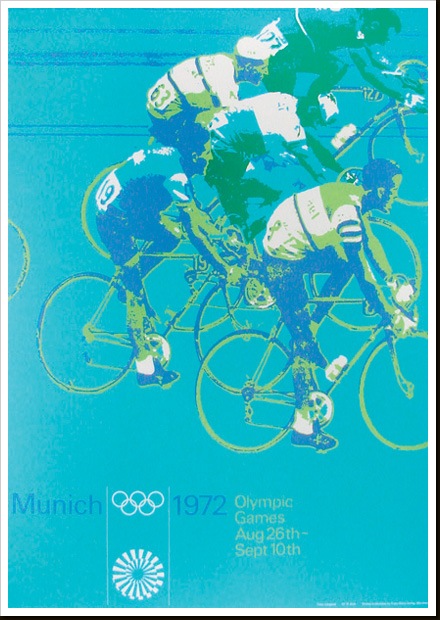
Munich 1972
Posted by Scott

Part of a series of posters from ’72 Munich games by Otl Aicher. I’ll post some more examples in the coming weeks. These must have had a very modern feel when they came out, the colors certainly contrast the prevailing palettes of the time.

3 Comments Leave A Comment
GM says:
October 17, 2007 at 8:34 pmgnarly. it’s got that nice tactile, hand crafted, serigraphic feel to it. what’s the significance of the white symbol at the bottom?
Scott says:
October 17, 2007 at 9:26 pmit’s the logo from the ’72 games.
John says:
November 18, 2007 at 1:48 pmHi, there!..7d3b084308d33ed32324018b9f72177d