Cristiana Couceiro
Posted by Shelby White
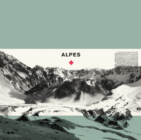
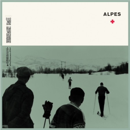
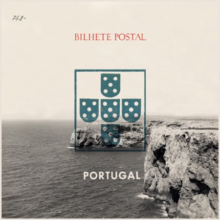
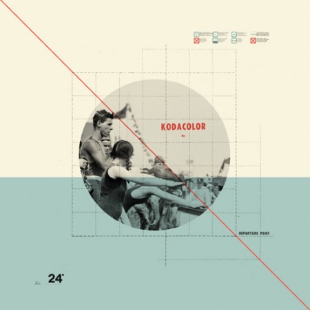
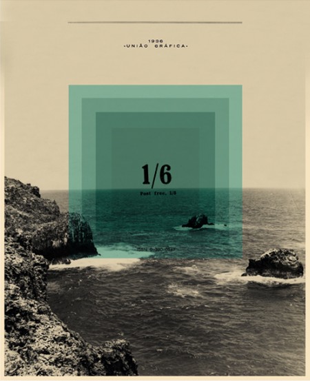
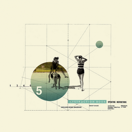
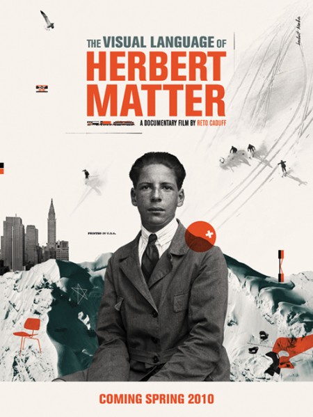
A couple of weeks ago I stumbled across these beautiful pieces by Cristiana Couceiro. I was immediately engaged by the simple, collage-like style and muted mid-century colors. There is also something about the use of monochrome mountain imagery and type that really catches my eye.
See more of Cristiana’s work on flickr.

14 Comments Leave A Comment
Daniel Carvalho says:
June 9, 2010 at 1:49 amPortugal represent.
Speaking of Portugal, love that third image.
Christoph says:
June 9, 2010 at 2:03 amp.s. there’s a broken link on the images – they link to 2010/06/06/ instead of 2010/06/09/ like the Comment link at the bottom does
ian shimkoviak says:
June 9, 2010 at 3:03 amsomething very satisfying about this style. Lots of folks do it, but few do it well.
Gilberto Ribeiro says:
June 9, 2010 at 6:05 amAn artist from my country! :D
had seen it factured here on another occasion. But it is undoubtedly a good influence our
Shelby says:
June 9, 2010 at 7:03 am@Christoph I didn’t see that issue but removed the links anyhow. Thanks for letting me know.
@Gilberto, I’d be curious to know what is Portugal like?
rent says:
June 9, 2010 at 8:25 amI also met Christiana not long ago and was captured by her awesome work. Love her use of color and collage…great stuff!
Gilberto Ribeiro says:
June 9, 2010 at 9:44 amDo you want other country for compare with Portugal? Or want to know how our country culturally is?
Doug says:
June 9, 2010 at 3:55 pmCouceiro’s work is amazing; it makes me warm inside, knowing that graphic collages can actually look slick but still retain a bit of vintage-retro grunge. Been waiting for a post on this for a long time, thanks!
Patrick says:
June 9, 2010 at 5:43 pmDude, another great post. Love the first two.