As a fan of your work, and someone who reads your blog almost everyday, I was a bit surprised to see my own work as the first post. Thank you! But of course your first commenter is right, I didn’t change this up much from the original. In hindsight, I think as a designer i should have aspired to be more original with the piece. In fact, I have a poster to design this weekend, and this pushes me to work harder to achieve that.
shannon-
I don’t think the fact that it was only changed minimally is such a bad thing. If the piece achieved your purpose then it was a success. That’s the beauty of designing posters for small shows, there aren’t any rules. Sure, some projects might call for a more original composition, but I don’t think this one did. Besides, a lot of poster artists make their entire careers from this sort of re-contextualizing. Shepard Fairey is a good example, if you look at a lot of his work you’ll see that it’s directly taken from other sources. Here are some examples:
I DO NOT agree with the opinions of the person who wrote that page, but it’s just a good resource for some of Shepard’s sources. I think the way he takes this source art and turns it into something new and fresh is brilliant.
Anyways, long story short, have fun with design, it’s about creating interesting looking things for specific purposes….If that means you have to draw new faces on an old Atari cover, more power to you!

4 Comments Leave A Comment
Erik says:
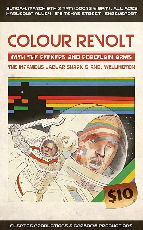
May 3, 2008 at 3:00 amnot much different from the original. redid the faces and added the guitarr =)
Shannon says:
May 3, 2008 at 10:07 amAs a fan of your work, and someone who reads your blog almost everyday, I was a bit surprised to see my own work as the first post. Thank you! But of course your first commenter is right, I didn’t change this up much from the original. In hindsight, I think as a designer i should have aspired to be more original with the piece. In fact, I have a poster to design this weekend, and this pushes me to work harder to achieve that.
Scott says:
May 3, 2008 at 1:56 pmshannon-
I don’t think the fact that it was only changed minimally is such a bad thing. If the piece achieved your purpose then it was a success. That’s the beauty of designing posters for small shows, there aren’t any rules. Sure, some projects might call for a more original composition, but I don’t think this one did. Besides, a lot of poster artists make their entire careers from this sort of re-contextualizing. Shepard Fairey is a good example, if you look at a lot of his work you’ll see that it’s directly taken from other sources. Here are some examples:
http://www.art-for-a-change.com/Obey/index.htm.
I DO NOT agree with the opinions of the person who wrote that page, but it’s just a good resource for some of Shepard’s sources. I think the way he takes this source art and turns it into something new and fresh is brilliant.
Anyways, long story short, have fun with design, it’s about creating interesting looking things for specific purposes….If that means you have to draw new faces on an old Atari cover, more power to you!
Shannon says:
February 2, 2009 at 11:28 aminteresting enough, super touch has posted a response to all this obey plagarism:
http://www.supertouchart.com/2009/02/02/editorial-the-medium-is-the-message-shepard-fairey-and-the-art-of-appropriation/