Helvetica and the Subway
Posted by Scott
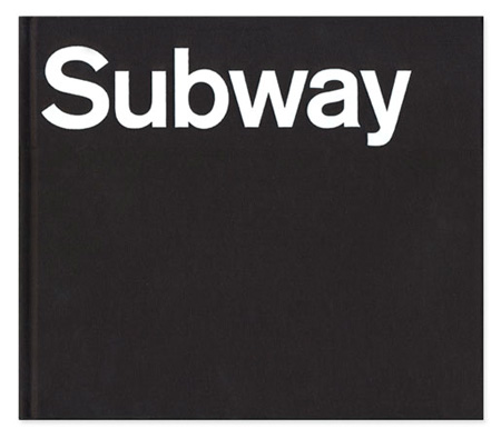
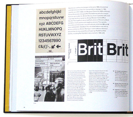
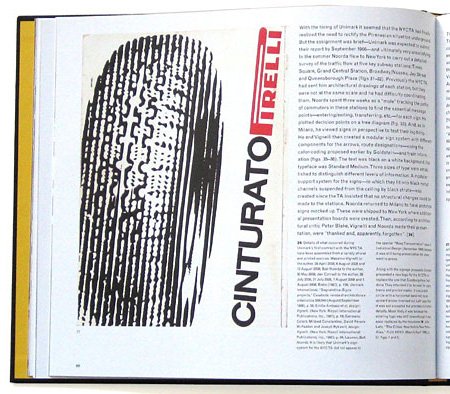
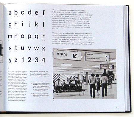
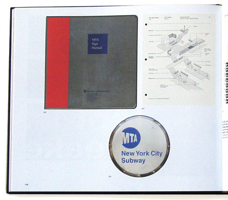
Helvetica and the New York City Subway System by Paul Shaw — which examines the Helvetica’s role and history in the New York City Subway system — looks like a must have for any design collector. It’s currently sold out of it’s initial limited edition but Shaw’s site says they are looking for a publisher. Let’s hope that works out.
Also not to be missed is David Heasty’s One Color Subway Map featuring, of all things, Helvetica. You may still be able to score a print, details are here.
Via The Daily Heller via Thinking For a Living

16 Comments Leave A Comment
Scott says:
March 8, 2010 at 9:59 pmWas it not Vignelli who first brought Helvetica to the System?
Scott says:
March 8, 2010 at 10:02 pmAlso lets not forget he also brought a Underground style map along with Helvetica, which was unwisely dropped in the late 80’s I believe.
Imar says:
March 8, 2010 at 10:32 pmWhat’s up with the capital S on the cover? Not Helvetica, is it?
Matt Sauter says:
March 8, 2010 at 10:38 pmThis is a beautiful book. I received my copy a little while back, and I didn’t even open it for a while. I was busy staring at the shipping package, which had been beautifully addressed by hand (Paul Shaw is also a calligrapher).
In a follow-up “thanks for the support” email, Shaw mentioned that, although there are no plans for a second edition, he hopes to find a publisher to do a trade edition. I’d recommend grabbing a copy if anyone has a chance.
Ian says:
March 9, 2010 at 8:19 amI’m not sure if this is the same thing, but I’m pretty sure I’ve read it, or an abbreviated version, online.
http://www.aiga.org/content.cfm/the-mostly-true-story-of-helvetica-and-the-new-york-city-subway
That says it’s also by Paul Shaw, and while not full book length, was a very interesting read.
Check it out if you want to buy the book but it’s out of stock! :D
Chris says:
March 9, 2010 at 5:44 pmAbout the S on the cover, I have noticed that too in the Subway system and am perplexed by it. It looks like Aksidenz grotesk. On some signage they have both that S and Helvetica, I have been noticing the pairing of the two more and more, and I think they use Arial for the Metrocard machines!
Phife says:
March 9, 2010 at 7:50 pmyup the “S” on this cover and spotted throughout the NYC subway system is Akzidenz Grotesk. The signage system was (re)designed around 1960 or 61 (cant remember exact date) and while Vignelli would have preferred it to Akzidenz Grotesk (called Standard back then), Helvetica hadnt gained enough popularity in the States yet and Akzidenz was the closest suitable typeface that was available for any extensive reproduction of type in sizes large enough for transit signage.
Theres a pretty thorough essay that Paul Shaw wrote on the same topic as the book thats up on the AIGA website—
http://www.aiga.org/content.cfm/the-mostly-true-story-of-helvetica-and-the-new-york-city-subway?%C3%82%C2%B4pp=6&recache=1&pp=1
Jan says:
March 12, 2010 at 3:56 amalmost everything shown in these pictures is akzidenz grotesk.
really sad for a “design” blog to mix these up, but well, whatever.
Florentina Kreimer says:
December 29, 2010 at 5:33 amThank you for the awsome article. I’ll keep an observation about your website, i allready bookmarked it to personal list :)