Michele Angelo Typo
Posted by Scott
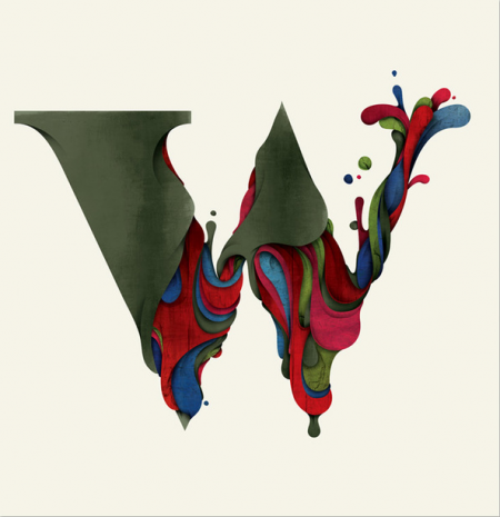
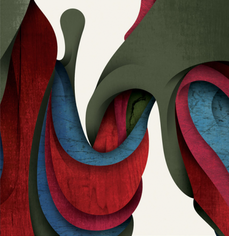
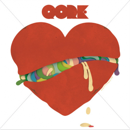
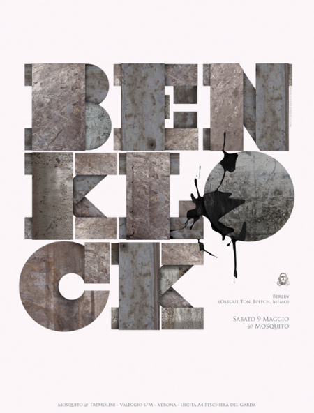
Loving this illustrated type from Michele Angelo. The “W” is giving me some nice Roger Dean-meets-Avant Garde Magazine flashbacks.


Loving this illustrated type from Michele Angelo. The “W” is giving me some nice Roger Dean-meets-Avant Garde Magazine flashbacks.

11 Comments Leave A Comment
Magazin says:
February 17, 2010 at 4:59 amHi, thank you very much. good job.
Pegasus says:
February 17, 2010 at 6:30 amHmm, I was thinking Roger Dean meets Wallace and Grommit.
Graphiste Shane says:
February 17, 2010 at 7:15 amI am a French designer, I come regularly to your blog
thank you for this article.
Here also a link to the video of my communications agency: http://www.youtube.com/watch?v=9yNdCFLLWks
Anonymous says:
February 17, 2010 at 9:05 amYou are such a hero Scott! I discovered your blog a year ago and every post is a pleasur but this one and the hiroyuki hamada one are the cherry on the top of the Cake.
Thank you, you’re a gold mine!
Martin (France)
felix. says:
February 17, 2010 at 9:38 amhmm, i am not too impressed by those ideas.
doesn’t anybody else think it’s a little too alex trochut + non-format?
Michele Angelo is — without a doubt — a good designer, but thats even more disappointing when those people jump on someone else’s style. i see such things on ffffound just too often. sorry.
what do you think?
Brent says:
February 17, 2010 at 2:35 pmI did see on Angelo’s webiste that he and Alex Trochut are friends, so it’s not surprising that they would be interested in and practice similar styles. The thing to me about having a ‘style,’ whether it’s music, design, art, or whatever is that it cannot seem forced. And I don’t feel like any of these works are forced. He may not be the champion of that particular style; but, to me the execution is still on point. Does that make sense? Anyways, just a thought.
I particularly like the last one, which I assume is where the reference to Non-Format was from?
felix. says:
February 17, 2010 at 4:12 pm@ brent:
exactly! it really wasn’t my aim, to insult this particular designer or his work.
like i said — it’s just that sometimes i get frustrated, when i see talented people’s work, but they seem to hop on whatever trend there is.
on the other hand, maybe that’s just the twisted view on things that the internet provides …
Rory McCawl says:
February 17, 2010 at 4:47 pmStunning, i love the texture to the shapes and letter forms, very inspiring.
Alex Rapada says:
February 20, 2010 at 9:35 pmWow! this is amazing work right here!
(Pryor Design Company) (Ann Arbor Design) says:
October 8, 2010 at 9:24 amI agree that the texture really makes these letter forms unique. I’ve seen the “drippy” font before, but to pair it with lots of overlapping, shadow and texture–wow.