Hey Ho
Posted by Alex


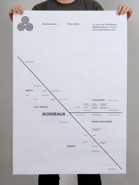
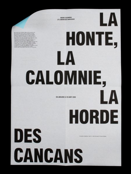
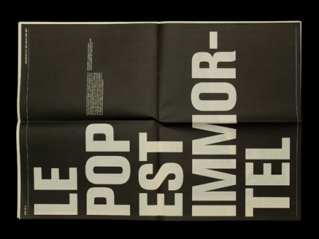
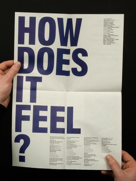
Gorgeous typographic works by French studio Hey Ho. I’m a big fan of this super regimented typographic chaos; a contradiction of terms I know, but looking at the pieces I think you know what I mean. Careful inspection usually reveals a tight grid and all of the placement feels *right*. I try to imagine adding or taking away elements and always find that Hey Ho has balanced things perfectly. Their work kind of reminds me of Experimental Jetset in an alternate typographic universe.

9 Comments Leave A Comment
Scott says:
January 29, 2010 at 12:13 amWow… Want that Max Bordeaux one.
alex says:
January 29, 2010 at 12:15 amYeah that one is the ultimate. I’d hang that anywhere
Jakub says:
January 29, 2010 at 12:47 amdefinitely love that Max Bordeaux too, very on point.
leslie says:
January 29, 2010 at 1:14 amoh god. this stuff is great, except that nearly EVERYONE in europe is designing this way right now. it’s inescapable! i live in london and even random party flyers are designed like this. yeah, it’s cool and better than a badly designed flyer, but unfortunately the look has hit overdose status. i’m sensing a revisit to 90s experimental type is just around the corner.
Inua says:
January 29, 2010 at 1:30 amI am with leslie on this, I am not so taken with the style – it may be perfect in structure and grid etc – but has passed from a trend, into graphic designers just trying to impress each other – this is when it should stop!
Edub says:
January 29, 2010 at 8:17 pmI’m with everyone else, would love to have the bordeaux poster to hang over my wine rack.
wampwamp says:
January 31, 2010 at 11:26 amI am a fan of big type, easy on the eyes. I have been using my itouch to internet because my computer broke, and it kills my eyes.
The trick with big type though is making it big and legible, too much hyphenation gets old fast.
Yuriy Zaremba says:
February 1, 2010 at 12:13 amVery well done. Especially diggin that first entry.
-l-l-l- says:
July 9, 2010 at 7:53 amdamn, i live between Bordeaux and Libourne, i need to find the first poster