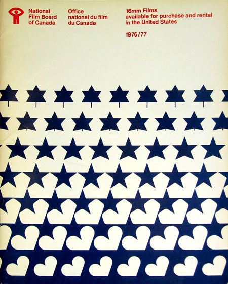
NFB 76/77

Sent via Jason Bustin:
“I’m in the process of moving and I came across an old National Film Board of Canada catalogue that was made available for American residents wishing to order 16mm films from the NFB in 1976/77.”
These evolving, MC Escher style designs are great. Especially love the motion metaphor tie in with the NFB. The bowed text at the top is an artifact of correcting for the angle at which the photo of this piece was taken.
I never realized it until I started posting all this stuff, but Canada seems to have a very strong legacy of graphic design, something for which I am not quite sure they are getting their due credit. I didn’t study design in school, is Canadian design a part of the curriculum of most design programs? If not, it should be. Just scroll through the recent entries here and you’ll see lot’s of great examples. I have a lot more coming too.

17 Comments Leave A Comment
drew kora says:
October 6, 2007 at 6:20 pmOdd you bring up Canada and awesome design. I was just in Toronto for a design conference and Toronto’s Pearson International Airport is like a designer’s dreamland. The signage is gorgeous, the place is ultra modern, sparkling clean, lots of glass…it’s like a space station. The whole city is cool had a really nice sense of style as well.
A few photos of it on my Flickr page. Scroll down for the picts: http://www.flickr.com/photos/gravitymachine/
Tor Løvskogén says:
October 7, 2007 at 2:27 pmLove it! Also looove Boards of Canada, as in the two guys from Scottland – probably not so unknown to you :-)
Michael McCourt says:
October 7, 2007 at 3:16 pmIt took me a while to realize that the design starts as a leaf at the top, then turns into a star. There’s just so much to look at, but it’s so simple.
sabih says:
October 8, 2007 at 9:20 amOh wow, that is gorgeous – I’d love to get that as a poster…
Adam says:
October 8, 2007 at 11:27 amAs a Canadian Graphic Design student, for me the answer would be no. I’m in my 3rd year and we’ve yet to really talk about Canadian Design. We talk non stop about European/American designers.
I love seeing this stuff because it reminds me of growing up, oh the nostalgia!
We used to watch BOC films on a daily basis in school on the reel to reels!
Scott says:
October 8, 2007 at 1:48 pmAdam, that’s sad to hear, maybe someday everyone will catch on… Love BOC films, they show the shorts on cable here once in a while. Good stuff.
Christian (Élément Kuuda) says:
October 8, 2007 at 8:09 pmYep!! As a Montreal resident, even convincing people around me here that Canadian design is amazing, is sometimes a hard task to do. I dont know why that is though, but I guess people take whatever is here for granted.
I remember the BOC films as well, they are probably the main inspiration for my art and I guess for many other artists AROUND the world. Canadian design should definitely be in the curriculum of design programs. It really takes a guy from California to notice that :)
Scott says:
October 8, 2007 at 8:22 pmYou’d think when your flag is a marvel of graphic design to begin with people might get the hint… guess not. You guys need to talk to Switzerland, they designed that bad ass flag and the rest was smooth sailing, they have major design cred for days. Time for the CDAC, Canadian Design Awareness Consortium. I’ll head up the San Francisco chapter, then picket American storefronts with poorly designed signage imploring them to hire Candian designers and extolling the virtues of the Montreal Games branding package.
Javier says:
October 21, 2007 at 8:49 pmthat´s one of the better acheved grafic messages I have ever seen!
well done.
greg says:
November 2, 2007 at 9:50 amI’ve always LOVED the National Film Board of Canada logo.
Brilliant.
D.so says:
January 28, 2008 at 1:53 pmwow….i love this poster….does anybody know the name of the designer who made it?
thanx
Mercedes Kemp says:
April 18, 2008 at 9:44 amsoundful flapcake beechwood dingwall inset dracontites tractite pneumotoxin
Mesa Driveshaft Service, Inc.
http://cnn.com/2001/TECH/fun.games/12/07/batman.review.idg/index.html
paul says:
October 13, 2008 at 4:33 pmA few years ago, there was an exhibit at the Canadian Museum of Civilization celebrating design from the 1960s. In history, this was probably the most solid era in Canadian design. Some info on that exhibit is here:
http://www.civilization.ca/media/docs/fs60s02e.html
Now, Karim Rashid is sometimes celebrated as a Canadian industrial designer. Not sure if he’s actually Canadian though (born in Cairo but raised in Canada and now working in NYC). He graduated from Carleton University in Ottawa anyway and the school is very proud of this.
Doublenaut and Mike Deforge are two designers doing work in typography and illustration that I dig quite a bit.
http://www.doublenaut.com/
http://kingtrash.com/blog.php
Lately, people are probably giving Canadian music more attention than design. This isn’t really a bad thing. The Canadian Polaris Music Prize also supports a lot of designers through posters made for every nominee.