Simon Page
Posted by Alex


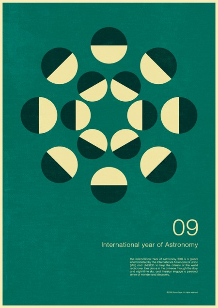
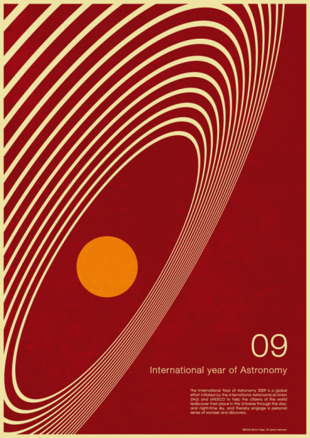
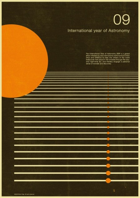
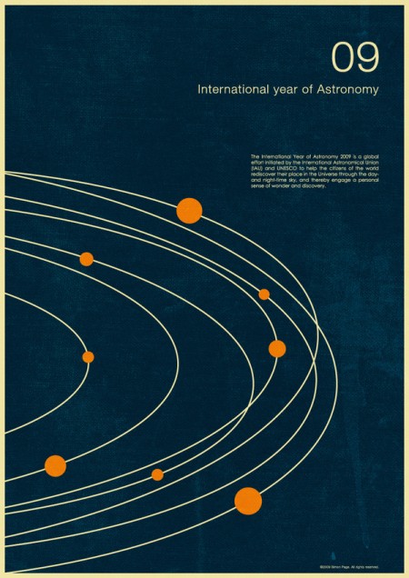
This series by Simon Page is great. I’m always a fan of this retro minimalist look. I think he does a great job making it feel aged without going overboard. The color and texture is spot on and the vintage feel is skillfully conjured. Sounded like what started as a personal project turned into a successful client job after they saw the work. Got to love when that happens!

11 Comments Leave A Comment
For-W-Art says:
November 2, 2009 at 3:07 amWow those are brilliant, thanks for introducing me to his work.
gerwin says:
November 2, 2009 at 6:44 amYou’re right on him not going overboard, all of the ‘aging’ was done quite right. Nice.
Jesse says:
November 2, 2009 at 8:53 amThose are fantastic, what a great series. And I love that it turned into a paying project. Even better! Thanks for sharing
Jakub says:
November 2, 2009 at 12:29 pmLove that brown and orange one! great find!
Scott says:
November 2, 2009 at 2:59 pmamazing!
Simon Page says:
November 2, 2009 at 6:42 pmThanks for the comments and posting my posters.
If you drop me a line or leave a comment on my website will be sure to let people know when prints are available to buy in the next few weeks.
Op says:
November 2, 2009 at 8:06 pmCould stare at that second one for a looong time.
Ah wait I just did! Darn those hypnotic circles, love how it seems to make the orange circle appear to be in a 3D space. Great work.
sk says:
November 2, 2009 at 8:30 pmThese are great. Please let me know when the prints are available to buy!!
Rent says:
November 2, 2009 at 9:43 pmvery nice. he’s done a great job with the weathered look too.
Alex / HeadUp says:
November 2, 2009 at 10:29 pmDefinitely some top notch work! I’d be curious to see how he replicates this look in his prints, it was a big challenge for me with a project I did a couple months back. As if trying to design for the monitor and make it look authentic wasn’t challenging enough (in a good way), trying to achieve similar results in printed form is another beast entirely.
Simon Page says:
November 18, 2009 at 12:54 pmPrints now available from my website and here:
http://simoncpage.inprnt.com/