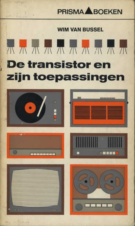
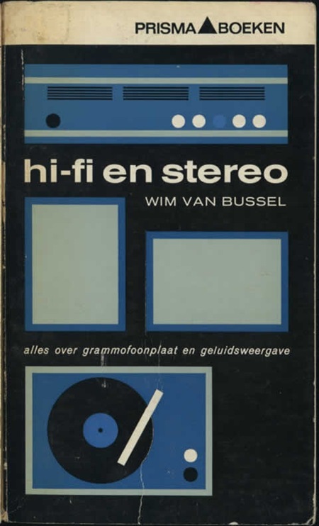
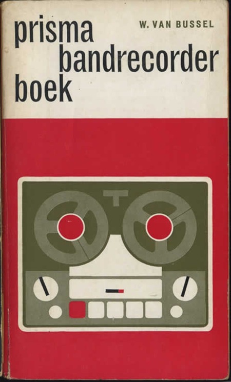
Prisma Covers
Posted by Scott


Some really nice modernist book covers featured over at Defunkt. I love this style of illustration, Mike Mills took a similar tact for the Beastie Boys Stereo Speaker poster. And of course, you really can’t lose with Trade Gothic.
Via Monoscope

6 Comments Leave A Comment
Joaquim Marquès Nielsen says:
February 26, 2008 at 2:12 pmWauw! I love the fact that the buttons are sometimes varied – that some of them pop out in a different color. That really makes the graphic all the more interesting I think.
Wicked stuff as usual :) A pleasure for the eye.
– J
Alex / HeadUp says:
February 26, 2008 at 4:14 pmVery cool– I look at them as a combination of relatively simple shapes, a pictogram. Creating these is not hard in practice, the challenge comes when youre trying to think of an object in terms of its simplest possible features without losing its recognizability.
Marc says:
March 4, 2008 at 6:25 amThese are gorgeous. Think YES studio like them too:
http://www.yesstudio.co.uk/ > The Stands
Ben Blood says:
March 26, 2008 at 1:30 pmUrban Outfitters are selling t-shirts with a design very similar to the top poster. Interesting how design comes full circle.