Jessica Helfand wrote an open letter to design sudents everywhere this morning. It is an insightful piece, and I think everyone could benefit from giving this a read really, student or no student.
If you’re graduating in the middle of a recession, it’s likely that an arc of despair trumps the impending thrill of your newly-liberated station in life. Conversely, though, I can’t imagine a better time to get out of school. Nobody’s hiring, but why let that stop you? While the mechanics of, say, having a roof over your head suggest that a little modest income might be a good thing, the actual economics of making work no longer depend on an actual employer. The portfolio no longer means a big black suitcase schlepped around from studio to studio. Get your work online, put your videos on YouTube, and get busy.
I am about 1-2 years out from graduating myself and I already feel the jitters of the “what next…” syndrome. The world of design is changing so fast, every day, and it can be quite an intimidating place to look out upon from within the graduate school bubble. Sometimes I feel like being a student is like being a star college basketball player; floating along no problem in this league—making threes, hitting jumpers, dominating the *paint*—only to be in for a big surprise when you graduate to the Pros and get dunked on by guys double your height and ability that got recruited straight out of high school.
The cries of “nobody’s hiring!” that sound throughout the design world can be periodically distressing, but also inspiring in a backward kind of way. As Ms.Helfand alludes to above, the traditional model of graduate/interview/work for studio is not what is necessary anymore (and thankfully!). New opportunities exist, and as long as you have that hyper-awareness and ready ability to adapt, you can take advantage of them just like before. At least that’s the way it seems from inside the bubble.
It does seem like a scary time to graduate now (and probably will again in a couple years), but the optimist in me agrees with her letter and isn’t concerned. Everything is going crazy and I’ll just try to stay crazy right along with it. Read the full letter on Design Observer.
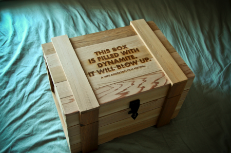
It’s done! The semester came to a close last week and my hypothetical Wes Anderson Film Festival went off without a hitch. On the final day, the project consisted of a presentation box, DVD set, poster (30″ x 44″), fold out schedule, identity system, catalog book (63 pages), website, soundtrack packaging, tickets, billboards and outdoor signage, iPod/iPhone skins, a trailer, and a few other assorted doodads. It was crazy to see it all in one place. I was very happy with the way it all turned out and am relieved to have made it through successfully. This semester was a particularly intense one (as we were also presenting our thesis proposals), and it’s exciting to have made it halfway through the graduate program. Next up will be thesis development over the summer.
This semester’s project really helped us develop our conceptual and technical skills, as we were challenged to create a integrated brand system across a variety of mediums. Everyone had to work with a number of vendors (easily my least favorite part) and be able to coordinate a massive design effort on a strict schedule. My process was not without its speed bumps; color calibration issues at the printer, boxes delayed by weather for weeks, and unfortunate stylistic meanderings early on, all contributed to periodic frustration along the way. Thankfully, once I knew how I wanted everything to look, the implementation of the brand became systematic. The last couple weeks were just a matter of hammering things out.
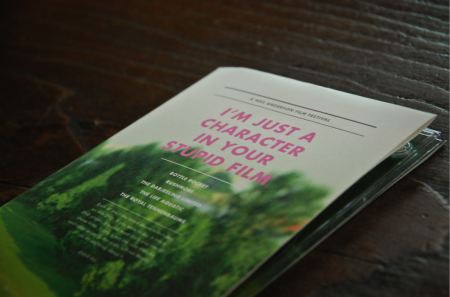
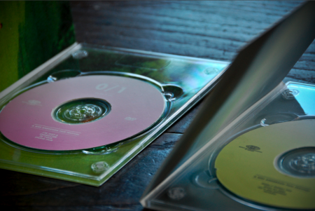
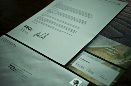
Above I’ve included some of the pieces that I have not written about previously. First is the presentation box which housed all of the other materials for the festival. It was constructed by Wood Box Supply and is branded with an irreverent slogan. I liked this, but still wish I would have thought of something a little funnier. Next is the DVD set which came in a similar wooden box. These were created out of paper folds and a plastic DVD tray. You’ll also see the catalog, which was one of my favorite things to design, as it allowed for the most copy to be written. As usual, no one will probably ever read most of what is contained within, but it was still fun to put together. Next you’ll see the identity system for sending things to and fro, and which classified my rank as ‘marginally important person.” The rest of the project, in its entirety, can be seen here.
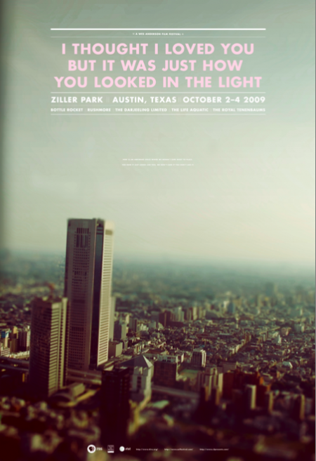
The last image is one of the final versions of the poster (there were many color variations). This was one of the first things I designed for the project. After I completed the rest of the system, I really didn’t feel like the poster fit as well with the other elements. The photograph, especially the dominant color palette, didn’t mesh very well with the warmer tones at work elsewhere. I was aware of this as I worked through the rest of the system, but had unfortunately already printed the poster very early on. It can be a real nightmare printing at the end of the semester (due to the student rush at the vendor), and I always try to finish early and get the printing out of the way if possible. In this case, I would have liked to switch out the photo for something more consistent with the rest of the project. I really had a hard time seeing my picture of a Tokyo skyline (tilt shifted as it may be) conjuring Wes Anderson.
Given that the photograph didn’t really feel like the festival, I tried to at least bring it a little more on brand with the language used. The original title of the poster was “I love you too but I’m going to mace you in the face”, a line from The Darjeeling Limited, but this was determined to be “too violent” and I changed it to a Fall Out Boy lyric that possessed the same dry wit. This title fit with the rest of the identity marks and I was happy with the tone it set. The last issue was finding an appropriate text lock up to fit in the sky section. Eventually I settled on one that didn’t fill out the whole space. In the empty area below I wrote “Here is an awkward space where we weren’t sure what to place. For now it just looks like this, we don’t care if you don’t like it.” That made me laugh and I figured it was as “Wes Anderson” a solution as I could muster. It was that or leave it blank, but on a 30″ x 44″ poster, there needed to be something there. I like the poster as a stand alone piece, but as part of the system, I feel like it is the weakest link.
So that’s it, all done! As I’ve mentioned, the project is for a hypothetical Wes Anderson Film Festival and there is no actual event. I got more than a few confused emails after the trailer was posted. So just to be clear, this doesn’t actually exist. If Mr. Anderson is reading this, and would like to actually hold the festival, that would be fantastic for all involved.
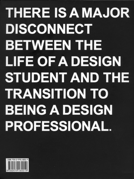
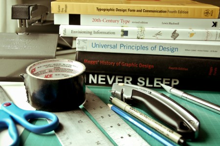
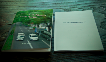
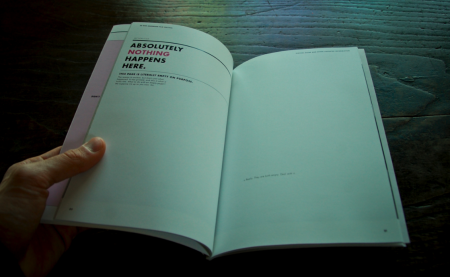
I just finished reading Never Sleep, the new book by Andre Adreev and Dan Covert of dress code. As a student, the back of the book (pictured) kind of freaked me out when I first saw it. My brief and occasional foray into the world of freelance has exposed me to some differences between school and the professional world of design, but I’ve always figured I’ll be in for a wake up call when I graduate regardless. I was psyched to see a book written about this exact process, and I spent last night (as the title suggested) reading the lot of it.
The book chronicles Andre and Dan’s transition from design school to the professional world. They describe, in-depth, just about every aspect of their journey; studying at CCA, working for MTV, and the eventual creation of their own studio in NYC. Along the way, they include examples of their own work from each stage of their career, as well as various essays by professors and professional designers (many of which are available on the site). The book describes just about everything that happened to Andre and Dan, even the occasional IM conversation, and this makes for a very engaging read. The third person narrative is just about as random as it is amusing, and is ultimately very accessible and insightful for the struggling design student (that’s me).
Dan is Ohio. Andre is Bulgaria. They is dress code. At the combined age of 50 their work has been recognized by shiny awards, appeared in lots of magazines, coffee table books, and 3 museums. They met while studying graphics designs at California College of the Arts. Then moved to New York and got jobs with MTV working in motion and print—before stupidly leaving their dream jobs to start a studio of their own. (Buy)
