The Swedish National Bank had a competition for designers to redesign the Swedish banknote. The Stockholm Design Lab, was among the 46 competitors and was even among the top 8. Unfortunately they did not win, but their design was promising. I really enjoyed their banknote design because of the simplicity and type.
We’ve talked about currency design before but I’m still rather curious if there is a list somewhere out there that can detail all of the finer points that a new design for currency has to be upheld to. View the full PDF for SDL’s design process.
Do you feel this is a fitting redesign of the Swedish banknote?

Editor’s note – In answer to some of the questions in the comments: This contest is not for Gap. We are not affiliated with Gap. Gap has nothing to do with this contest. This is for fun, not Gap. Gap will not be using any of these logos. Gap will not be forcibly entering your home and removing belongings. This is not a secret conspiracy by Gap and the Freemasons to get you to design free logos. This is not crowd surfing. I bought some socks there one time like five years ago. Also, Gap has apparently been using the new Helvetica logo for nearly a year now, everyone just decided to notice and get super pissed off when they added a gradient square this week. If you submit a logo to this contest, you retain the rights to that logo.
By now you have seen the new Gap logo. By now you have sent a “this is terrible” rant to all your designer friends. By now Gap is probably about to pull a Tropicana. (Update, they did).
OK so I get it, you don’t like the new logo. I don’t either. I want the little gradient square to fall into the gap and never come back. But I couldn’t help but think: what would I have done if Gap had come knocking and asked me for a new logo? How do you rebrand a company as ubiquitous as The Gap?
So rather than rant and rave, let’s fix this. We are a community of designers and I’m sure someone here can come up with something better. So here’s the contest:
Your Job: Design a new logo for the Gap. Assume a fairly open brief and think about where their brand is and where it’s going.
Timeframe: 1 week. Contest ends on Wednesday October 13th. Short yes, but this isn’t school, let’s work quick.
First Place: Your choice of giclee print from the ISO50 shop (size 24 x 36), a shirt of your choice (also from the shop), and a process feature article here on ISO50 (If you choose to, you can write a process piece on how you developed the winning design, which we’ll post here on the blog).
Two Runners Up: Two shirts of choice from the ISO50 shop.
Instructions: Email alex [@ symbol] iso50.com with the subject line “New Gap Logo” and attach your redesigned Gap logo. Please make sure your file is in JPEG or PNG format and clearly displays your logo. Size 450w x 250h pixels please. Center the logo, make it look nice. Limit two entries per person.
Due to the extremely high volume of submissions, entries may not be posted right away, but we’ll do our best to get them all up before the 12th!
Voting: Winners will be determined by a popular vote after the last submission date on a separate post.
Legal: All entries remain the sole property of the designer who created/submitted them.
All entries will be posted here after the jump
Continue reading →


I have been flying a rather insane amount over the last few weeks. I complain about a lot of things when I’m traveling: the food, babies, people that insist on stuffing overhead luggage when it will NOT fit, etc. The one thing I have never considered is the boarding pass. Tyler Thompson has written an excellent article on why the boarding pass is indeed worthy of scrutiny. Take one look at the old Delta pass above and you’ll see why. As he states, “It was like someone put on a blindfold, drank a fifth of whiskey, spun around 100 times, got kicked in the face by a mule (the person who designed this definitely has a mule living with them inside their house) and then just started puking numbers and letters onto the boarding pass at random”.
Tyler has done Delta a big favor and redesigned their boarding pass, the design of which you see above. I think it’s obvious that aesthetically, these are much more pleasing to the eye. I would want to hold onto these after my flight was over just because they look awesome. Now of course, the design of a boarding pass has to be more than just beautiful. There are a number of criteria and limitations in place that might prevent your boarding pass from becoming a little piece of art. Worth mentioning in this regard is Timoni Grone’s response to Tylers inital designs. She runs through a meticulous process to come up with a redesign of her own, taking into account all the necessary “practicalities and priorities”.
The cool thing about his project is how he opened it up to others to submit reworkings and suggestions, a few of which he’s posted as you scroll down his page. He’s provided the Illustrator file for download and tweaking. Make sure to head over there and submit yours if you’ve got something brewing. And feel free to sound off if you too feel like the boarding pass design is indeed a fail.
I must say my favorite part of any boarding pass is the little scribbles the security guards make when you pass the initial check at the metal detectors. They do it with such purpose and apparent deliberation, that I think the scribbles must mean something. I always wonder what would happen if I augment their scribbles with scribbles of my own (or scribble before they do). Would I get sent to Homeland Security? Maybe two scribbles on your boarding pass = terrorist. Anyway. I feel safe knowing we have such a complicated system in place.
I could write a similar article about the terrible design of movie tickets, which I feel have slid drastically in the past few years. Since when is a movie ticket printed on receipt paper worth saving? I used to love hoarding all of my movie ticket stubs — now, calling it a “stub” would be an absurd misrepresentation. I call my movie tickets trash.
Thanks @rohrsh

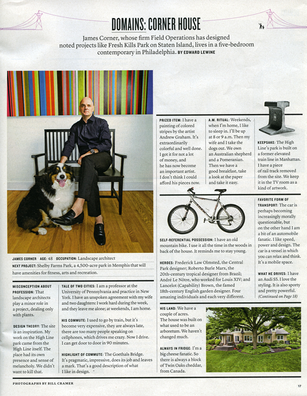
The New York Times Magazine is the reason I wake up early on Sunday morning. Excellent photography, fascinating articles, and sophisticated design fill its pages week to week. It was recommended to me when I started graduate school and I haven’t missed an issue since.
This week the Times rolled out a new, svelte version of the Magazine. Like everyone, they are cutting costs where they can, and it was determined that reducing the size of the magazine by 9% would save them millions in paper costs. To accommodate the smaller page real estate and squeeze in more words, they enlisted Lyon Text, a more condensed typeface than they were using before. It’s a very subtle switch, and as they say, “Perhaps if we hadn’t mentioned it, you would hardly know the difference.” Where the change is most obvious is with the two new display faces: Knockout (H&FJ) and Nyte (Dino dos Santos). Both work really well in the new layout; definitely my favorite part of the redesign. They have also reworked the table of contents, changed the section order a touch, and sprinkled a multitude of new design elements throughout.
I think Arem Duplessis and his team have done an incredible job. I loved the Magazine before, and was initially concerned they might mess with a winning formula, but I think they succeeded in turning budget induced page shrinkage into a successful and well-executed redesign. Intact is the nuanced and ultra refined look and feel that first caught my eye. The smaller size is actually more manageable (a la Rolling Stone), and afforded them the opportunity to make the exciting upgrades. I don’t think anyone will miss the extra millimeters.
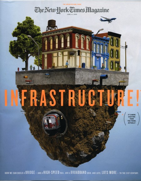
note: There were two covers that came out with the redesign. The one above, with a model by Thomas Doyle, was my favorite, but be sure to check out IC4Design’s version on the NYT website if you’re interested.