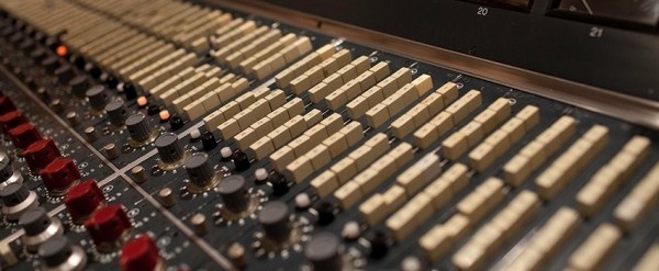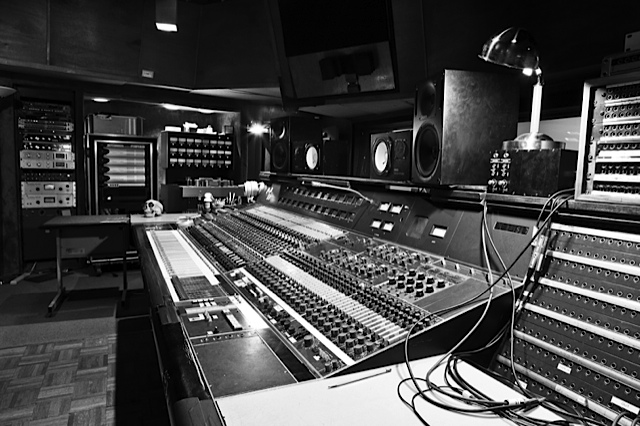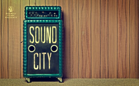


Can’t believe I just now stumbled onto this. Sound City is a documentary about the legendary studios by the same name. Everything from Neil Young’s After The Gold Rush to Nirvana’s Nevermind were recorded at Sound City Studios so a lot of people in the community were sad to see them close their doors in 2011. The documentary chronicles the history of the facility through interviews with many of the artists who recorded there. The film is produced and directed by Dave Grohl who purchased Sound City’s Neve 8028 mixing console when the studio closed. Must have been a good feeling to end up owning the same console his band recorded their breakout album on over 20 years before.
Update: Watched it. Really entertaining; very engaging for people into this sort of thing already but also does a great job of explaining the recording process for the layman. My only criticism is that at times the underlying plot of “how and why Dave Grohl acquired the Neve Console from Sound City” seems a little forced. I’d rather have seen a bit less of Grohl waxing nostalgic on his past and fawning allover Rupert Neve and more interviews and dialog about Sound City itself.
Sound City Film


Kyle Tezak designed these icon collections to represent select films. Each film appears to get four icons, two colors, and a unique type treatment. You can see some of his work in-progress for this project on his Dribbble page.
I’m aware there are countless other projects that reduce films down to a few graphic elements. I particularly enjoyed this one because the elements are icons, not just squares and circles (albeit cleverly chosen ones). I find icon design trickier than poster design, and I am impressed with Kyle’s clear adeptness at the former.


I’ve been wanting to see Werner Herzog’s Encounters at the End of the World for some time and finally got a chance to see it tonight. After seeing Fitzcarraldo and The Bad Lieutenant: Port of Call – New Orleans (which is so incredibly bad that it’s certainly some sort of elaborate joke he’s playing) in rapid succession, I was excited to check out his take on the Documentary format. Based on the trailer I was somewhat looking forward to the imagery in Encounters — I was expecting the majority of the film to be shot underwater like Wild Blue Yonder but was pleasantly surprised to find it was more about what was going on up top. The people, landscapes, buildings, and machines around McMurdo Station make for some beautiful shots. As Herzog narrates in the film “..on this planet, McMurdo comes closest to what a future space settlement would look like.” We even get treated to some vintage celluloid from a 1970’s-era expedition. Definitely a must-see.
More stills after the break. Continue reading →


The Auteurs has a post on their picks for the top movie posters of the decade. Considering that the vast majority of modern movie posters fall short of the standards set in heyday of film, this must have been a difficult list to assemble and a boring task to complete. Nevertheless, they have managed to dig up a few gems. Good to see The Bank Job in there — always a favorite — but I was pleasantly surprised by Funny Games, hadn’t seen that one.
Can you think of any obvious omissions from this list? Let us know in the comments
For some background, more good movie posters from years past can be found in these older posts: 50 Beautiful Movie Posters, 100 Greatest Movie Posters, and, of course, SOLARIS!.
Via The Auteurs


Grain Edit has a great post on the upcoming Photo Lettering Site from House Industries. When I first saw the headline for the original post I was half hoping for some sort of digital way to achieve that awesome blurred edge style from old movie titles and magazines. Sadly, that wasn’t the case. But the reality was just about as good, a bunch of great until now defunct vintage typefaces. The Photo Lettering Site is not fully operational yet, but you can check out some posters featuring some of the fonts here.