Combining Fonts


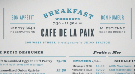
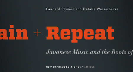
H&FJ just put out a really cool article on combining fonts. They break it up into four lessons and provide visual examples and typeface options. All the examples use their fonts, but the lessons carry over to usage with other typefaces easily.
I found the article to be especially inspiring, or at least liberating. I have a weird mental block when it comes to combining typefaces. I’ll often use two different ones, but never three without a huge mental commotion. I don’t know what it is, but I get really stressed out trying to finagle more than two typefaces into a design. Of course it depends what type of design it is. I guess I always felt like there was this mystical over-arching design rule that prevented exciting combinations of type (I know that sounds ridiculous). Anyway, something about their examples opened things up for me. It’s nice to hear it from the high authorities that this sort of thing can be this effective.
I’m also consistently amazed how good they are about talking about type; the adjectives they use are always way out of left field but completely spot on. Calling Gotham Rounded ‘cheeky’, for example, wouldn’t have come to me right away but makes complete sense once I hear it. If you recall their scene in Helvetica where they rattle off some rather satisfying descriptions of type — that was awesome.
