The Science Behind Fonts
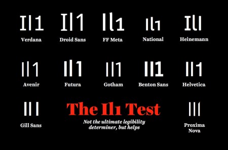
A nice read on how the various facets of typography can influence us.
The science behind fonts (and how they make you feel) on TNW


A nice read on how the various facets of typography can influence us.
The science behind fonts (and how they make you feel) on TNW
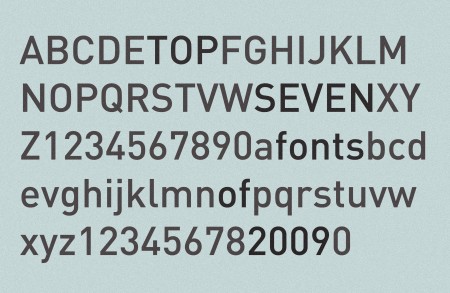
I was inspired to investigate my favorite typefaces of last year by all the “Top Ten Fonts of 2009” lists I’ve seen going around. I tried desperately to make my list longer than seven, but honestly I don’t know if I used more than that. (I only have 50 anyway) Keep in mind, when I say “favorite fonts of the year”, I am referring to the ones I used most, not necessarily ones that were released in 2009. New font releases rarely get me very excited anyway. This list pretty much sums up the only fonts I ever implemented in all of 2009. There is an outlier here or there, but I keep everything pretty regimented.
So here we are, my favorite fonts of 2009:
Knockout – Probably my favorite of last year. I used it everywhere. It’s so versatile, and has so many weights, that I found it really helpful for many projects.
United – You know I love this.
Din – One of my favorites of all time. I found myself using this in just about every infographic I had to create.
Miso – It’s free and comes in handy every once in a while. Found this one popping up in my freelance work a bunch.
Plantin – One of the sole serif representatives. I used this for just about every single time I had body copy. Thanks Monocle!
Futura – Had to include this after my Wes Anderson project. Didn’t use it a whole lot elsewhere, but I always check out how things look in Futura just in case. Especially for logos — Futura comes through in a pinch often.
Trade Gothic – Especially Bold No. 2. If I hear a cool word I don’t know, I will write it down so I can type it out in Trade later just to see how bad ass it looks.
Anyway, nothing too surprising up there I don’t think, but interesting to see it all in one place. List yours if you have them!
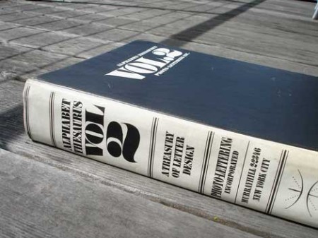
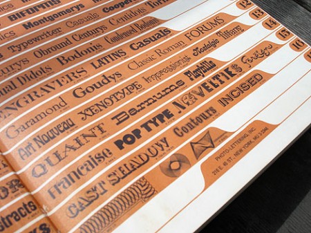
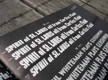
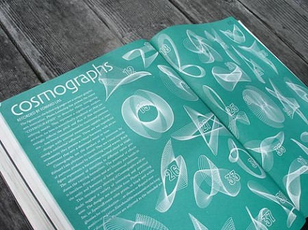
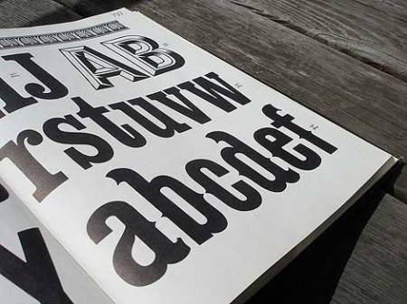
Grain Edit has a great post on the upcoming Photo Lettering Site from House Industries. When I first saw the headline for the original post I was half hoping for some sort of digital way to achieve that awesome blurred edge style from old movie titles and magazines. Sadly, that wasn’t the case. But the reality was just about as good, a bunch of great until now defunct vintage typefaces. The Photo Lettering Site is not fully operational yet, but you can check out some posters featuring some of the fonts here.